Graphs and charts are serious business. They are powerful tools for conveying information and patterns in a concise and visually appealing manner. Diagrams encompass all sorts of analytical illustrations and are most commonly used in science, mathematics, and other clinical disciplines. To an untrained eye, they almost always appear to show the objective truth. They carry a gravitas within them, a sense that the material being presented has been carefully collected and parsed through. Most importantly, the type of diagram used to showcase the information is chosen with utmost care.
Enlarge
In Data Visualisation: A Handbook for Data Driven Design, Andy Kirk lists 49 different chart-type options to choose from, each with its own unique strengths and weaknesses.[1] Some chart types, such as line graphs, are more suitable for displaying data over time, while others, such as bar charts or pie charts, are better for comparing different categories or values. It is a serious task that, when implemented or misdesigned, can lead readers to come to misleading conclusions about a specific topic. Heavy is the burden that falls upon those who create diagrams.
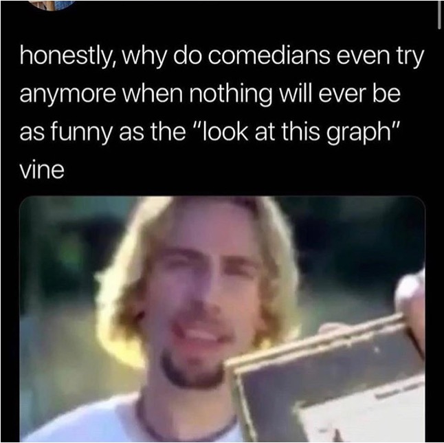
Look at this diagram here:
Enlarge
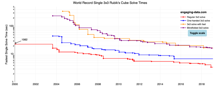
The Rubik’s Cube World Records for 3×3 Puzzles (Regular, feet, blindfolded, one-handed) is a perfect example of a well-crafted diagram. The lines tell a story of adversity and perseverance, the points representing a clever dance of hands and fingers, toes and soles, working together to bring harmony into the world. Observe how the people solving the cubes with their feet jumped from 344.3 seconds down to an impressive 16.96 seconds. It is history told in a couple of dashes and dots. No embellishments are needed. It is symmetrical, and it is correct. Anything placed within its boundaries has to be the truth - it must be truth to honour this pure, beautiful space!
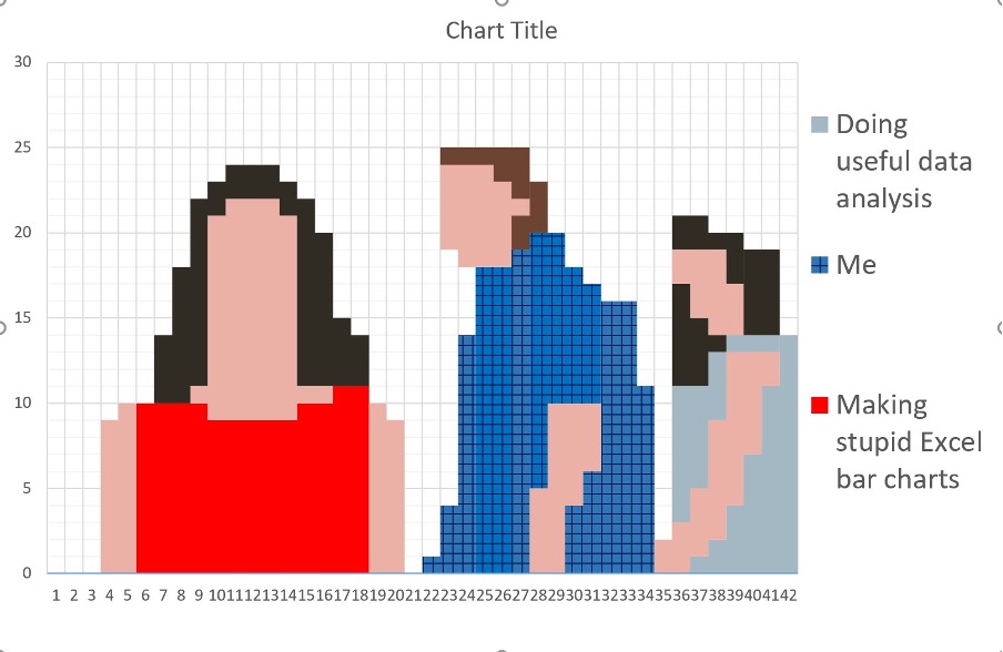
Now look at this graph:
Enlarge
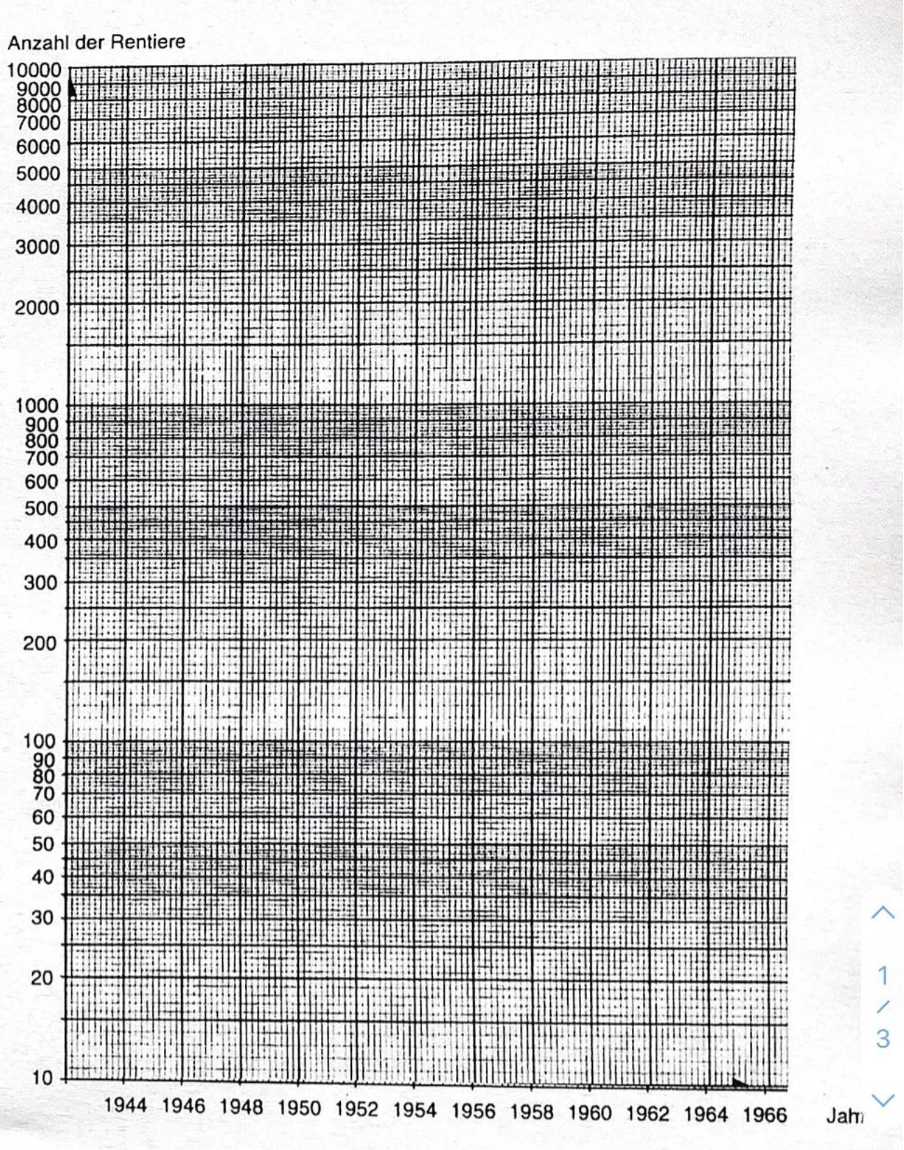
I don't know about you, but this graph pisses me off. Do you feel it in your chest and brain area? Where am I looking at? What am I looking at? Are these the tiny bars of a prison for ants or a diagram representing the Anzahl der Rentiere? The chaos, the claustrophobic small squares bunched up like empty windows of an abandoned building, only evoke confusion and anger. I stare into the chart, but nothing stares back. Nietzche would weep. I do not need to know German to know this thing is bullshit. How will I extract my data and my truth from these shapes?
The moral of the story, diagrams are fundamental to many forms of communication, including memes. Now to the main topic of this article: what about meme diagrams? Those things that make you go “haha”, but also make you go ‘this is something I saw once in my math book’. To make an actual meme diagram, you can't just use a graph or chart and call it a day. We need to spice it up with some humour, too. Just like diagrams, humour is no laughing matter. Sigmund Freud noted at the turn of the century that only a few thinkers had given any sort of philosophical consideration to the topic of humour.[2] Since then, there have been numerous efforts to give credence to the art of comedy; however, some intellectual circles still perceive it as a lesser thing, even though it has played a crucial role in providing psychological relief and social cohesion throughout history.[3] Nowadays, comedy has carved out a space for itself online, with the internet becoming a vast playground for creating and disseminating humour. Open your TikTok or Instagram feed and just scroll. If you do not snort or chuckle in the first few seconds, sorry, but you are doing 'The Internet' wrong. If you did, the thing that made you laugh is a meme. Not to say that all memes are funny. Some are just entertaining, but the majority of memes should qualify as being somewhat humorous.
Enlarge
Memes are everywhere - they are used by ordinary people and by companies alike, posted on every single social media platform where they go viral and/or fall into obscurity. The internet is very funny, that is true, but it is also srs bsns[4], as well. As a hub for brainy discussions on every imaginable topic, online debates range from politics and history to psychology and other scientific research. Sometimes, matters of great importance, such as whether a hotdog is a sandwich or whether or not there are more wheels or doors in the world, are discussed with great passion and intellectual vigour. Lengthy Twitter threads and forum topics abound, interpreting and detailing the modicum of each side, with even professors from prestigious universities chiming in to settle the debates. Evidence abounds, and it should come as no one's surprise that meme diagrams have evolved in this vast digital Agora. They are an excellent method of expressing viewpoints in a comical and ironic manner. They are available in a plethora of templates, ranging from pie charts to bar graphs, line graphs, scatter plots, and beyond. Sometimes, the diagrammatic mode is not so apparent, but upon closer inspection, it becomes evident that the memes are utilizing variables, axes, and labels to convey their humorous message.
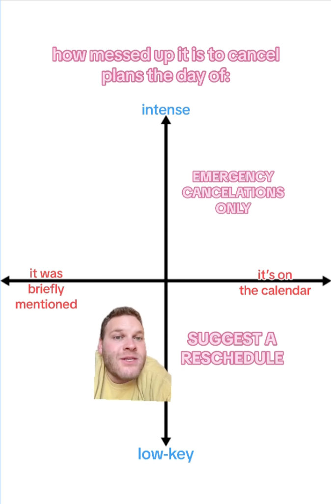
The widespread appeal of meme diagrams is undeniable, with entire subreddits devoted to alignment charts, political compass memes, and other diagram-based meme styles. Popular YouTube creators frequently produce ranking videos, dividing Pixar movies, Dragon Ball Z characters, and even fast food items into distinct tiers based on their individual tastes and viewpoints. Take, for instance, this meme graph depicting the chaos of canceling plans on the day of the event. Instagram user @brian_flakes plotted an x-axis representing how established the plans are and a y-axis representing the intensity of the plans, with four quadrants showing the impact of canceling said plans.[5] The post was made by popular demand after a collection of diagrams by @brian_flakes went viral, with his most popular one ('ranking the best days of the week to be drunk') garnering an impressive 3.4 million views.
Another viral meme diagram in the digital nexus is the ever-present, ever-evolving Galaxy Brain meme, aka the Expanding Brain meme. This meme consists of several panels that compare the size of a person's brain to other variables. It is commonly used to highlight someone's refined taste, sarcastically reacting to different objects, implying that less desirable items are actually superior to popular ones. For example, the first viral instance of this meme dates back to a 2017 Reddit post rating the usage of the pronoun 'who,' with 'who' being at the bottom of the smartness totem pole and 'whomst'd' at the top. The Expanding Brain meme has become such a staple in the meme world that there are different meta iterations and spin-offs, such as the WWE's Vince McMahon version or the Drake drinking Sprite and ascending rendition.
Why do these diagrams manage to rack up thousands of shares and likes on social media platforms? If one searches for #axis graph on Tumblr, there are many 'mathy' memes utilizing line graphs, axes, and column charts depicting the egos of Game of Thrones houses to the rise in banana prices, some racking up thousands of likes, reblogs, and replies. They are funny, sure, but math, geometry, and statistics are hardly known for their comedic appeal. There were no tears of laughter when I was learning sinusoid forms. Only pain and suffering. So why does looking at a weird pie chart incite a knee slap or two from the viewer?
Enlarge
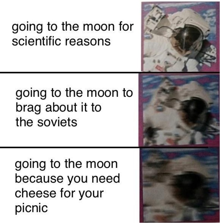
Chart and Laugh: What Makes a Meme Diagram a Diagrammable Meme?
What is in a name? When it comes to meme diagrams, the emphasis is on them, first and foremost being 1) memes and 2) diagrams. Every person who has internet access must have seen a meme or two in their online lives. Professor Kirby Conrod defines them as 'self-replicating chunk[s] of information' that have technically existed throughout human history in various forms, spreading through sharing and repetition.[6] Officially first coined by British evolutionary biologist Richard Dawkins in 1976, memes have become an integral part of contemporary internet culture. They are humorous, often satirical, and have the power to transcend language barriers. Whatever, this is a meme. And this is a meme, as well.[7] You probably already know what they are already, so I won't bore you with any more definitions. Picture one in your brain, and let's move on to the real meat and potatoes: diagrams.
Now, this following paragraph is something you should read carefully and then relay everything to your loved ones during a rainy Sunday dinner. According to Princeton's historical companion on information, diagrams are visual aids that utilize lines, shapes, symbols, or words to effectively convey information clearly and concisely.[8] They have been used throughout history to depict many concepts, objects, processes, and systems. The earliest examples of diagrammatic representations can be traced back to 70,000 BCE, found in prehistoric engravings in ochre located in the South African Blombos cave.[9] Given their versatility and efficacy, diagrams are integral to nearly every communication system and can take on different forms, such as flowcharts, mind maps, organizational graphs, or network diagrams.[10] They can sometimes be challenging to decipher without proper labels or annotations, which can provide more context. There is a reason why the most iconic diagrams take advantage of basic shapes such as circles, squares, and arrows to represent hierarchies, processes, or relationships. Euclid's geometric diagram, Copernicus' heliocentric model diagram, Darwin's tree of life, and Feynman's diagrams of quantum mechanics are just a few examples of famous diagrams that have profoundly impacted our understanding of the world.
For many scientists, such as Jane S. Richardson, diagramming is a powerful cognitive tool that transcends language barriers, providing a means to visually convey intricate concepts and connections.[11] Similarly, philosopher Ludwig Wittgenstein also recognized the value of diagrams in his exploration of the relationship between logic and language, viewing them as dynamic instruments that capture the fluidity and intricacy of thought beyond the limitations of words. They serve as therapeutic tools that help circumvent 'aspect-blindness' (i.e., the inability to perceive different aspects or perspectives of a concept or phenomenon) or 'linguistic idleness' (that is, lack of clarity or applicability in the use of language).[12] DDiagrams are, in essence, 'multistable artifacts' that can be interpreted differently depending on the context and the observer's point of view.[13] Despite recent technological and communication advancements, diagrams remain a vital tool for representing knowledge and facilitating visual communication. Rather than being static, diagrams are dynamic objects that mathematicians manipulate as part of their reasoning process. They act as experimental platforms where actions unveil hidden information or aid in complex mental computations. In addition to visually representing text, diagrams function as manipulable tools and offer evidence for justifying mathematical assertions. They play an essential role in the discovery process and can provide insights that complement verbal explanations.
Taking into account the essential facets of diagrammatic representations, I posit that meme diagrams similarly operate as a cognitive tool that:
- combines humor and visual design to create a unique form of communication,
- can take on different kinaesthetic forms, but the most viral ones are either easily understood or explicit in their message while incorporating aspects of humor and irony,
- offer a concise yet impactful way of presenting qualitative information that can be interpreted from different angles, emphasizing user interpretation and participation in the creation of meaning,
- utilize labels and captions to add context and enhance the comedic effect of the graph,
- espouse opinions and perspectives on various subjects, often satirizing cultural and societal norms and
- use grid-like structures to provide visual organization and coherence to the information being presented.
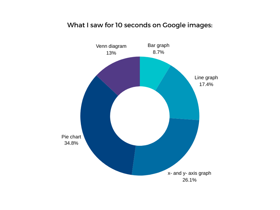
It is of the utmost importance to differentiate between actual and meme diagrams, such as the one shown here, which combine elements of both memes and diagrams but are not conventional meme diagrams. Instead, they function as satirical or parodic interpretations of traditional graph formats. Make no mistake, if you classify one of these incorrectly, you should be shunned and ostracized from modern society. Just putting it out there. Another brilliant observation of mine is that many diagrams have been used in creating memes; however, a cursory Google search for 'meme graph' will show that the most commonly used templates are graphs with x- and y-axes, pie charts, and Venn diagrams. This qualifies as scientific research and should be taken as such. Here is a chart for good measure:
Enlarge
Two additional popular meme diagrams that have to be added to the genre are tier lists and alignment charts, which utilize a grid-like design to affix judgments and use labels to relay a hierarchy or classification of various variables. Tier lists are a staple in the gaming industry, used to rank characters or in-game elements by their respective viability, but like all game-related things, they have been expanded and adapted into meme culture. Here, in the vast expanse of the interwebs, they are used to rank and classify a wide range of topics beyond gaming. For instance, here is a tier list used to rank Medieval elephant drawings from artists who never saw an elephant or a list classifying the effectiveness of hand dryers. Similarly, alignment charts, which originated from the Dungeons and Dragons role-playing game and were used to type characters' moral alignments, have been appropriated and transformed into a popular meme template. Now you can find an alignment chart on gender neutral things to call people, with 'pals' being categorized as lawful good and 'fuckers' placed in the chaotic evil position. All good things turn into memes, one way or another.
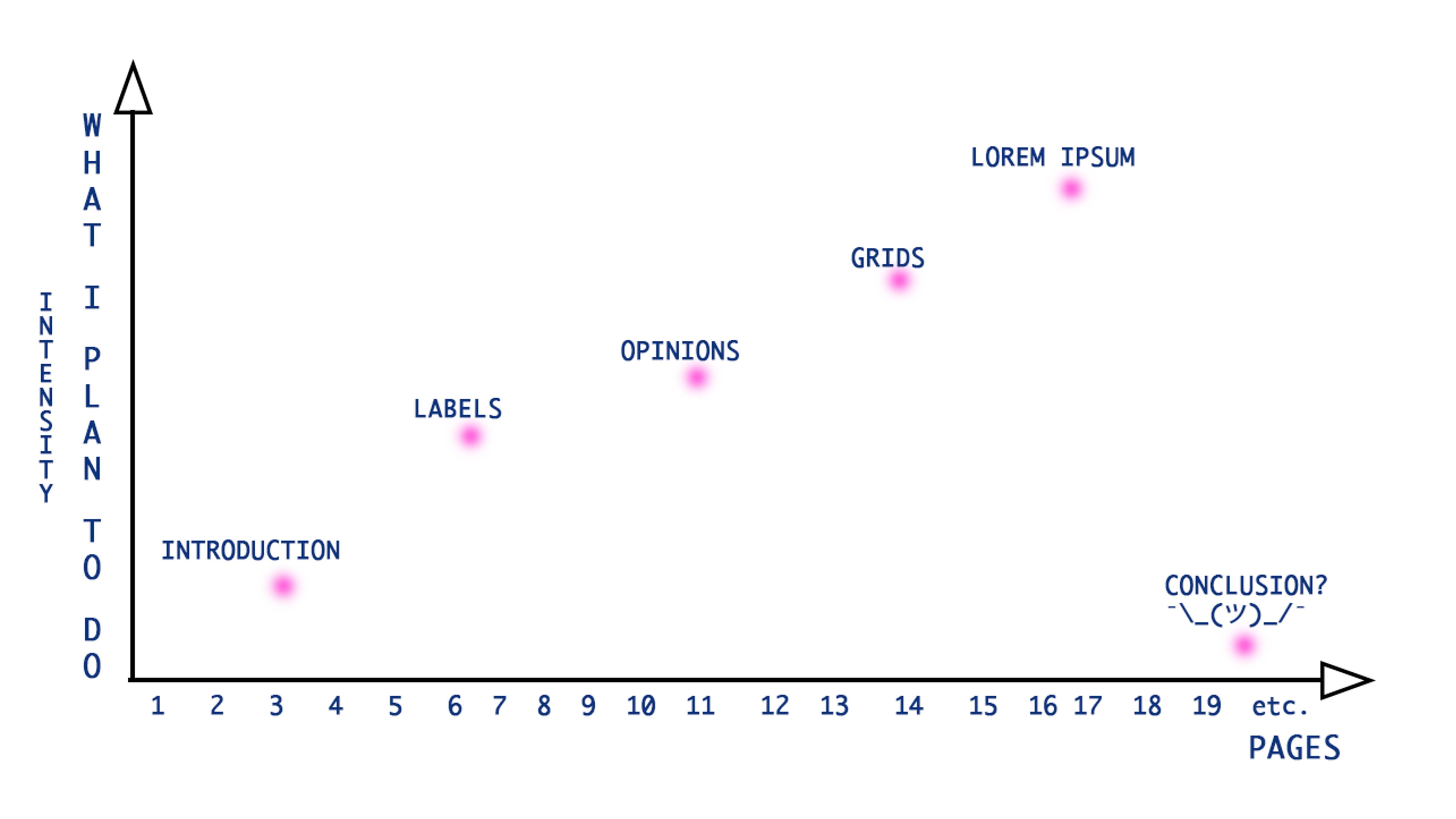
Anyways, among the six traits specified in this paper, I want to focus on (4) the use of labels for categorization and judgment allocation, (5) the inclusion of strong, marked opinions, and (6) their grid-like format. Here is a graph of my plan:
Labels Are Us: Safety First, Chuckles Later
In The Power of Labelling, Joy Moncrieffe explains that labels have the power to create boundaries and establish categories.[14] They play a crucial role in structuring social environments and assisting with navigating society's complexities. The societal treatment and perception of specific issues and individuals involve two fundamental processes: framing, which influences public discourse or media representation, and labeling, which assigns distinct categories based on these frameworks. These mechanisms reflect the totality of subjective perspectives, that is, how different entities align with societal structures and hierarchies and society's expectations for their interactions across different contexts. In precis, calling your neighbor a weirdo and not talking to them because you saw them scream at the houseplant in the communal hallway is perfectly acceptable in our established social structure. Labeling is a natural and ingrained human behavior used to make sense of the world around us. Meme diagrams are a natural evolution of this labeling process, adding structure to feelings and ideas in a visually comedic and relatable manner.
Looking at @brian_flakes' meme from the beginning of this article, we can see that each point on the graph is a moment that has been gingerly singled out of a probable sequence of events. 'Not a real plan' and 'Suggest a reschedule' are labels that categorize and classify different responses or actions. Although these clauses exist in the English language and are uttered in everyday 'IRL' conversations, it is the act of extracting and isolating that elevates them to the category of nonce words, protologisms, or even neologisms (if the phrases go viral). The hyper-intellectualization of ordinary, everyday occurrences and solidifying abstract feelings gives them a sense of importance.
Labels also offer a sense of structure, belonging, and safety.[15] When you flip through a newspaper, you see a lot of news about big shots and VIPs who don't seem to be doing much to fix the problems in the world. Faced with the overwhelming pressure of environmental, societal, and economic crises, you can either cry or you can laugh. Why not both, you might say? And I fully support that. Find creative ways to alleviate your frustrations. Meme diagrams, for instance, can simplify and categorize these complex feelings, allowing you to find humor and connection in shared experiences. Make a meme diagram of Taylor Swift's polluting the Earth with her jet - kinda funny. Didn't change much, but you felt better for a second, right? She might see it and get angry, though. Your meme may be so good that it incites change. Riling people up, creating riots in the streets. After all, humor has been used to examine power dynamics and question established social norms throughout history. It is a potent tool for political and artistic movements to challenge authority, provoke critical thinking, and subvert established hierarchies.
Labeling and judging are essential. According to German philosopher Kuno Fischer, a joke (or, in this case, a meme) is a 'playful judgment' that produces a comic contrast.[16] Only in judgment does a joke attain its peculiar form and the free sphere of its unfolding. What meme diagrams do is offer a brief respite from life's burdensome responsibilities and help individuals confront and dispel rigidity and seriousness by telling what's what and where it should be. Without labels and categorization, meme diagrams would not be funny. They would lose their comic effect.
Enlarge
Meme diagrams are appealing because they give users the ability to relay their opinions effectively and impactfully. Opinions play a vital role in online discourse, enabling individuals to participate in conversations, share insights, and connect with others who may hold similar or contrasting views. Have you ever seen a post on Reddit that made you want to reply with a succinct 'This'? Or a TikTok that filled you with so much rage that you disliked it and then sent it to all your friends who disliked it, which also served as a great bonding moment between you? Birds of a feather flock together. The rule is that you will feel much more comfortable hanging out with someone with similar core values than with someone with opposing views. Opinions also wield significant influence; they can make or break someone's reputation and sway public perception of specific individuals, topics, or issues. Take, for instance, the Church of Scientology. It was a reasonably popular religion, attracting celebrities and influential people alike. Their image was strictly controlled by the Church, and everything published by the media was carefully reviewed and sanitized. Then, one little cartoon made an episode about its central beliefs, and now it has turned into a giant and somewhat terrifying joke. Online opinions can extend into real-world interactions and contribute to shaping public opinion as well as collective behaviors. Case in point is the concept of the Milkshake duck, i.e., an internet celebrity or viral figure who is initially celebrated but later revealed to have a problematic past, is the best example of the impact online opinions can have on one's reputation and public perception. One second, everyone loves you; you are showered with money and attention, and the next thing you know, you are Woody Harrelson after the Rampart Reddit IAmA.
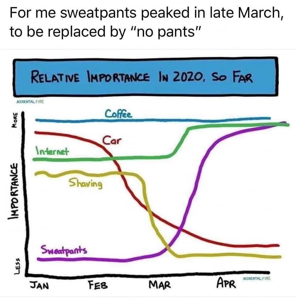
Meme diagrams are a perfect tool for expressing perspectives and establishing social bonds. Rather than crafting a verbose and intricate argument about how much you hate cats, a concise and visually stimulating meme diagram can effectively communicate your stance in a heartbeat. Being funny can also decrease the number of potential confrontations and heighten the chances of people interacting with you and your content. Artist Christine Sun Kim created a series called Degrees of Deaf Rage, a collection of murals depicting meme-like Venn diagrams that delve into the intersection of disability, identity, and power dynamics. She explains that diagrams are a format that is easily communicated and understood, making them an effective tool for conveying complex ideas in a concise and visually appealing manner.[17] She also disclosed that she uses humor when she wants her ideas to be accessible. Grading, highlighting, sectioning, juxtapositioning, and positioning serve as a way to communicate both incredibly dumb and surprisingly poignant observations. When you use visuals to express your views, it can make them more powerful and relatable. This way, you can share your opinions with others easily. Moreover, incorporating familiar phrases, language patterns, and cultural references can facilitate the expression of one's opinion in a manner that resonates with others. Though there might be a number of papers and articles written on a particular subject, nothing cuts as deep as an image that succinctly summarizes the importance of sweatpants, coffee, and other things during the pandemic with a few lines and colors.
Meme diagrams open up a space for debate as their very existence provokes and challenges the viewers to question and critically examine the frames and labels that have been imposed upon them. Interaction is vital in experiencing the meme diagram, whether by passively observing and finding amusement in the clever juxtaposition of graph and text or actively engaging in discussions surrounding the underlying messages.
Enlarge
There have been many diagram memes that have incited rage and laughter alike, sparking debates and conversations about the assumptions and the underlying ideologies embedded within them. Underneath @brian_flakes' original post are numerous comments praising his graph, stating that it helps their social anxiety and makes them feel seen and heard. Everyone experiences these things, but very few stop to carefully chart them for an Instagram video. For some, though, the exactness is not enough. Some commenters have actively critiqued the diagram, suggesting that there 'should be a z-axis', representing 'how close you are' to the person you are canceling on.[18] On the original Galaxy Brain meme for 'Whomst’d', the top comment reply is a simple whomstd've, implying that there is an even higher level of linguistic absurdity that can and must be achieved. Precision and detail teeter on the verge of unhingedness, adding to the hilarity by giving weight to a relatively mundane topic.Opinions play a crucial role in meme diagrams, adding humor and depth to the visual depiction of information. When opinions are well-balanced, they have the potential to draw significant attention and facilitate substantial interaction through comments and debates. The labels, which have been previously touched upon, serve as reference points for these viewpoints, functioning as anchors that ground the thoughts and provide context. Now for the finale of this pièce de résistance: to what are these opinions anchored? How is the information structured spatially to creatively engage viewers in these discussions? Let us turn to the grid.
Constrained Humor: The Importance of Grids
(Editorial note: the first draft of this paper was written in a much more serious tone. Though I know I should change the tone of the following section to match the rest of the text, I think it should be left untouched because it is honestly kind of fire. Please write your complaints to the editors if you think I am in the wrong).
Bernhard Siegert gives a fascinating historical overview of the development of the grid, tracing its origins back to the ancient Greek concept of taxis. Taxis, an idea formulated by Xenophon, refers to the systematic and fixed organization of elements within a space, and it constitutes the central principle in economics. Interestingly enough, Xenophon believed humans to be inherently unpredictable and disorganized, defying the orderliness of the grid, which could only apply to things and inanimate objects. Only in modernity do we find the transformation of 'humans into retrievable objects', creating a distinct ontological separation between the two eras.[19] During the 16th and 17th centuries, grid-shaped control structures emerged to categorize and classify information, imposing order on the world. The grid profoundly impacts our cosmogony and modern concepts of place and existence because it enables us to consider both filled and empty spaces, reflecting a comprehensive understanding of spatial organization. Furthermore, the grid serves as a mediator between place and the understanding of order, suggesting a mutually reinforcing relationship. Siegert regards the lattice/grid as a 'cultural technique' (German Kulturtechnik), referring to the ways in which humans engage with media, and more recently, encompass fundamental processes and distinctions that lead to a variety of conceptual and existential elements believed to form culture.[20] The lattice shapes our perception and understanding of the world, as it intersects with various fields of knowledge and technology, from mathematics and geography to politics and government. Stiegler also distinguishes between different types of grids, such as 'representational, topographic, cartographic, speculative, and three-dimensional (total) grids'.[21]Each one has evolved throughout history and builds upon the other, creating an absolute network of control and organization.
Another art historical angle for the visual weight of meme diagrams can be found in Rosalind Krauss' seminal essay titled Grids. Krauss masterfully showcases how these structures have become a dominant visual language in modern and postmodern art, both in a spatial and temporal sense. The grid is flat, geometric, and composed of repeating units, creating a sense of order and rationality. It does not imitate nature or reality directly but rather imposes its own aesthetic logic onto the content it contains[22]. The space occupied by the grid is both independent and self-contained, existing as a separate entity from the content it represents.[23] In a philosophical sense, it represents the 'staircase to the Universal', masking as well as revealing the underlying systems and structures that govern our perception of reality.[24] As the grid becomes a metaphorical framework for understanding the interconnectedness of ideas and experiences, materialism comes to the fore and spiritual introspection falls by the wayside.
Meme diagrams, in their utilization of grids, embrace and subvert this notion of structure. Rigid order is imposed on chaos and randomness, as the grid serves as a framework to present the data and humor systematically and analytically. The meme diagram uses the grid to create unexpected connections and juxtapositions and replaces spiritual fulfillment with comedic satisfaction, inviting the viewer to question traditional modes of knowledge and interpretation.[25] The grid is also closely linked to myth and mythology, which stands as a symbol of the human need for order and meaning in a chaotic world. Narration, in its essence, is the process of sequentially stringing together events and information to create a cohesive story. Meme diagrams bare-bone the narrative structure, deconstructing it into individual data points and presenting them through the grid. This fragmentation often lays out information in a simplistic and straightforward manner, contrasting the complex and nuanced narratives we encounter in everyday life.[26]
In the introduction to the handbook on data visualization, Andy Kirk opens by citing Christopher Booker's The Seven Basic Plots, a book on narrative structures found in stories all around the world. There are several themes explored within, but The Quest is the most important to understanding data visualization. Within this theme, the protagonist embarks on a journey to acquire an object or reach an important destination while overcoming various challenges and obstacles along the way.[27] The visualizer has to embody the role of the guide who will take the viewer through a narrative, helping them make sense of complex data and reach a meaningful conclusion. The diagram itself does not inherently tell a story, Kirk writes, because its 'structure and arrangement' exist 'in abstract space'.[28] However, if used as a visual aid, iit can help illustrate the significance of the connection between the variables depicted in the diagram.
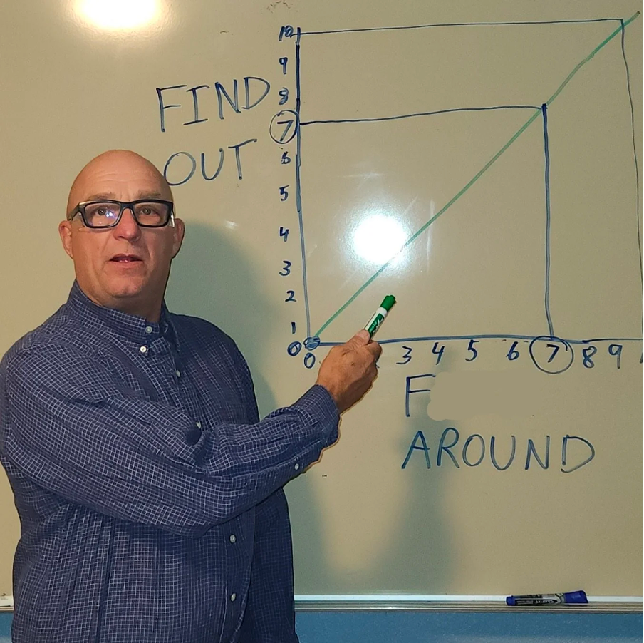
To illustrate, let us look at this political compass meme. Within four quadrants, a complex political issue can be condensed and streamlined, often in an ideologically charged way and full of preconceived notions about different political stances. A story is relayed with ease and clarity through the use of a simple graph, allowing viewers to quickly understand and engage with the message being conveyed. The downside is that controversial topics such as gun control, immigration, or healthcare are reduced to simple coordinates on the graph, oversimplifying the nuances and complexities of these issues. Another example is the viral Fuck around and find out diagram, which utilizes the line graph format to create a satirical and exaggerated representation of cause-and-effect scenarios. The absurdity of the diagram lies in its deliberate misrepresentation and exaggeration, highlighting the inherent flaws in trying to reduce complex phenomena to simple linear relationships. Flattening is the key element in these meme graphs - they provide a surface-level understanding of complex issues without delving into the underlying intricacies. After all, brevity is the soul of wit.
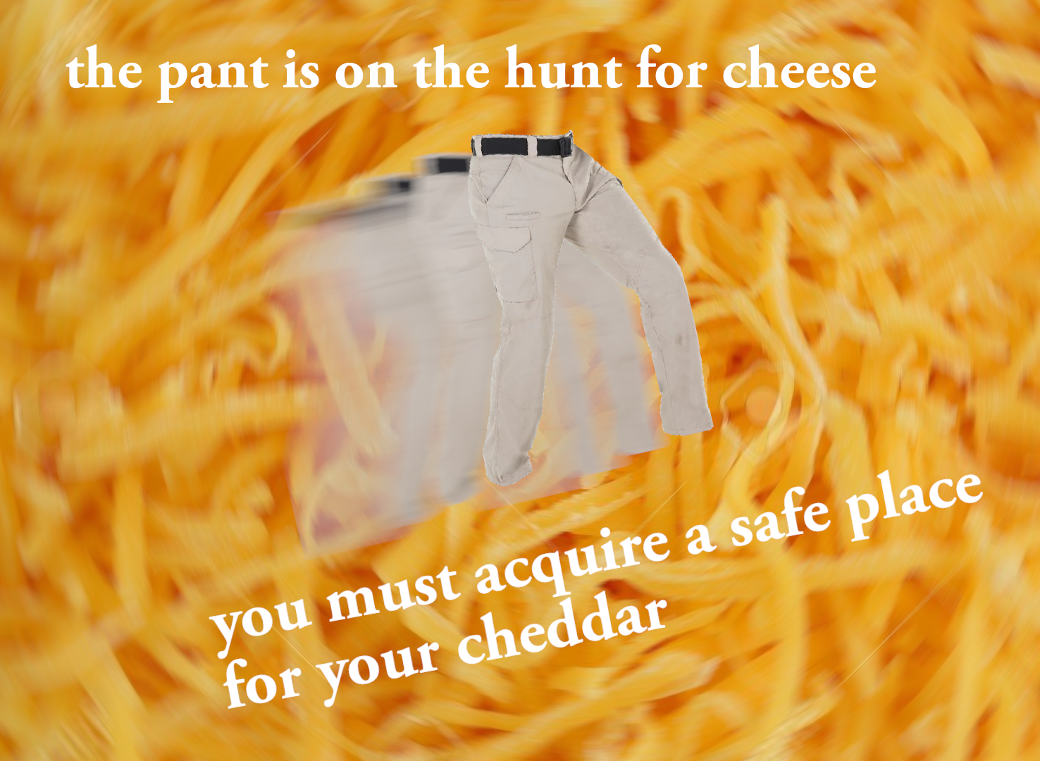
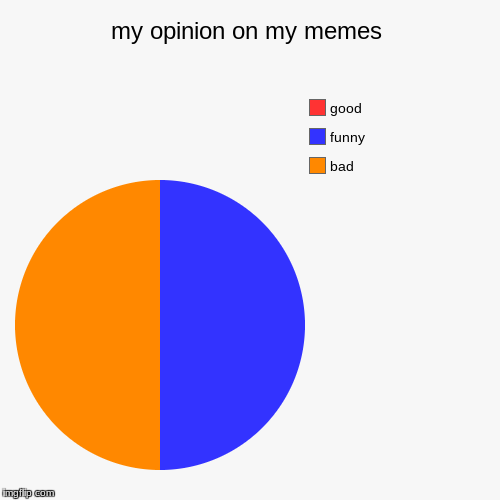
This article has been too serious for too long. Here's a meme diagram for a quick break:
Enlarge
An All Too Serious Conclusion to an Essay on Meme Diagrams
In a world characterized by constant change and complexity, the human mind seeks order and structure to understand and navigate the chaos. Regulation is deeply rooted in our psychology and can be seen in various important aspects of our lives, including meme diagrams, which some might argue are the most meaningful thing in the world. The format serves as a way to organize information, categorize concepts, and visually represent connections or relationships between different elements, providing a sense of clarity and coherence in a world that may otherwise feel overwhelming and fragmented. Organizing information into visual representations allows us to see patterns, identify connections, and make sense of complex ideas or systems. Life can be mapped out, labeled, and anchored to specific positions, turned into unchangeable and fixed points within a two-dimensional area. It is a coping mechanism in decision-making processes - an overwhelming abundance of choices and information in today's world can often lead to decision paralysis. The diagram serves as a tool to simplify and streamline decision-making by presenting options in a structured and organized manner. It acts as a cognitive aid, helping us make sense of the overwhelming amount of information and possibilities available to us.
Meme diagrams also represent the personalization and customization aspect of internet culture. They are all about you and your perspective, validating your own beliefs. It's awesome when you realize that people share and agree with your opinions, right? In this vast internet space, I found you, can you believe it? And when that valid opinion is turned into a meme diagram, it just gets better and more relatable. You hate [insert thing here], too? Let's become friends on the Facebook. These memes provide a sense of belonging and community as individuals relate to matching experiences and perspectives, and function as soft pixel clay to mold and shape thoughts and emotions into easily shareable and relatable content. It is a Ptolemaic universe, where the diagrams revolve around the individual's perspective and validate their beliefs. The viewers are Narcissus staring into the proverbial pool of opinions, gazing at the memes, seeking reflections of themselves. A whirlpool of echo chambers can be formed from the strong currents of like-minded individuals rushing to their metaphysical likeness, reinforcing their viewpoints without engaging with opposing ideas.
Examining the comment sections of meme diagrams shows that people frequently express agreement and support for the presented discourses, thus strengthening their beliefs. Negative comments on 'cringe' or abhorrent opinions also create a fertile ground for conformity within the comment section. Meme diagrams cleverly and inadvertently utilize various psychological strategies, such as those found when using mindfulness, where the patient is asked to center oneself, meditate on the moment, write down their feelings, and grade the intensity from a scale of one to ten. The patient has to realize that their thoughts are only thoughts, they must become aware of their current state, ground themselves, and identify what are they feeling or have been feeling for a while now. Point to where it hurts - are you frog number one or frog number six? Anxiety-riddled Internet users obsess over the intricacies of everyday life, but the memetic lattice acts as the Archimedean lever to bend the chaos of existence into a structured and understandable form.
And they are funny, too. Well, they try to be, merging the seemingly objective nature of graphs with the intentional humor and subversive power of memes. They offer a sturdy framework for absurdity, taking intricate or tedious data and rendering it into comprehensible, often chaotic content. Remember, grading tastes using meme graphs is 'srs bsns', and the reactions to the opinions' correctness' or 'incorrectness' demonstrate the silliness of quantifying and validating subjective preferences. You find breadcrumbs in the big dark forest and follow them to a satisfying or dissatisfying judgment. And what can make a judgment more palatable than making it funny? If you can make people laugh, you can easily win them over. Funny can soften the blow, but the comical can also be a form of ironic detachment, allowing individuals to express their opinions without fully committing to them. It is the act of rationalizing, of stepping away from the emotions and presenting them in a detached, humorous manner that provides a sense of safety and distance. Meme diagrams put the feelings and thoughts behind the bars of the grid and let them live in the realm of absurdity and irony.
Anthropocentric in nature, meme diagrams are both objective and subjective, chaotic and organized, combining the rigidity of data representation with the fluidity of personal expression. They allow ordinary people to be Karens about 'stupid' things, deprived of other luxuries. The logic is as follows: if I cannot control things outside of me, or more seriously, if pandemics can strike at any time and I cannot own a house, then by God, I will fight anyone who tries to tell me that a hotdog is actually a sandwich. The diagram allows its creator to take out all complexity and nuance, flatten, and render everything into a stable variable that can be positioned carefully into a self-contained shape. Then, make other people laugh and/or get angry at it.
Ivana Emily Škoro is finishing her studies at Aalborg University, researching blockchain technologies and NFTs. She works for a Croatian record label and specializes in digital ownership and copyright. She has curated an exhibition for the Wrong Biennale and published articles for multiple publications, including the Critical Meme Reader.
Bibliography
Benveniste, Alexis. ‘The Meaning and History of Memes’, 26 January 2022. https://www.nytimes.com/2022/01/26/crosswords/what-is-a-meme.html.
Biggs, Michael. ‘Why Study Wittgenstein’s Diagrams?’ Edited by R. Haller and K. Puhl. Die Osterreichische Ludwig Wittgenstein Gesellschaft, Wittgenstein and the Future of Philosophy: a Reassessment after 50 Years, 1 (2001): 95–100.
Blair, Ann, Paul Duguid, Anja-Silvia Goeing, and Anthony Grafton, eds. Information: A Historical Companion. Princeton: Princeton University Press, 2021.
@bran_flakezz. ‘Back by Poplar Demand: A New Axis!!!’ Instagram, 6 November 2023. https://www.instagram.com/reel/CzUa9LmP_Nu/?utm_source=ig_web_copy_link&igsh=MzRlODBiNWFlZA==.
‘Cultural Techniques’. In Monoskop. Monoskop. Accessed 10 February 2024. https://monoskop.org/Cultural_techniques.
Fischer, Kuno. Über die Entstehung und die Entwicklungsformen des Witzes. Nachdruck der Ausgabe von 1871. Norderstedt: Hansebooks GmbH, 2016.
Freud, Sigmund. ‘Jokes and Their Relation to the Unconscious’. In The Artist’s Joke, edited by Jennifer Higgie, 25–30. Documents of Contemporary Art. London : Cambridge, Mass: Whitechapel ; MIT Press, 2007.
Higgie, Jennifer. ‘All Masks Welcome’. In The Artist’s Joke, edited by Jennifer Higgie, 12–19. Documents of Contemporary Art. London : Cambridge, Mass: Whitechapel ; MIT Press, 2007.
Kirk, Andy. Data Visualisation: A Handbook for Data Driven Design. Los Angeles London New Delhi Singapore Washington DC Melbourne: SAGE, 2016.
Krauss, Rosalind. ‘Grids’. October 9 (1979): 50. https://doi.org/10.2307/778321.
May, Emily. ‘Expressing Rage through Angles and Pie Charts with Berlin-Based Artist Christine Sun Kim’. Friends of Friends, 9 August 2019. https://www.friendsoffriends.com/art/berlin-christine-sun-kim/.
Milner, Ryan M. The World Made Meme: Public Conversations and Participatory Media. The Information Society Series. Cambridge, [Massachusetts] London: The MIT Press, 2016.
Moncrieffe, Joy, and Rosalind Eyben, eds. The Power of Labelling: How People Are Categorized and Why It Matters. London ; Sterling, VA: Earthscan, 2007.
O’Reilly, Caoimhe, Paul J. Maher, Adrian Lüders, and Michael Quayle. ‘Sharing Is Caring: How Sharing Opinions Online Can Connect People into Groups and Foster Identification’. Acta Psychologica 230 (October 2022): 103751. https://doi.org/10.1016/j.actpsy.2022.103751.
Siegert, Bernhard. Cultural Techniques: Grids, Filters, Doors, and Other Articulations of the Real. Translated by Geoffrey Winthrop-Young. First edition. Meaning Systems, Volume 22. New York: Fordham University Press, 2015.
[1] Andy Kirk, Data Visualisation: A Handbook for Data Driven Design (Los Angeles London New Delhi Singapore Washington DC Melbourne: SAGE, 2016).
[2] Sigmund Freud, ‘Jokes and Their Relation to the Unconscious’, in The Artist’s Joke, ed. Jennifer Higgie, Documents of Contemporary Art (London : Cambridge, Mass: Whitechapel ; MIT Press, 2007), 25.
[3] Jennifer Higgie, ‘All Masks Welcome’, in The Artist’s Joke, ed. Jennifer Higgie, Documents of Contemporary Art (London : Cambridge, Mass: Whitechapel ; MIT Press, 2007), 12.
[4] ‘Srs bsns’ should not be conflated with ‘serious business’. I don’t this I need to explain this reference to you because you are reading an article on memes, but for a more in depth explanation, please consult: https://knowyourmeme.com/memes/the-internet-is-serious-business
[5] @bran_flakezz, ‘Back by Poplar Demand: A New Axis!!!’, Instagram, 6 November 2023, https://www.instagram.com/reel/CzUa9LmP_Nu/?utm_source=ig_web_copy_link&igsh=MzRlODBiNWFlZA==.
[6] Alexis Benveniste, ‘The Meaning and History of Memes’, 26 January 2022, https://www.nytimes.com/2022/01/26/crosswords/what-is-a-meme.html.
[7] Yes, you did get Rick rolled in a serious article on meme diagrams. What are you going to do about it?
[8] Ann Blair et al., eds., Information: A Historical Companion (Princeton: Princeton University Press, 2021).
[9] Blair et al., 397.
[10] Blair et al., 397.
[11] Blair et al., 400.
[12] Michael Biggs, ‘Why Study Wittgenstein’s Diagrams?’, ed. R. Haller and K. Puhl, Die Osterreichische Ludwig Wittgenstein Gesellschaft, Wittgenstein and the Future of Philosophy: a Reassessment after 50 Years, 1 (2001): 98.
[13] Blair et al., Information, 400.
[14] Joy Moncrieffe and Rosalind Eyben, eds., The Power of Labelling: How People Are Categorized and Why It Matters (London ; Sterling, VA: Earthscan, 2007), 1.
[15] Moncrieffe and Eyben, 2.
[16] Kuno Fischer, Über die Entstehung und die Entwicklungsformen des Witzes, Nachdruck der Ausgabe von 1871 (Norderstedt: Hansebooks GmbH, 2016).
[17] Emily May, ‘Expressing Rage through Angles and Pie Charts with Berlin-Based Artist Christine Sun Kim’, Friends of Friends, 9 August 2019, https://www.friendsoffriends.com/art/berlin-christine-sun-kim/.
[18] @bran_flakezz, ‘Back by Poplar Demand: A New Axis!!!’
[19] Bernhard Siegert, Cultural Techniques: Grids, Filters, Doors, and Other Articulations of the Real, trans. Geoffrey Winthrop-Young, First edition, Meaning Systems, Volume 22 (New York: Fordham University Press, 2015), 97.
[20] ‘Cultural Techniques’, in Monoskop (Monoskop), accessed 10 February 2024, https://monoskop.org/Cultural_techniques.
[21] Siegert, Cultural Techniques, 98.
[22] Rosalind Krauss, ‘Grids’, October 9 (1979): 50, https://doi.org/10.2307/778321.
[23] Krauss, 52.
[25] Krauss, ‘Grids’, 54.
[26] Krauss, 54.
[27] Kirk, Data Visualisation, 1.
[28] Kirk, 170.