Report of ‘The Map is not the Territory?! Mapping as critical artistic investigation’, 16 April 2008 at Piet Zwart Institute in Rotterdam, by Sabine Niederer.
After traveling to Rotterdam with my new INC colleague Margreet and a friend, we arrived in a packed room at the PZI. Bureau d’Etudes had just started presenting their fascinating layered maps. The focus of their talk was on information visualization as a strategic tool in unfolding facts and figures about complex political topics, in what they refer to as an “artistic and activist practice”. After mapping the French food industry, from agriculture to meat and vegetable food products, Bureau d’ Etudes published a newspaper that was distributed amongst researchers, activists as well as farmers and others working in agriculture and food industry. The newspaper, called “La belle au bois dormant” (The beauty in the sleeping forest), features their complex map of the “systeme agro-alimentaire”, which comes with two full pages of legend: one for the acronyms and one for the symbols used on the map. As Florian Cramer, host and organizer of the event pointed out: sometimes maps are not simplifications, they can just as easily be complications. A project that Bureau d’Etudes is working on at the moment is called Mapping the Laboratory Planet, which the artists described as an “open source database for mapping the laboratory planet with a geographical and critical approach.” It’s not working yet, so let’s wait and see at: www.laboratoryplanet.org
.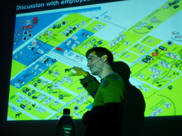
Figure 1: Bureau d’Etudes presenting their ‘agro-alimentaire’ map
The second speaker was Theo Deutinger, a Rotterdam-based Austrian architect that makes maps and cartograms to produce “snapshots of globalization”. These snapshots varied from funny illustrative work (like the ideal European consumer, depicted in most popular European brands) to poignant work such as his map Walled World, in which he shows the world’s remaining separation walls (which were reinforced after 9-11, according to Deutinger ), on an America-centric world map. Inspired by Peter Sloterdijk, this map shows “der Weltinnenraum des Kapitals”, in which 73% of the worlds income belongs to 14% of the worlds population. In 2004, Deutinger produced the work: European Central Park, in which he depicts Europe as one big city, with the Alps as its central park.
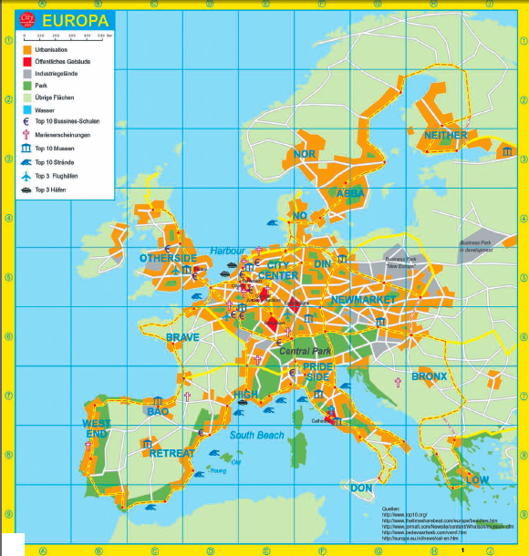
Figure 2: European Central Park, by Theo Deutinger, www.td-architects.eu/
The Swiss artists Christoph Wachter and Mathias Jud presented their fascinating project Zone Interdit, a collaborative project in which users can collect and describe footage of military zones all over the world. All countries block the military zones differently on their maps: Germany covers them with a green patch, France just shows a cut-out. And because Google Earth buys satellite pictures, they sometimes show the message that a certain area is unavailable for a zoom in, and suggests “try zooming out for a broader look”. The artists started collecting pictures of military zones in newspapers, magazines, on websites, in army’s pr materials, on soldiers blogs, and soon other people started adding to the database. Their collection of Guantanamo bay pictures is now so extensive that they managed to base a 3D walkthrough model on it, which is available on the website and also open for editing and adding. The crown on their work must have been when their site was temporarily down and they were emailed by a UN security official asking them when the site would be available again.
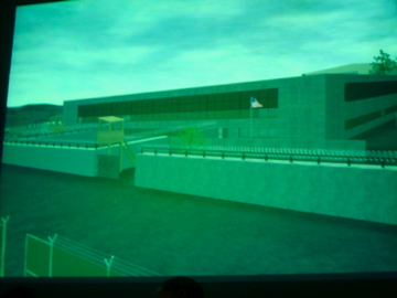
Figure 3: One of the 3D prison walkthroughs available at www.zoneinterdit.net.
After this project presentation, Florian Cramer pointed out the very thin line between mapping and modeling. Of course the two meet in the case of Zone Interdit. But mapping is doesn’t have to be realistic in its form, and however Google Maps mashups are immensely popular, they do have a counterpart in the type of information visualization that is free of the geo, or free to scale the geo (a done by many cartographers, including Bureau d’Etudes and Deutinger).
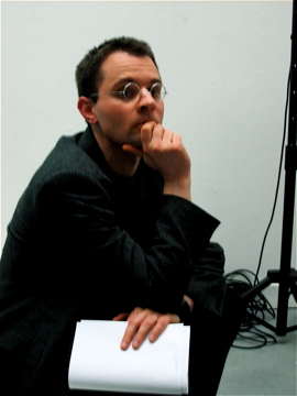
Figure 4: Organizer Florian Cramer, head of PZI MA Media Design Research.
After the three presentations, Michael Murtaugh presented a couple of student projects. A good example was given by former PZI student Todd Matsumoto (who presented his own work), who’s simple and very effective project showed ‘media bombs,’ massive media attention such as around Janet Jackson’s “wardrobe malfunction” during the Super Bowl. After scraping the New York Times for 11 days in May 2004, during the period of the Abu Ghraib scandal, the news articles he found were enough to create a rich timeline. He put the articles in a chronological order, using the dates mentioned in the article. Impressively, the timeline starts in 1950 and ends in 2005 (whereas the news articles were from 2004), clearly showing a few media bombs about 9-11. A full pdf of this graph can be downloaded here: Media Bombs.
Other projects, shown by Murtaugh, all well worth mentioning:
- Roxana Torres’ Personal World Map: www.personalworldmap.org (currently developing a new version!)
- Shahee Eilyas’ Framing Leaders: http://shaheeeilyas.com/framingleaders/ and
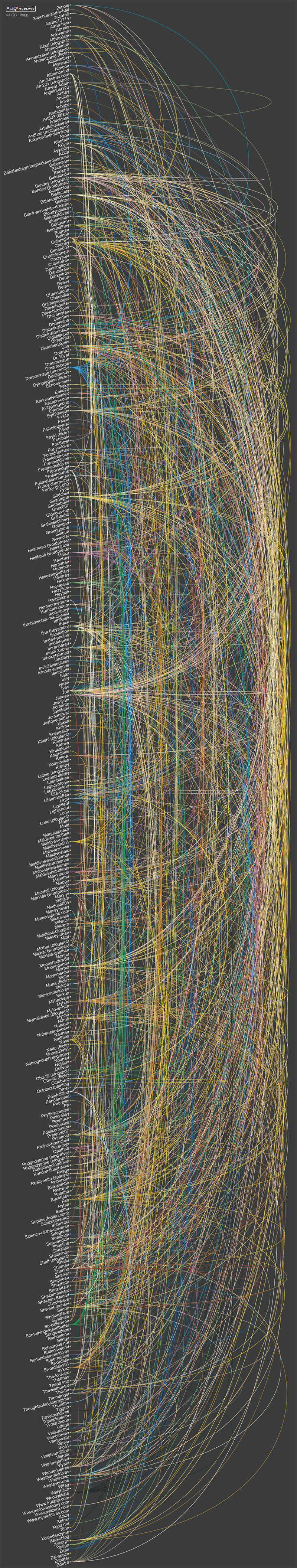
- Map of the Maldives Blogosphere
- Michael Murtaugh and Open Source Publishing (OSP) are working on a project for Bamart in Brussels, making various visualizations for their database.
Related to this last project, Murtaugh gave a very enthousiastic presentation of the open source svg editor Inkscape with which everyone can be a mapper. After seeing all this, it seems a thin line between information visualization that simplifies a massive data set and makes it readable, and the complex maps that are that are so beautiful to look at but sometimes really make you want to see the data set to interpret it. Sometimes ‘zoom out for a broader view’ seems like good advice after all.