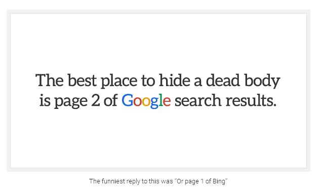
'The best place to hide a dead body is page 2 of Google search results.' For some time now the image above has been circulating online. The joke accurately introduces the core question of this essay. What is the effect of the list as the most used structure of presenting online information on the way people organize and find this information? What does it mean when people constantly use the list when dealing with information?
Hiding dead bodies in online lists
The joke in the image asks a deeper question. Searching for information online, do we even pay attention to results that are kept out of our view because of the hierarchical order? Do we fall victim to the hierarchic power of linear search results? The website Digital Synopsis, where the screenshot above comes from, offers an interesting statistic: 'according to research by the online ad network Chitika, page one results enjoy a whopping 95% of all search traffic'. Probably most users who look for information through corporate web indexers like Google or Bing (and how else would they do that?), share this desire for a fast and easy information recalling.
Below the image an interesting response is made that has also been circulating: 'The funniest reply to this was 'Or page 1 of Bing''. As this post on Reddit makes clear as well, Reddit users do not consider the first page of Bing results to have the same strength as a similar page of Google results. Online information is classified by many different corporations, and being a like any competitive market, the web has its winners and losers.
Looking for information on the web, users operate in fixed structures, databases and the lists display this information. Lists nowadays function as, or are part of, search interfaces that offer online information and thus the online information collector is constantly confronted with them. The popular search interfaces all consist of two basic modules: A search box and a list of results. Moreover, these search boxes and lists look the same across different providers. From corporate web indexers to a freely accessible open online archive, all share a similar design of lists. This reveals how similar decisions have been made with regards to the navigation of information they provide.
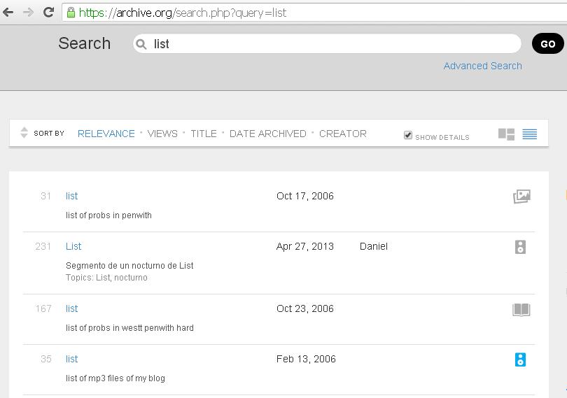
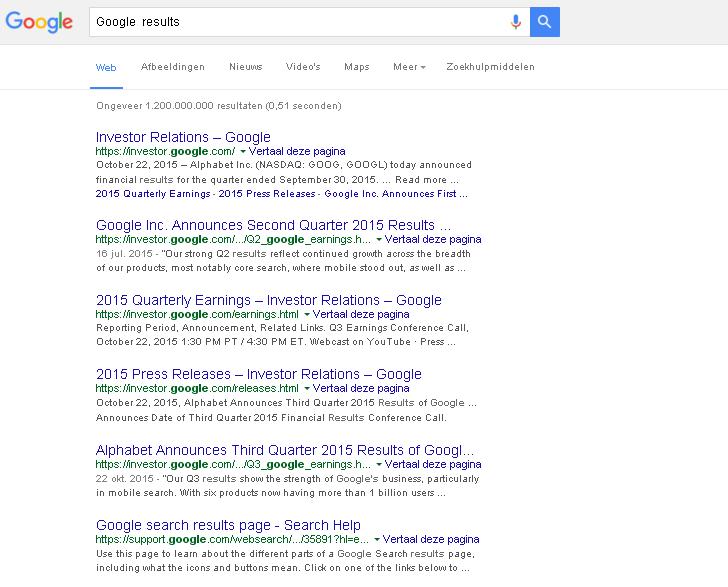
Google list of results does not look that different from Internet Archive's, does it?
I am interested in the list as a construction of culture that affects the act of (information) collecting through the enforcement of order. This order can be numerical, chronological, alphabetical, even random. Still I see order as an ideological construct, an outcome of ideologies of effectiveness and productivity within a certain economical system based on knowledge, which demands order in the vast amounts of information that surround us. Not being able to find information on the web in another way, users are constantly navigating within hierarchic lists of results. As such they are being influenced by the political dynamics that are hidden within the technology of the list.
I will explore what effect the list has on the average user. In order to do so I will first approach the list as an information technology; then I will try to sketch the transition from the professional librarian to the user as an amateur librarian; then I will look at the political dimensions of the list and its relation to the modernistic concept of the general archive; to finally come back to the web and the explosion of the list the web and its interfaces have brought about.
The List and Information Technology
Humans are natural collectors. The technology of the list seems to be a meaningful and very useful tool for that. On the one hand it supports memory, provides easy and time effective access to information. The list can be seen as a material form of classification. Classification is the act of organizing things in categories. Be it information, goods, artworks, ideas, whatever you want. However, classification remains an immaterial mind process if its not written down in lists.
The list as such is an information technology and one of the first constructs that emerged following the technology of writing. In fact, some of the first writings of humanity were lists.
Enlarge

The list can be looked at like all technologies and media. It shapes us and constructs us in a certain way. As a medium it becomes a norm through repetition. The list is a culture itself. The culture of organizing things in space in clarified and stable ways. And as any culture, it is being reproduced through individuals, who, of course, find it quite easy to use lists in order to organize themselves and their activities. Moreover, within web culture all users become cataloguers and data indexers, navigating within or themselves creating lists all the time.
From the Librarian to the Data Indexer Online
Library cultures can be described as pre-database cultures because libraries introduced the practices of information collecting that are also used in databases. Library cultures introduced working with information collections and the design of systems that could hold the content, as is happening also within databases. However, both cultures do not deal with the organization of information the same way. While in library classifications the structures that hold information are adopted by libraries and cataloguers who are using them, which comes with controlled vocabulary thesauri, digital or online database classifications bring a greater variety of classification systems. The role of professional cataloguer is expanded into the general internet user, who operates now as an amateur data indexer and collection manager. Not only do users make offline desktop collections, classify and assign metadata to items found online, they also create online collections within networks like Pinterest, Flickr, Facebook etc.
Moreover, since folksonomy – the practice of tagging by users – has emerged, huge amounts of subjectivity enter the wider cataloguing practice of online information, often outside controlled vocabularies. Critical librarian Emily Drabinsky writes in her essay Teaching the Radical Catalogue how controlled vocabularies are thesauri of terms which are assigned to knowledge objects: 'every object in a library will be placed in a subject division and assigned controlled terms; nothing lies outside of the system.' Controlled vocabularies represent fixed, given values. Therefore the librarian cannot assign subjective choices on the objects of the collection, while the online user can describe or tag pictures without using a guide of terms. In this random Google search result showing an image hosted on Flickr, the image of the bird belongs to a couple of different collections, it has metadata (thematic tags) assigned by the user, and of course comments from users on the bottom.
Unlike librarians who operate within category systems and controlled vocabularies, users can affect the online content with their subjective interventions. The language they can use is wider and seems more free. Moreover, users can create their own collections classified in various personal ways. But why is the persistent form of the list as we know it the dominant aesthetic expression of classification?
Online information is accessed within structures that are ruled by global classification principles and standardized systems. While users can create their own topical collections, the space in which they construct them are either standardized operating systems or standardized websites. Furthermore, users mainly access this information through the same kind of standardized lists, either from search engines or in online libraries. So we see something strange happening: users can arrange data in more different ways than librarians. But on the one hand they collect their information in lists with a very fixed spatial arrangement, and on the other hand most of the times they reproduce this normalized spatial arrangement themselves, probably because they are familiar with the form. Through repetition the structure then becomes part of culture; it becomes a norm. On top of that, users as librarians or data indexers operate on a secondary level, that is to say that the web content that they find is already classified, and what they can add to that has to follow the classification principles given by the context of the host. The content can be affected, but the classificatory structures are strong and fixed.
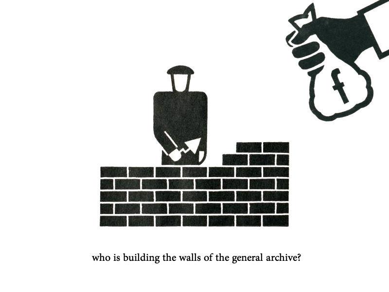
Who is the Classifier in the General Archive?
Enlarge
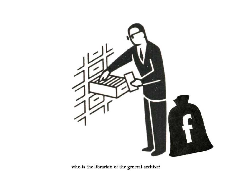
There is a critical issue with classification related to power and control: who is exercising classification? Besides looking at the cataloguer – professional or amateur – it is interesting to look at who creates cataloguing systems. In my experience a librarian never has the chance to create her own system, she always has to follow the given standards of the adopted by the library system. Librarians are the soldiers of the content management system choice and lists are their guns.
In the western world, libraries and archives have two main systems of library classification have been used and adopted by the majority of libraries or similar institutions. The most popular classification system is Dewey Decimal Classification. It was invented by the American librarian, educator and entrepreneur Melvin Dewey in 1876. Next would come the UDC, Universal Decimal Classification of the Belgian information and documentation scientist and entrepreneur as well, Paul Otlet, published around 1907.
The two systems rely on a fixed structure of first basic categories, which are each divided in more subcategories. Within this structure items should be classified and described through numerical systems which indicate their category and their specific place within it.
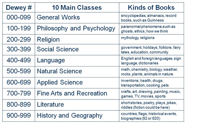
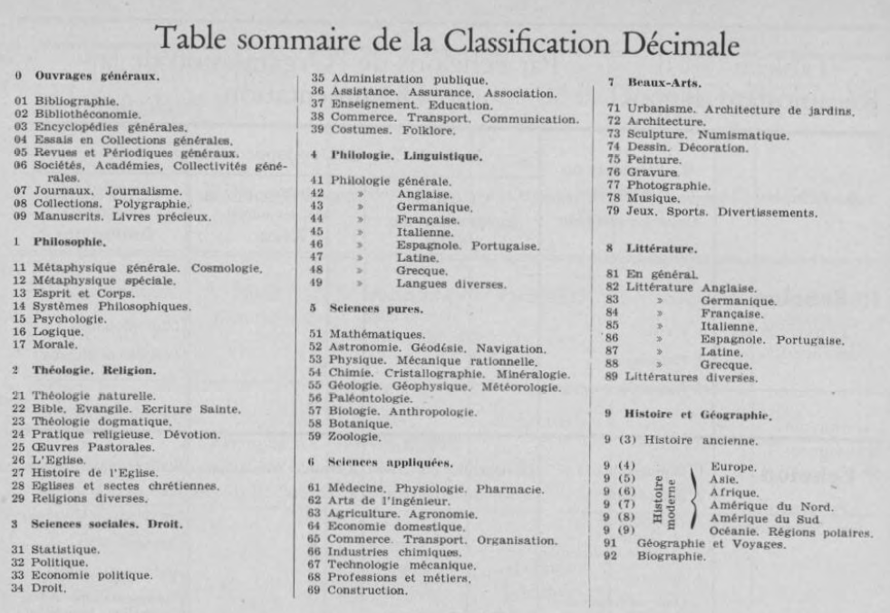
The list structures of the information visionairies of modernism, DDC and UDC
Categories are classes, distinct, huge, stable entities. Every (new) concept fits into them as a narrower term; therefore adopting new knowledge means always to go even narrower within existing categories and rarely creating new categories. UDC expresses a different model though: in the design of this system semantic links are present. UDC emphasizes on semantic interconnections of objects, through a different numerical system that uses symbols like + from algebra to indicate two different fields that the item can be assigned in. Its important here to notice that DDC is much more widely used than UDC.
UDC and DDC have been designed through personal efforts and views of these individuals who were envisioning organizational systems. Both Otlet and Dewey have been very passionate and visionary in their field. But on what kind of background did they operate?
Both of them have been very interested in the world of complex information and its organization. They have been dealing with information science even since before its formation as a science related with cybernetics, control and communication. They were both also involved in business, in fact they have been both selling their catalogue cards and systems. They shared standardization and globalization visions. Their visions were mainly social, imagining organizational systems of information that would promote communication, knowledge and peace. They seem to have believed that the world would become a complexity of information territory and that power would come together with knowledge.
Particularly Paul Otlet was talking about a 'collective book' a 'universal book of knowledge'. He created the Office International de Bibliography in 1895 together with Henri La Fontaine, an office with a goal to create a universal library, the Mundaneum, where the classification system of Paul Otlet, UDC, would be applied. The Palais Mondial, which later on became Mundaneum, opens in 1920. The institution was first hosted in the city of Brussels. Its huge collection was accessed through a system of thematic index cards.
Another important figure of the same period is philosopher, sociologist and political economist Otto Neurath. He understood the importance of pictorial language, in a similar manner. Where Otlet and Dewey created a vision of a proto-database, a structure that would hold together a universally big amount of information, Neurath proposed methods of information visualization. Together with illustrator Gernt Arnzt and his future wife Marie (Neurath) Reidemester they designed the project Isotype. The International System Of TYpografic Picture Education contained 4000 symbols designed by Arntz, that represented key concepts of the fields of industry, politics, demographics and economy, as explained in Arnzt web archive. Otto Neurath focused on uneducated persons and wanted to facilitate their understanding of complex data, as Frank Hartmann writes in Visualizing Social Facts. In other words, Neurath and his colleagues were dreaming of a universal system of information exchange, like Otlet and Dewey did too. But different from the other two, Neurath was taking a distance from alphabetical norms, recognizing that illiterate people were from default excluded by powerful knowledge.
All these ideas should be taken into account when we attempt to describe the ideology behind current classification systems because they were visions of a proto-web society. The need of a universal language seems to be always present within the ideas of organization visionaries. And universal language (whether a classification system, or a museum signing system, or a method of illustrating books), can be constructed only through standardization and institutionalization. The lists that materialize classification systems can be seen as the guards of universal language and of the institutionalization of thought, they are media that enforce systemization and thinking and acting through template choice standards.
The List and the Web
The web's information is classified under standards that nowadays are not simply defined by visionary individuals or knowledge institutions, but globalized corporations, particularly the online giants. And on top of this, these corporations affect the process of information collecting by adding their algorithmic filters, which personalize the content based on history, geographic position and identity.
The fact the companies like Google are the classifiers with a capital C, alongside the classificatory nature of the web, suggests that the web is dependent on bureaucracy and standardization and that it's a normalizing medium through its standardized classifications. By classifying the world and the self it is normalizing them. Yes, also the self, since we do not only find information on the web about the world but also constantly upload or submit information about ourselves. A good example is the user profile. Whether on an operating system or a social network, user profiles are constructed by lists which materialize the classification principles of the providers. It is not only the state anymore, as in the world of Foucault, that is involved in the biopolitical construction of a certain individual. The online corporation stands as an extra normalizer, being a provider of content and a provider of the structures through which users access and see that content. Online companies do not only decide what we see but also how we see.
Internet users collect their information within already classified collections. The systematic use of web indexers, companies which index the content of the web and offer it already classified to the users, implies also that we search and collect within indexed content and classification structures that reflect for example Google's decisions on information organization. As Stuart Hall explained, the classification systems citizens use in a society are learned. They are a foucauldian means of training.
In our advanced information societies, we don't learn only ethical, social or educational classification systems. These systems come mainly from the great systems of belief, religion, politics and culture, the community, or the knowledge institutions. In the online world, the classification systems come mainly from the online giants, so to say corporations. These systems are bound with the ideas of productive, easy, effective and fast use of information. It is important to keep in mind that the lists we operate in while collecting information online are there precisely to transform the search experience into a fast, productive and not ambiguous one.
As researcher Liam Young (2015) observes in his essay On Lists and Networks: An Archeology of Form, the list is a network and can facilitate networks. It is a fundamental model of a network because it is drawing things together, but also enforces networking through programming action. Looking at the beginning of the web, what I find interesting in Young's statement is that it reminded me this document, entitled 'HTML: A Representation of Textual Information and Meta Information for Retrieval and Interchange', written by Tim Berners Lee and Daniel Connolly in 1993. It shows that the list doesn't exist just within the front end of the web, in the interfaces that people use online. It is a structural element of the internet, because it is embedded within programming languages. Part of the document defines the design role of the list within HTML:
Enlarge
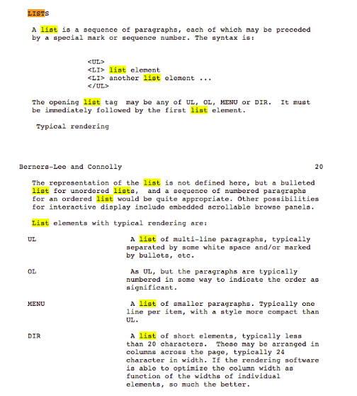
The element of the list (LI) and its particular expressions as ordered (OL), unordered (UL), MENU or DIR, are part of the syntax of HTML. This is important as it shows not only the significance of the list as a design form of the web through an archeological perspective but also reveals its syntactical nature, which is classificatory. As documented in the image, in HTML there are also unordered lists! Of course unordered here stands for not classified under a number but under a sign or bullet. Additionally, the opening list tag [...] must be 'immediately followed by the first list element'. The concept of hierarchical organization is thus embedded within web-design.
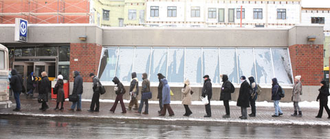
Alison Adam also wrote about lists from a computational perspective. Her essay 'Lists' – part of Software Studies: A Lexicon, edited by Matthew Fuller – refers to two special types of lists, queues and stacks. Queus use the logic of processing the first items listed first, while stacks do the opposite: they begin processing with the last listed item. Adam observes that a stack approach is not so common in our culture and cites the example of people waiting in line for a bus: the first listed has to go first, or at least that's how we do it in our culture.
What Adam emphasizes here is that within our culture the notion of hierarchic classification is strong. Of course this is something one can also observe in the lists of results from a query in a search engine. Who is really visiting the last listed item? People start from the first listed, and this can't be avoided within the culture of the list: first listed becomes the higher in hierarchy, the most important and most relevant.
Enlarge
If we live in a world of information, the web is the part of the world where all information is ordered. Lists seem to impose order as a default function, an ideological construct that rules web design and supports not only hierarchies but commodification of information.
The List and (Search) Interface
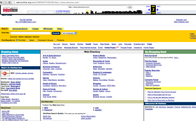
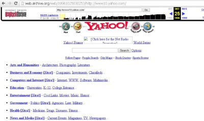
A study of the history of some web indexes, possible through the Wayback machine reveals some interesting findings that highlight transformations of their interfaces. The screenshots that follow document the emergence of Yahoo and Altavista search engines in 1996, followed by Google two years later.
As one can see the search interfaces of Yahoo and Atavista do not follow the dominant model of today, Google's simple (basic) search. Even Google itself has been providing lists together with the search box. In some cases they seem to have overdone it a little bit, when stating for example that they organized the whole web by topic:
Gradually, the homepage of Google search became a simple white page with an empty search box, as it is at the moment. Even the category-lists disappeared. The only list that remained is the list of results.
In general, search interfaces moved towards a model where natural language is replaced by a tag based search. The online guide of Google documents this perfectly when it expresses tip number 3: 'Choose words carefully: When you're deciding what words to put in the search box, try to choose words that are likely to appear on the site you're looking for. For example, instead of saying my head hurts, say headache, because that's the word a medical site would use.' So users are discouraged from constructing descriptive questions, like the ones they would ask the librarian. Instead, they are pushed to find a tag, a word that would include the best possible meaning of their research question.
But what does this element say about the use of language and its universal connotations? In Order of Things, Foucault reminds us that the alphabet rearranged the order of the universe through the spatial arrangement of letters. The alphabet became the most abstract version of textual based cultures, as it arranged things in space in a fixed position. The process of thinking more tag-based and writing in such a way, as described above, seems to bring even greater abstraction. Users need to communicate with machines, and machines have to communicate to each other in the processes of online communication. It follows a tradition of abstraction that constitutes the history of writing. The alphabet itself even becomes more a sort of controlled vocabulary thesaurus with keywords that represent concepts the simplest way possible. The alphabet in that sense is an extension of the concept of the list. It is a template, a standard. So on the one hand, folksonomy in the web seems to bring subjectivity in the foreground, however, the tag pulls back subjectivity towards the abstract.
The major contribution of Google to this universal abstraction was that it simplified the search engine as much as possible. 'Search the web using Google' is the motto under the search bar. This is maybe what has caused the popular misconception that the content found in Google is the 'web', while the results are part of the web that Google indexes. Web indexers classify the content and users search for it. The page of the search results is the listing of the classified content. Corporations like Google have in that way become the top classifiers.
Returning to the idea of (social) hierarchy that Alison Adam wrote about and expanding it to the lists we use to access information online, we can see how information retrieval based on hierarchical structures is the main characteristic of online search corporations. Contrarily, on the Internet Archive, which is a non profit knowledge institution, the search results do not appear hierarchically in the sense of ranking. Still, the mode of order cannot be bypassed. It is embedded within the culture of the list, a culture which makes order out of hierarchy, semantics or even randomness.
Thinking about the list and the interface I realized that the list is an interface. A prototypical interface to collections, a catalogue to access the classified content, an online catalogue of a library. But also the interface of the web is built with a multiplicity of lists on all levels from the back to the front.
If the list is an interface, and also constitutes interfaces itself, it's important to understand what interfaces are or how we can critique them. I want to bring Søren Pold and Christian Ulrik Andersen's interface criticism to the discussion. The authors have been working on a cultural and aesthetic criticism of interfaces. In their Manifesto for a Post-Digital Interface Criticism (2014) they point out some of the core qualities they find in interfaces.
The first statement they make is that 'the interface is an ideological construct'. As they note: '… [it] reflects a balance of submission and control. This balance is often conditioned by ideology. On some occasions the user is seduced to interact without negotiating this relation.' As the authors state, interfaces reflect power and control, which in the case of these lists is the power of the ones who create classifications, and the ideologies behind their views.
Search interfaces and their lists of results are ideological designs which embed users within the capitalistic notions of advanced information societies. They enforce the culture of extra productivity, because they are there to offer extremely fast and clarified information recalling. They support the culture of effective use of commodified information, because they do not allow the feeling of hunting of information and of a sense of play. And mainly, they enforce order as an ideology. An attitude and way of thinking that preserve the idea of knowledge and even a self being in order. Being under control. Clarified. Not vague. Thinking in lists, and listing even things that can't be listed.
As the authors point out, often times we are 'seduced' to use lists without even considering these points. This comes close to the very definition of ideology as an underlying dictation that functions on a level that people do not really understand, feel or consider – it functions almost automatically as a script. We perform web searches without acknowledging that our information experiences are subjected to this information capitalism. Operating within a loop that enforces a view of the web as primarily a place for fast and accurate information commodification. But the web could actually be a playground of information, an online ambiguous space with unexpected possibilities.
The second point of the interface criticism of Pold and Andersen is that 'the mechanisms of the interface constitute the sensible'. To them 'this coinciding registering and representation takes place at all levels of the interface. The multimedia as cybernetic mechanisms constitute the sensible (even beyond the human) i.e. the way we sense, what we sense, and how we act upon this.' Lists of results rule our information experience online. They manage to construct what is around us, what we perceive as our realities. The qualities engaged with the alphabetical list are embedded within this experience. The notions of a globalized, standardized looping reality are expressed in the visual characteristics of the list of search results. The sensible is becoming globalized and unified. The sensual is the same for every online user.
Flat Online Experience
A certain (perception of) space is created like this, constituted through the way one navigates within the list but also by it's formal characteristics.

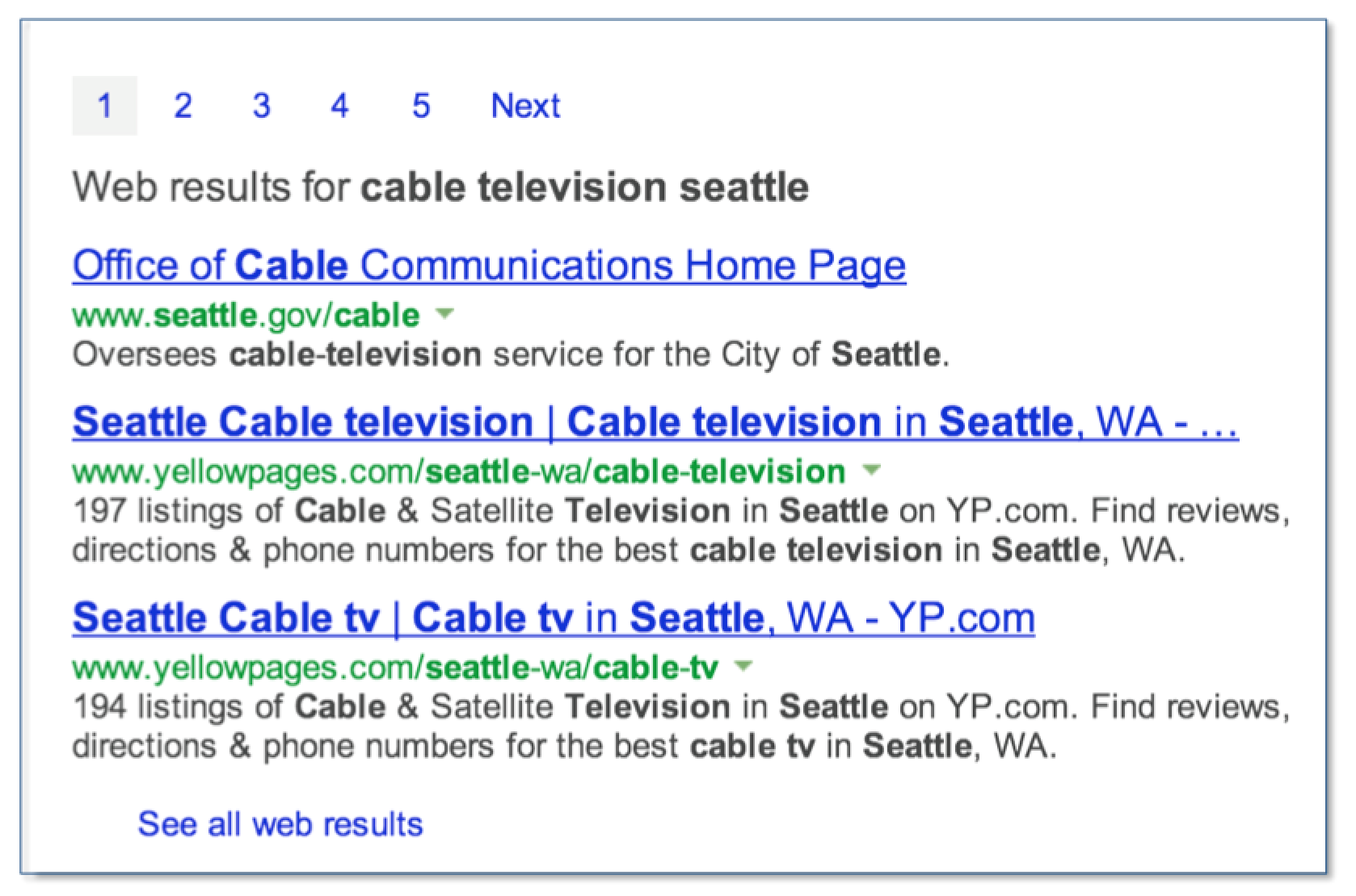
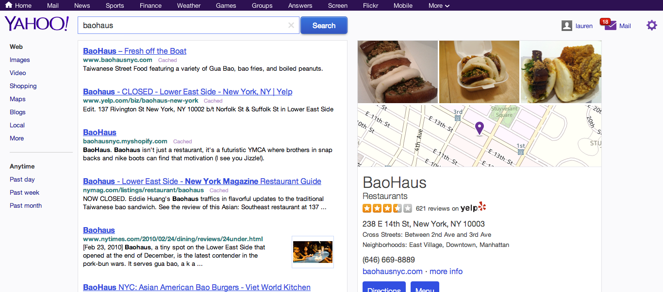
flat online experiences
Looking at the model of the list in online space and particularly lists of search results, like in online archives and libraries or web indexes, I approach it as an expression of a flat online experience. These lists are visually identical and look bureaucratic, therefore they reduce a possible interesting online experience to a very flat one. Flat here should be understood as boring but also as an experience where (the sense of) space is absent. The navigation in the list of search results is simple: going up and down, to the next and previous page, and picking items.
The results are rendered in the form of the fundamental, most basic and simple list. Constructed out of thin, possibly black or grey lines which, by managing free space, constitute boxes that hold words inside. They keep things in place where they should be. The lines create a grid which is a very visual form a list can take. These lines can be even absent. But they are still there as imaginary lines.
Furthermore, the results are static, nothing moves except our eyes and hand with the mouse, while going from top to down or back to top and from page to page, from left to right or the opposite. The background doesn't move as the boxes don't move, everything stays in place. The words of course don't move, they are what should remain still at the first place.
There is no depth. The background and the surface are both very two-dimensional modules, the one on top of the other. To me, this flatness of the background and of the items, together with the quiet and non movable structure, constitutes precisely the flat online experience. The totality of our senses is somehow excluded. No sounds, no movement.
And additionally, this flatness destroys the feeling of space; one has to navigate linearly and hierarchically in one surface. The list of search results manages to maintain a non-spatial experience for the person. Search result pages are information spaces that are treated in this tradition of standardization and bureaucracy with all its political implications and positions. It forces us to look at any content the same way.
Is the world of information a space where we only want to be productive, effective, go, hit, find, use? Or could we see the internet as a real space built on and for information? A printed list due to the materiality of its technology cannot provide the sense of depth. However, the online list is designed within an environment that makes possible the manifestation of a space, with characteristics that would consist a spatial and sensual experience.
Why this doesn't happen to online search results should be understood also through the history of 3D electronic space to 3D online space and the reasons why they never became dominant spatial design models, although they emerged in the early 90s. The work of Muriel Cooper and the Visible Language workshop of MIT in 1994 Information Landscapes, was a significant contribution for thinking the possibilities of electronic media, information and space.
The work of Cooper, a demo of a data visualization proposals, presented a three-dimensional textual space of typography, while investing on the possibilities of interactivity and animation. While the creators bring the elements of infinite zoom, transparency and live data, the user would navigate in a full three dimensional space, changing his position upon his desire. I am bringing up this example in order to explain that ideas related to more interesting and rich information experiences are not new. Still, information productivity and standardization do not allow playful and deep experiences with information. In 'Information Landscapes' the space was purely textual but the navigation possibilities transformed the list-notion of space to something much more interesting. As David Reinfurt writes, the design was focusing on 'creating connections and making meaning'. In other words, the way information was organized was not invested in clarifying and oversimplifying but in subjective associations.
A flat online experience doesn't enforce connections, because the fixed spatial arrangement of the list assigns things their fixed relationships. Therefore, such flatness reduces even the possibilities of learning or thinking something new. It seems to me that approaches like Cooper's did not become popular due to efficiency reasons. On the one hand, 3D approaches on the web would be really difficult to handle from the old dial up connections. The tools were also not easily accessible to a wider audience, that probably did not have a computer at home. They would be really time consuming. Additionally, online information is highly corporate, being foremost a commodity. The structures that hold it support the goals of the Classifiers. The simple form of the list thus materializes and guarantees the commodification of information.
Now, after all these decades of flat online experiences, it seems that the tools for a new approach in information organization is accessible, the content is there, and still we insist in the normalized list to see or order information. Being part or wider community of artists that deal with the networked context, I have been witnessing and enjoying the practice of many creatives that are not computer scientists but became self- or online-taught web designers. The fact that many of them use programming languages to create online works shows that good amounts of literacy can be acquired online in such a field. Users can still approach their way content and structure, they are just not trained as such. Moreover, the web is full of content, not only through web indexers but in online archives, libraries and other repositories. All the elements are there to create new information landscapes, and it seems to me that we do not do it mainly because, as internet users, we operate under the power of repetition.
Overall, looking for information on the web is dominated by principles of oversimplification, extra productivity, efficiency and clarification for easy use. These methods have been transforming our potential information experiences in consumer experiences full of order. The lists of results as a main expression of these principles have reduced the abundance of the online experience. Destroying the possibilities of ambiguous association, hyper subjective opinion formations and not allowing for serendipitous experiences, they have been flattening online space and therefore the online subjects' self. The results of a search could be displayed in a much more playful way that would emphasize collecting of information online not as picking items from a list but more as exploring a world of possibilities. Tonnes of digitized material from museums, libraries and archives are available online after decades of digitization – offering the ideal material to design explorative and deep online information experiences.
Do we still have the time to see the internet as a space? To oppose to the effects of the list? To respond to flat online experiences? And do we want that? I think we do.
Nikos Voyiatzis’ (Athens, 1982) work explores information organization in its political and aesthetic dimensions, particularly in the networked context. He has a studied Library Science in the Technological Institute of Athens and Media Design& Communication:Networked Media in the Piet Zwart Institute in Rotterdam. He has been working as an art librarian, information literacy instructor and educational designer. His writings are about databases, user profiles and lists and participates in exhibitions and cultural events, on and offline. This INC Longform originated in his Piet Zwart Institute graduation thesis.
References
Adam, Alison. 'Lists'. Software Studies: Lexicon. MIT Press, 2008.
Berners Lee, Tim and Connolly, David. 'Hypertext Markup Language (HTML): A Representation of Textual Information and Meta Information
For Retrieval And Interchange', 1993,
http://www.w3.org/MarkUp/draft-ietf-iiir-html-01.txt .
Drabinsky, Emily. 'Teaching the radical catalogue'. In Radical cataloging: essays at the front, 185-205, 2012.
Gerd Arntz Webarchive. http://www.gerdarntz.org/.
Hartmann, Frank. 'Visualizing Social Facts: Otto Neurath's ISOTYPE Project'. European Modernism and the Information Society, 2008.
Foucault, Michel. 'The Order of Things'. Tavistock Publications, 1966.
Hall, Stuart. 'Representation and the Media', Lecture, 1997.
https://www.youtube.com/watch?v=6sbYyw1mPdQ
Young, Liam Cole. 'On Lists and Networks: An Archaeology of Form', Amodern, 2015,
http://amodern.net/article/on-lists-and-networks/.
Pold, Soren and Andersen, Christian Ulrik. 'Manifesto For a Post-Digital Interface Criticism', 2014.
Reinfurt, David. 'This Stands as a Sketch for the future'. Muriel Cooper And The Visible Language Workshop. Dexter Sinister, 2007.
Senellart, Michel (ed.). Michel Foucault: The Birth of biopolitics: Lectures at the College De France, 1978-79. Palgrave Macmillan, 2008.
How to search on Google,
htps://support.google.com/websearch/answer/134479?hl=en.


