Talking about the aesthetics of big-tech is tricky. The ubiquity of flat, geometric sans-serifs, cutesy illustrations and their compulsively positive kindergarten appeal seems to be too easy of a target. How do you criticize something that is already so blatantly parodying itself? It seems like, everything that has been automated, A/B tested, and put into a guideline under the dogma of metric-driven design justifies itself. The visual appearance of big-tech corporations is only the logical consequence of that approach. If you sand down a block of data you end up with a circle.
When design decisions are based on nothing more than a global sense of the nature and format of the data that will appear as header, footer, or body… then templates end up as collections of clichés, essentially functioning just like stock photography – because all you can do is prepare for the mediocre, the common denominator.
— ‘Skeleton, Corset, Skin’ by Femke Snelting, 2006
Of course, this approach, the default for the corporate web, has been and should be questioned. I am obsessed with the way tech companies market themself. I can’t deny that camouflaging in, over-identifying with (or ‘hijacking’) your frenemies visual language is lots of fun. But especially when I look at the kind of illustrations that have been dubbed „Corporate Memphis“, „Big Tech Corporate Art“ or, in Alt-Right terms, „Globohomo Art“, I feel like I am already looking at an absurdly crude caricature. It feels a bit like watching The Social Dilemma on Netflix. Everything from Google Doodles to Open Doodles, Alegria, to humaaans and shape.so is so interchangeable that it somehow becomes resistant to criticism.
For now, I’d like to take a look at some examples from my personal collection of hero images. Below is a small selection of illustrations, alongside their respective file names, that I have collected from various websites throughout the last three years. The filenames of these images are the actual illustration here. I find that they reveal more about the working conditions and systems in which they were produced and embedded than the scenarios within the images themselves. The full collection of those images can be found on are.na alongside some other material regarding this whole shebang.
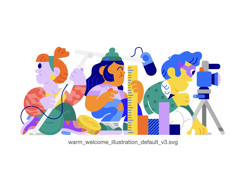
My latest find, from the YouTube account settings page. Three characters: One holding a microphone, another holding a ruler, and the last operating a camera. There’s also a coin and a bar graph. These seem to be content creators. What is the camera person filming? We can’t tell because it’s out of the picture. But if we put this image into an array, we would see that the camera person is filming the possessed girl on the left. She has been caught red-handed – eavesdropping on the camera person’s audio. The person in the middle doesn’t seem to be bothered by any of this, perhaps that’s the one who filed the content ID claim.

Light and dark hues of blue are paired with a warm yellow and muted orange. You just entered the outskirts of the city. People are watering their lawns. The sun is casting long shadows into the van. The last couple of days have been draining. While you stop at the traffic light, a group of construction workers is waiting to get picked up. Green! Everything is flowing again. The city is pulsating in a steady rhythm. People are moving in, others are being moved out. The infrastructure is not fully there yet. Your spouse has been texting you, but you only have 2% percent battery left. You are not sure if this trip was a good idea. But you hope to find work here.

I can’t remember where I got this one. But here we see someone scurrying through the scaffolding of an unfinished page. Tiny helpers that are doing all the work while we are asleep. With their large hands and even bigger feet, it’s quite surprising that nobody noticed them yet. Clouds on the horizon suggest that all those loose parts haven’t been uploaded yet. From version to version, these little gnomes are going to climb upwards, on the likes and ideas of someone else. Shooting for the stars, tweaking some settings, maybe leaving a review. Most of it is automated, but there is still a lot of work left to do for a real hero.

Again an illustration I snatched from the account settings. This time it’s Facebook. Looking at the pie charts behind these three smurfs I would guess that this is a work session. Whether those are Facebook devs or users is not clear to me. Are they just typing what the presenter has to say about the latest stats or are they manipulating what the whiteboard is displaying? It’s not the best showcase of Alegria as an illustration system and the filename is also just an incomprehensible string of letters. But at least this GIF captures the eternal limbo of Facebook participation.

This is one of the earlier specimens. In 2017 Dropbox re-branded with an array of hand-drawn illustrations meant to „represent a space where creative work-in-progress happens“. Ah yes, the overwhelming joy of manual labor. There is an odd parallel between scanning paper cutouts and graphite drawings and pasting text strings between a password manager and a browser. The naughty user who refuses to log in by button is forever greeted with an empty text box. As you pass me by, you can hear me crying from afar: Remember me! One must indeed imagine Sisyphus happy.