A contribution by Meeusontwerpt
The subgroup of Valiz, Meeus Ontwerpt and Puntpixel has set out to create a digital version of two editions in a new series by Valiz called Context Without Walls. The paper versions of Context Without Walls – books containing essays about and works by a contemporary artist – are being designed by Meeus Ontwerpt and are full of design and conversion challenges. Some of these include working with image-filled essays, references in the margins and notes. As starting point we have decided to try and make a simple e-pub that works even on the most primitive devices (like e-readers). This means we cannot do too many crazy things (regarding interactivity, but also with respect to the lay-out). Therefore the result of this simple version will be quite dry. However, by thinking well about details we want to make sure a certain quality and a connection with the original book design are maintained.
What did we do design wise, in order to achieve this? (For images, scroll down)
- Convert the print colors to matching RGB colors (of course you cannot see the colors on every device, but we didn’t want to skip the colors completely).
- Adjust the cover design to a one-language book (the original book is bilingual).
- Start from a single-page design instead of a design in spreads.
- Choose open source typefaces (through Google font) that come close to the original typefaces and that work well for the screen (Libre Baskerville instead of Plantin en Cabin instead of Akzidenz Grotesk).
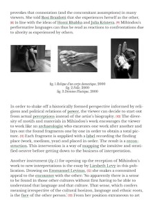
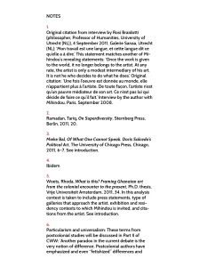
- Define styles for the text, titles, subtitles, notes, and keywords that work well for the screen (for instance the use of whitespace and notes, which are not shown in superscript, but in between brackets and in a color).
- Set a standard rule for the use of images in between the text: there always must be three small images that form one image together. In this way the images still resemble the small images in the margin of the paper book.
- Translate the visual essay in the heart of the paper book into an e-version. For example, in the paper book we use black as a background color, but in the e-pub that could turn out ugly since extra white margins might appear around the screen, that’s why we choose a white background here.
- Add a content page in big letters, so it is easily clickable (this content page can exist next to the automatically generated content page of the device).
- Add extra features that make the e-pub similar to the paper book, like endpapers.
What is the next step?
Puntpixel is making a generator that creates an e-pub, based on the input of text in mark-up language. The design of the books will be translated into the right CSS styles to use in this generator, so the final e-pub is going to look like the original paper design.
Then we will have a simple e-pub that can be tested on different devices. And the good thing is we also have a system to convert a whole book to an e-pub (since we are working with a series that comes in very handy). The important thing we have to sort out is how to easily make a mark-up document from for instance a Word document.
The next step is to create a more complicated e-pub (e-pub 3), with more possibilities concerning interactivity and layout. Unfortunately such a version won’t be able to work on all the readers / devices. What we would like from such an elaborate e-pub we don’t know yet, that’s something we still have to decide together.
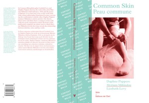 Cover design for the bilingual paper book (with back and spine)
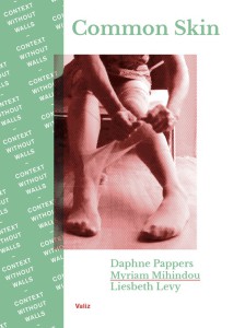 Cover design for the monolingual e-pub (with RGB colors)
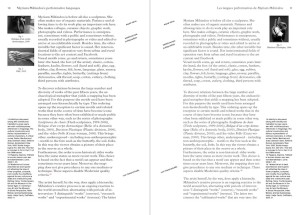 Design for the inside of the paper book (with margin, images, footnotes and keywords)
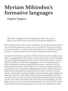 Design for the inside of the e-pub (with solutions for the images, footnotes and keywords)
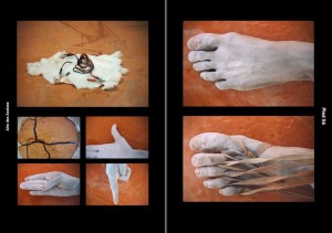 Design of the visual essay in the paper book (with black as a background color)
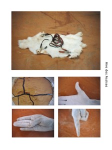 Design of the visual essay in the e-pub (with white as a background color)


