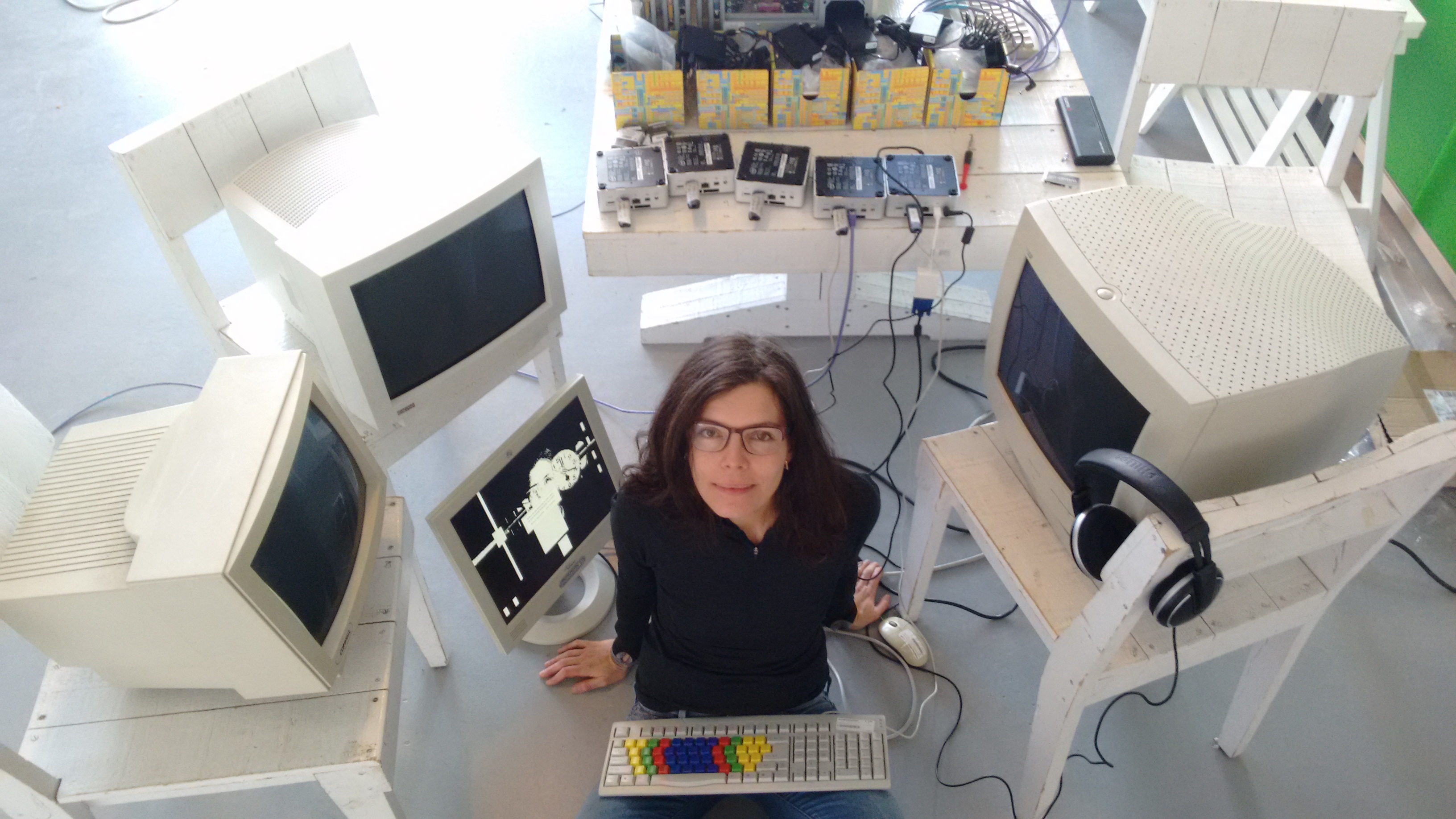
Olia Lialina at MU, Eindhoven
Twenty years ago, my father came back home from work and brought the first computer into our living room. It was a big beige box with a flickering screen on which we could type and paint. Around the same year, in 1996, the Russian net.art pioneer Olia Lialina created My Boyfriend Came Back From the War (MBCBFTW), an interactive web narrative that tells the fictional story of a couple trying to talk to each other after the war. The launch of Netscape 3, which made it possible to split the browser in independently controllable frames, inspired Lialina to explore the boundaries of the browser and create an ambivalent dialogue. MBCBFTW has become an icon in the history of internet art, and has inspired international artists and non artists to create their own interpretations. Lialina has been collecting all these interpretations (unfortunately some have been lost) in the Last Real Net Art Museum, an online museum that is at the same time a critique on the first internet art exhibitions organized by museums.
In the retrospective exhibition at MU, thirteen of these interpretations are on show, ranging from an interactive burger story, to a t-shirt, to works that tell real traumatic stories. For the occasion, MU has also commissioned two new works by Foundland and Constant Dullaart, presented as homages to Lialina’s iconic work. Together with a completely emulated version of MBCBFW, on the good old-fashioned PC towers with Windows, this exhibition is a tribute to the World Wide Web and presents a new approach to keeping history alive. The day before the opening, I asked Olia Lialina some questions about the exhibition and her practice.
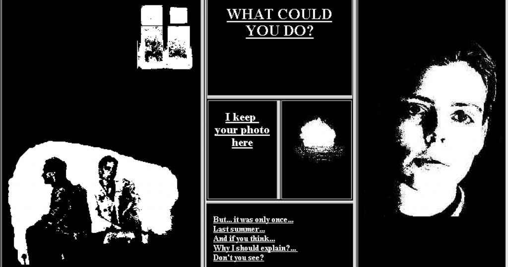
My Boyfriend Came Back From the War, Html, frames, 1996, Olia Lialina, image MU
You have been collecting, preserving and monumentalizing web culture of the 90s for quite some time now. What made you start this?
I started collecting web pages when I started to teach students. I wanted to explain and compare things that were happening on the web to things that happened before but I couldn’t find the old web pages. In 1999 I became aware that the people who were online weren’t aware of their own history.
From an aesthetical point of view, the star backgrounds of old homepages caused the urge to preserve web culture. When I realized that the pages with star backgrounds were disappearing, I started to collect them so that I could show them to the students. But it’s not just about a teacher who can’t find old web pages, it is about the history that we will not be able to remember. Furthermore, there is no respect for what unprofessional designers made before professionals came. That’s why I started to protect and monumentalize their productions.
How did you see web culture and its aesthetics change through the years?
Web culture has been changing all the time. When you search for ‘design trends’ or ‘top 10 design trends’ in a specific year, you will find lots of articles that describe these trends. But these trends were always related to graphic design, for example typography or color combinations, and rarely to structure or layout. And of course, everything that was not made by design professionals was ignored. That’s why I started to make my own timeline. This timeline starts with the style that I call ‘Prof.Dr’. Starting in 1993, the earliest examples are very simple webpages by academics, in default styles: the links are blue, the visited links purple, the active links red, and you browse from top to bottom. I call it ‘Prof.Dr’ because when I started this in approximately 2006 it was the best search request to type in Google to find old pages, since the very first pages on the internet were build at universities. Up till now, I still don’t have a better search term. Because of all my writings about this code word, the term has sort of popularized and established as a name for this style and time.
The main ideological change is that you don’t make your own webpage anymore; it is made for you by a service that provides you with a template. This crucial change also affects aesthetics, which become more organized and corporate. Only for a very short time, about five years, people felt responsible to build cyberspace themselves. That is why these aesthetics, the star backgrounds and under construction signs, have become a symbol for self-made cyberspace. One Terabyte of Kilobyte Age, is the documentation of this self-made cyberspace with star backgrounds, animated gifs and MIDI background sounds. This ‘Geocities 1996’ style is a symbol of the blast of colors, animations and bright and loud productions, of the time when everybody was welcoming everyone to their pages and making their own corners of cyberspace.
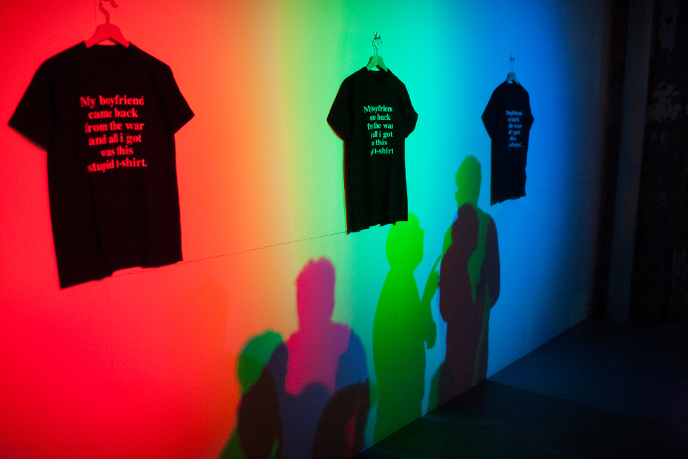
My Boyfriend Came Back From the War, Black T-shirt, Mark Wirblich, 2005, photo: Boudewijn Bollmann
In an interview with Josephine Bosma from 1997 you said that you didn’t like the discussion about the definition of net.art. How do you think about this today?
I still think that back then, the works of artists should have been discussed in more detail. Not just as a whole, as if it was a movement. It was not a movement. All these years it was always about the terminology. Talking about the terms, discussing them, protecting them. Looking back, twenty years later, I know I’ve spent quite a lot of time explaining the meaning of the words, or rejecting some. But I don’t regret it because all these discussions made the medium we are working with visible, which is the most important thing for net art.
This exhibition is simultaneously being showed at HeK in Basel. Next to this, your work is also on show in the Electronic Superhighway exhibition at Whitechapel Gallery in London. This indicates that there is a high interest in exhibiting internet art. Can you describe how the interest in internet art, from an institutional and public level, has changed?
In my memory, it’s already the third attempt of contemporary art trying to embrace new media art. Still one can say that, with all the great intentions, there is no respect or understanding of net art. It’s important to keep the places that are specialized in new media art, although I don’t like the term new media art. Places like MU, HeK, really try to go into the details. They put a lot of effort in working with the right browsers and finding the right equipment to show the online projects in all their glory. They invest their energy in thoughts about the exhibition, and do not just make the works easily accessible for the public. In a recent article about Electronic Superhighway the journalist says that the exhibition ‘…ticked all the boxes in terms of canonic name-dropping, yet it felt rushed and cluttered, and seemingly conducted so as to get this kind of art “out of the way”, to move on to something else, and quickly send these works back to the specialist archives.’
New media art is getting popular for a third, short period of time. New Aesthetics and post-internet art have made it more accustomed to show the works in real spaces, which contributes to an increase in interest. I don’t know for how long it stays this time, but every time the wave of popularity brings something new. For this third wave it’s the increase of interest from the galleries who are supporting media artists.
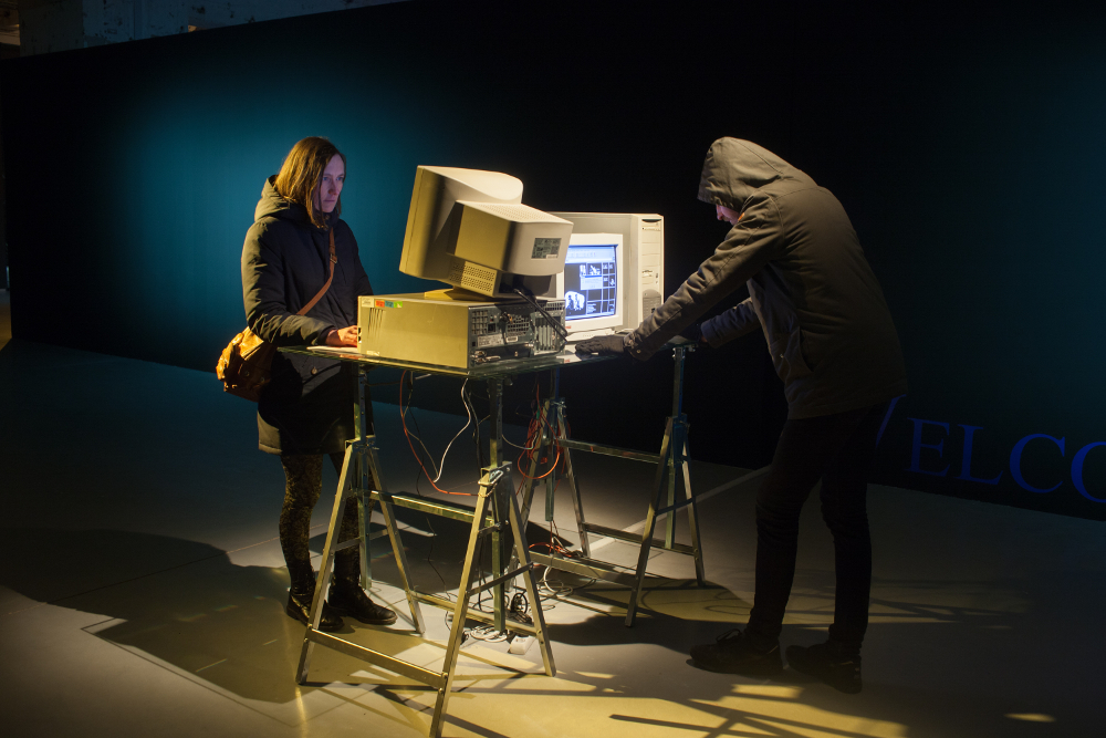
My Boyfriend Came Back From the War, Html, frames, 1996, Olia Lialina, MU Eindhoven, photo: Boudewijn Bollmann
For this exhibition you slowed down the internet connection and used old PCs from the 90s. Is it only about preserving the past or giving access to the memories of the past? Or do you also look back on those years with feelings of nostalgia?
I’m not nostalgic, I think I’m quite futuristic, because I still believe in a future where people are making the web themselves. If we want to show the online works in an offline space, we have to make the effort to show the works in the original way, otherwise it doesn’t make sense. It’s much more fun to look at the works on an authentic computer with the authentic connection, inside the original Netscape browser. When I was making the exhibition I couldn’t believe how beautiful the Netscape browser is. You can’t avoid the feeling of nostalgia, but there will also be people seeing it for the first time in their lives. And concerning 28,8 kbps connection, believe me, it’s a very special feeling to click on something that isn’t there immediately.
MBCBFTW is one of the early works that is often mentioned in the history of net art, and it has been appropriated and remixed numerous times. What has made this particular work so influential?
I am proud that people have been appropriating and remixing the work. I think it happened because MBCBFTW has a recognizable structure. Some works in the show are cold and formalistic, they translate the work into newer functions of the net, such as a blog, twitter, flash, or an animated gif banner. Other artists used the structure of MBCBFTW to tell their real stories. Freya Birren’s story is about her relation with her boyfriend who came back from Iraq. And one of the new works, by Foundland, is about mothers who realize that her sons left for ISIS. The structure seems capable to express difficult conversations. It’s also about not knowing whether you are watching a monologue or a dialogue.
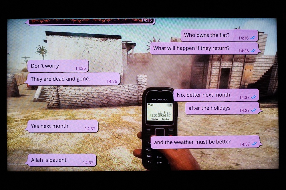
Baby Come Home, video, 2016, Foundland, MU Eindhoven, photo: Boudewijn Bollmann
In your article Not Art&Tech from November 2015, you write that the computer of the future should be visible, and that this is the main topic on your agenda for media theory. Can you shortly describe what you mean with this, and why it is so important?
This is an allusion to the famous phrase “The computer of the future should be invisible!” by Don Norman. Everybody is repeating his words, and designing according to what he said. It was his idea that interfaces should vanish and that there would be no awareness of computers. The only thing left is you and the task you have to do. This is sort of accepted by everybody as if it’s beneficial. But I think there should be made an effort to introduce some other design paradigms where the emphasis is on the visibility of the computer. When you want computers to be invisible, you can’t demand an understanding of how computers work, or awareness, and media competency.
If you could travel through time would you go backwards to the 90s or forward to the future? Or any time else?
You can’t imagine how often I think of where I would go if I only had one choice. I then think of the Middle Ages, or sometimes of the beginning of the 19th century, to meet all the famous Russian poets like Alexander Pushkin and Mikhail Lermontov. Time traveling occupies my mind. I wouldn’t go to the 90s, with all the research and preservation I have done, I have made enough contribution to building this time machine. Therefore, nobody has to go back to the 90s, but still enjoy it.
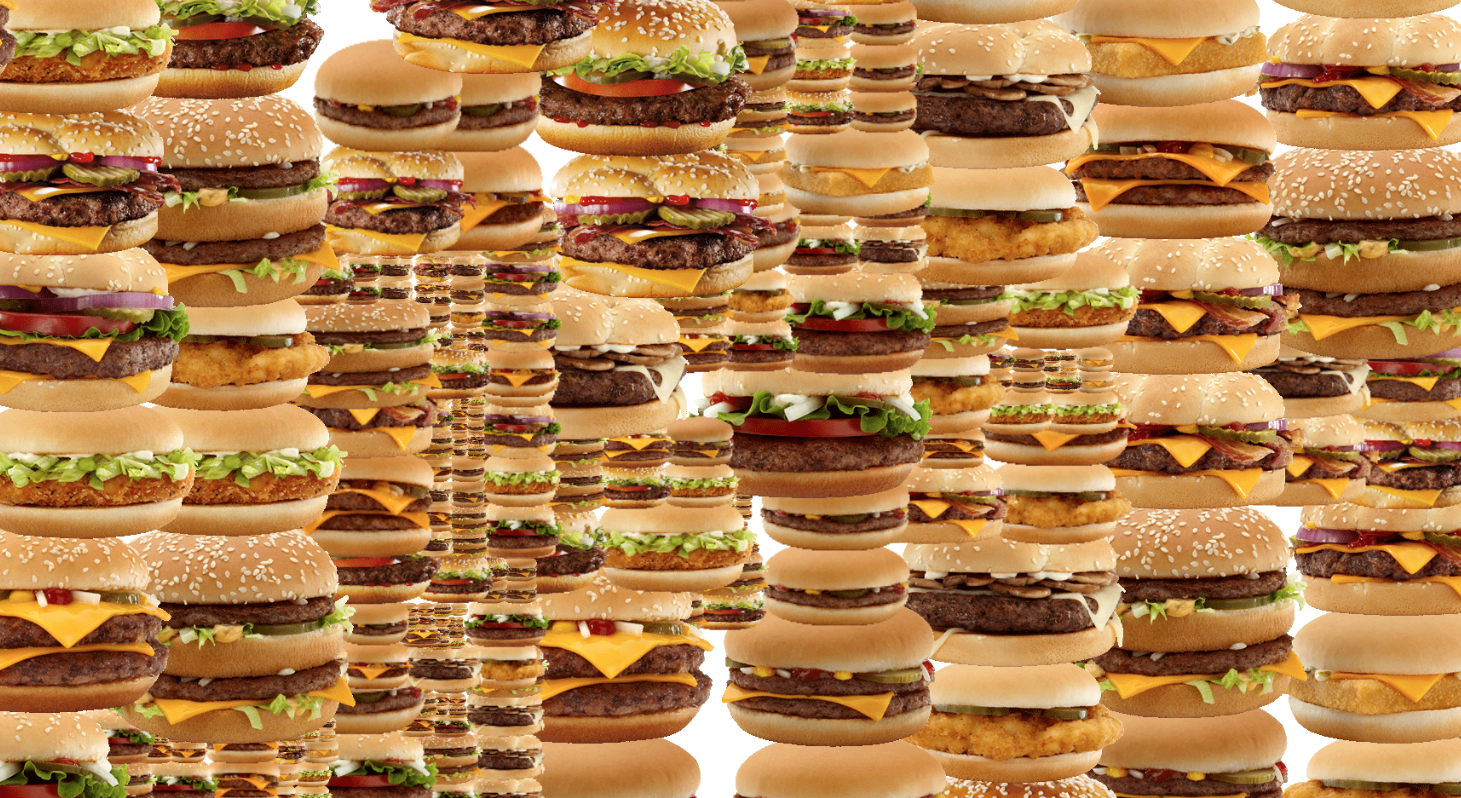
My Burger Came Back from the War, HTML, JavaScript, Guthrie Lonergan, 2012
In the same interview with Josephine Bosma from 1997 you tell that Alexei Shulgin introduced you to the internet. Your first impressions, such as work by Jodi and the nettime mailinglists, were not commercial but related to internet art. Today, this is quite impossible, since the internet is integrated much more into daily lives. Image you would be today’s Alexei Shulgin and you had to introduce me to the internet what would you show me?
First of all, I would try to keep you away from Facebook. I would show my favorite place of today: blingee.com. Concerning internet art, I’m a big fan of Jan Robert Leegte, his work is very interesting in understanding the structure of the web. I would also show the work of artists like Evan Roth and Cory Arcangel, and the work of my students. For the history of everything, I would show the works of Helene Dams, for instance I Can Has History?, the family tree of lol cats, this gives a good overview of what happened over the years. But I think I would give a different answer every month, as of February 2016: Random Darnknet Shopper, and all other projects by !Mediengruppe Bitnik; the amazing precious time machine into web history, oldweb.today to recognize the volume of the connected world; all projects of the last twenty-two years made by Tale of Tales; and the newest project by my student Simon Baer, Cannot Sleep with Snoring Husband, recommended to everyone who thinks that you can’t cry looking at net.art.
Time travel back to the 90s with the work Olia Lialina, the exhibition is on show at MU, Eindhoven until 20 March 2016.
Further reading
Co-curator Annet Dekker also published an interview, you can read it here.
A publication linked to the exhibition will be published by HeK with essays by Michael Connor, Joanne McNeil, Roman Leibov, and Bruce Sterling.
References
Josephine Bosma, Olia Lialina interview Ljubljana, 5 August 1997, nettime
Olia Lialina, Not Art&Tech: On the role of Media Theory at Universities of Applied Art, Technology and Art and Technology, Universität für angewandte Kunst Wien, November 2015
Olia Lialina, Prof. Dr. Style: Top 10 Web Design Styles of 1993 (Vernacular Web 3), July 2010
Don Norman, ‘Why Interfaces Don’t Work’, in: Brenda Laurel (Ed.), The Art of Human-Computer Interface Design (1990: 218)
Jeppe Ugelvig, Taking a ride on the Electronic Superhighway, i-D, 5 February, 2016


