This post documents my attempt to turn UX principles on our current manual used with interns at the PublishingLab, luckily for me – I have a captive test-audience!
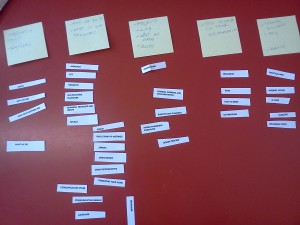
The content is already 90% written, with an existing table of contents so I began with card sorting to test the intuitiveness of the sections. The first test was an open sort to see how participants would create sections, the second was a closed sort to try find connections in common and how intuitive headers were. I then asked for suggestions, and took into account some behavioral observations I’d made over the last few weeks.
Now, on to this process…
What we have & what we want
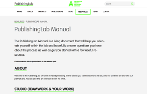
Currently the manual is circulated as a .pdf – which, in my opinion, is likely to doom it to being outdated. So my first fix is to move it out of pd..forget and on to our website. I decided it should be location in the ‘resources’ section on the site after asking interns where on our current site they would look for a manual (3 of 4 said ‘resources’ – although I felt resources was intuitive, it’s important to listen and test before assuming).
The purpose of the manual is to help new and current interns update themselves on expectations, facilities and useful resources. We want the manual to save time and confusion, to be a place where interns can orientate themselves and answer their own questions as often as possible.
Card sorting
Method:
An open card sort was followed by a closed card sort while the participants talked out loud about their decisions and I made observations. I could not answer any questions that arose because the associations needed to be their own.
With the closed card sort I saw an opportunity to adjust it slightly by having the participants write their own definitions of the section headers above the cards on post-it notes).
Purpose
The tests were to help label categories and navigation
I found the best practices suggested on usability.gov helpful in setting up my tests.
Results
The card sort showed there is still some work that needs to be done. There were terms that were ambiguous to all participants:
- ‘rule of thumb’, ‘remember’, ‘act’
- cards that appeared to mean the same thing: approach and design process
Suggestions so far
After the card sort, I asked the participants for their suggestions and it frequently came up that some brief, contextualising information would make it easier to decipher if they wanted to read the whole section.
Other suggestions included:
- The possibility of interns to update the ‘practical info’ section themselves – which, naturally is key to keeping a document alive. Rather than being a top-down document dictated by a project manager or coach, the additions from past students will help future interns find relevant info we might not consider adding because of existing familiarity.
- possibly add addresses useful to new interns
-
the hybrid workflow could benefit from being seen as a gif, possibly the scrum method also
- missing and could be included: facilities & opening hours etc
As well as the helpful verbal suggestions of the interns during the test, I have been able to observe behaviour during the initial weeks. My observation was that there were a few practical issues that weren’t addressed in the original manual (like how to print) which took up time of staff and resulted in repeated questions. This is why I decided to include a 5th section in the manual titled ‘Practical Info’.
Writing
The next challenge is the writing. I’m taking the research I’ve done for writing for the web and applying it here liberally. After the card sort, I asked the participants for their suggestions and it frequently came up that some brief, contextualising information would make it easier to decipher if they wanted to read the whole section.
The next stage includes some re-writing and re-structuring of content.
What’s next?
Adding a subpage to our resources section for the manual and testing some navigation options with a few work tasks to see how well the manual can be used to find necessary information.
example scenario:
Resources
Usability.gov, http://www.usability.gov/how-to-and-tools/methods/card-sorting.html


