It seems there’s no perfect solution yet in the digital publishing realm for art publishers. It’s apparent that the reflowable ePub format does not suit visual publications very well, but is fixed layout ePub (FXL) the solution?
What’s a fixed layout ePub?
A fixed layout epub can be described as a hybrid of pdf & ePub; combining the design control of a pdf with ePub’s searchability and the ability to be sold on Amazon. Sounds good, so why isn’t it more common?
The pros
- Distribution: while you can’t currently sell .pdfs, you can sell ePubs in iBookstore and on Amazon
- Live text: all written content is searchable (for example, captions over photos do not have to be part of the image)
- Control over page design
- Full-bleed images and backgrounds
The cons
- Labor intensive: InDD CS5.5 and earlier do not support exporting fixed layouts, so that means coding it by hand. Each page of a FXL has it’s own .xhtml file, unlike reflowable ePubs which have one .xhtml per chapter
- Limited distribution opportunities: very few readers support it at the moment. Apple is the main re-seller and this may result in needing to design 2 layouts (i.e. a tweaked version for Kobo)
- The format doesn’t scale for mobile reading.
The controversy
I think they sound like a pointless step backward – a filetype with all the rigidity of PDF but with none of the cross-platform support. – Ben Hollingum
The quote above epitomises the Digital Reader article’s list of problems with fixed layout books. Digital Reader proposes that eBook designers should move away from trying to keep the printed book format as a template for digital publishing. Craig Mod argues that the bond between reader and text can be strengthened or broken by the container, I see this as an affirmation that it needs serious consideration by designers and developers. He sums up his concern below:
Amazon and Apple are the paper‑makers, the typographers, the printers, the binders and the distributors: if they don’t make a style of paper you like, too bad. The boundaries of digital book design are beholden to their whim. – Craig Mod
Fixed layout books are often children’s books, photography or cookbooks. To decide whether using fixed layout is right for a project, the publisher needs a clear idea of what their reader’s devices are – it takes too much effort to create a layout that might work well in i-Books and not at all on other readers. This problem of limited implementation affects fixed layout ePubs as well as reflowable ePubs which often support only a very few styling options. The IDPF cautions eBook developers to be aware that reading systems typically restrict the ability to modify body margins indicates this limitation. Which essentially means designers are bound by the choices of distributors and e-reader makers.
The experiment(s)
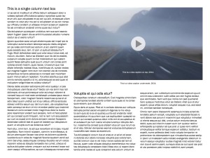
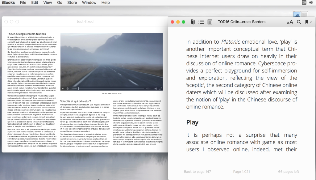
To demonstrate, I created a fixed layout epub in InDD CC 2015. It didn’t take much time to file > export fixed layout, and the pros are that it retains my weird text wrap, and the caption over the video. Since I wrote about the display in the cons section above, I thought I’d also show what it looks like – not just tell. When viewed in iBooks, changing the width of the viewport (screen) does not change the size of the text and it is only suitable for viewing on an ipad.
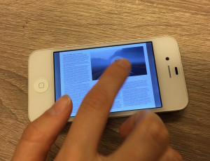
See the comparison between the reflowable layout (right) and my test fixed format book in iBooks (on my Macbook), then on the iPhone and on the iPad below:
On the iPad it displays landscape and the caption text on the video is searchable:
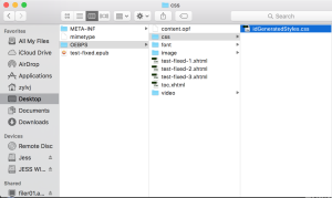
It’s obvious that the reading experience is just as difficult on a mobile where you have to zoom to read as it is reading pdfs. Another difference between fixed and reflowable ePubs is shown below, see that there are 3 pages in this book – and 3 corresponding xhtml files, imagine if it had been 130 pages:
Now that you’ve seen the rough-and ready test, here is an exciting example of a hand-coded ePub3 by Walrus Studio, which includes columns and an interactive map. This book is really inspiring, but it’s also custom-made – requiring a skilled developer and robust budget.
The other possibilities…
What can be done about visual layouts in digital publications? The IDPF is writing standards, however it is unclear whether these will be viable because the e-reader market is so varied in its adoption of standards. The financial imperative may not arise to accommodate visual publications in ePub format.
To see what is happening, here are some interesting experiments and standards, starting with an example and how-to:
- Adaptive layout how-to by Sorotokin
- Paged Media Module, which has been a working draft since 2013 from the W3
- Media Queries, which help text display on different devices by linking to a stylesheet relevant to the targeted device’s capabilities. Liz Castro shows how she used media queries to better display poetry across devices
- The IDPF brought out a specification for ePub Adaptive Layout here
Future
With a proper API (an application programming interface, which allows one authorised application to read and manipulate data in another), entrepreneurs outside of Amazon or Apple could step in and offer more beautiful, efficient, or innovative reading containers for our books, leaving the bigger companies to do what they do best: payments and infrastructure. – Craig Mod
Ideally, artist books could incorporate the interactivity made possible with ePub3 with custom layouts which really reflect the unique visual quality of the work. It’s not necessarily about mirroring the beautiful print spreads of art publishers, or following the highly-customised methods of an App, but looking for ways digital publishing visual books can be improved with what we have. For now, the PublishingLab plans to keep experimenting and looking at what others are doing in the digital publishing realm. We hope to post successful visual experiments and inspire publishers and eBook developers to find ways of creating better reading experiences.
References
Craig Mod, Future Reading Essay
Alan Kay, Dynabook
Additional Reading
For a really clear distinction between ePubs, PDFs and Apps see this excellent article from Indesignsecrets


