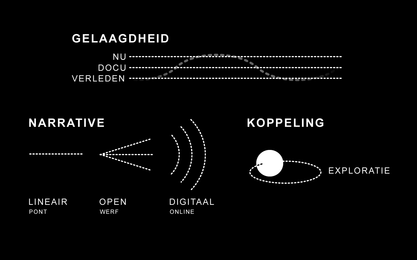
By determining commonalities across values of both end-users and stakeholders, the various layers of meaning came to surface. As the documentary Haven: Omzwervingen in de Nacht
itself is set in a literally dark ‘in-between’ period where the surroundings and inhabitants needed to redefine their purpose and function, it became evident to explore the notion of Zeitgeist.
Zeitgeist for this project can be defined as the general cultural or spiritual climate within a specific group, along with the general ambiance and mood associated with an era, but in this case also intrinsically bound to a specific, relatively small, location; the NDSM-wharf.
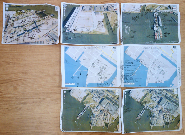
The location itself, a former shipyard on the northern banks of the river IJ, still exerts a mysterious seductiveness. Remains of a once prosperous harbor are still present and are inhabited by different types of residents over the years. It is these types of residents that form the building blocks of our narrative. The stories that they tell, the dreams they hold dear, their day-to-day worries.
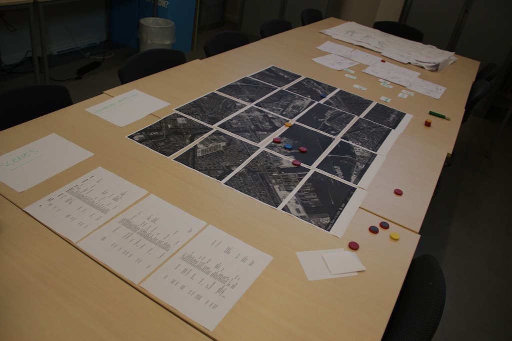
By providing them with two actual radio channels that can be tuned into, themed towards past and present (e.g. riveting hammer sounds to portray a 1950s vivid harbor), visitors can roam the NDSM-wharf freely and experience it through their own eyes. By hearing sounds of the past and empathizing with the surroundings, visitors can imagine the past in their own way.The supply of content (approximately 10 minutes of documentary max., 25 Polygoonjournaals of around 1 minute each and about 40 images) could be seen as either a blessing or a curse. As said in the blogpost before “Changing any aspect, will change the target and also the roles of the other aspects. That is why, before you can realistically say (or even see) what the target is, all the other aspects should be well defined.”. As the content was only provided one-and-a-half week before the actual deadline, by definition the target was only finalized at that moment. However, it allowed us to make concessions and quickly wander down the decision-making process with various stakeholders.
Early iterations hinted towards unlocking content depending on the physical location of the visitor. Standing on the ferry towards the NDSM-wharf would unlock an introduction movie, and each step taken towards so-called hotspots (a pier, a rusty hoisting-crane and quay with an industrial harbor view) would open up new movie clips and photographs. From a usability point of view and a more practical and technical side, GPS-based unlocking was replaced by a more intuitive and identifiable form. Easily recognizable stickers were designed and placed around the harbor with a unique number on them. As a sticker was found, the number could be entered into a special menu of the application after which the associated content could be viewed. The location of the sticker was linked to the actual location of the content (i.e. a 1930s Polygoonjournaal of the famous boat hotel ‘Botel’ would be shown next to ‘Botel’ itself).
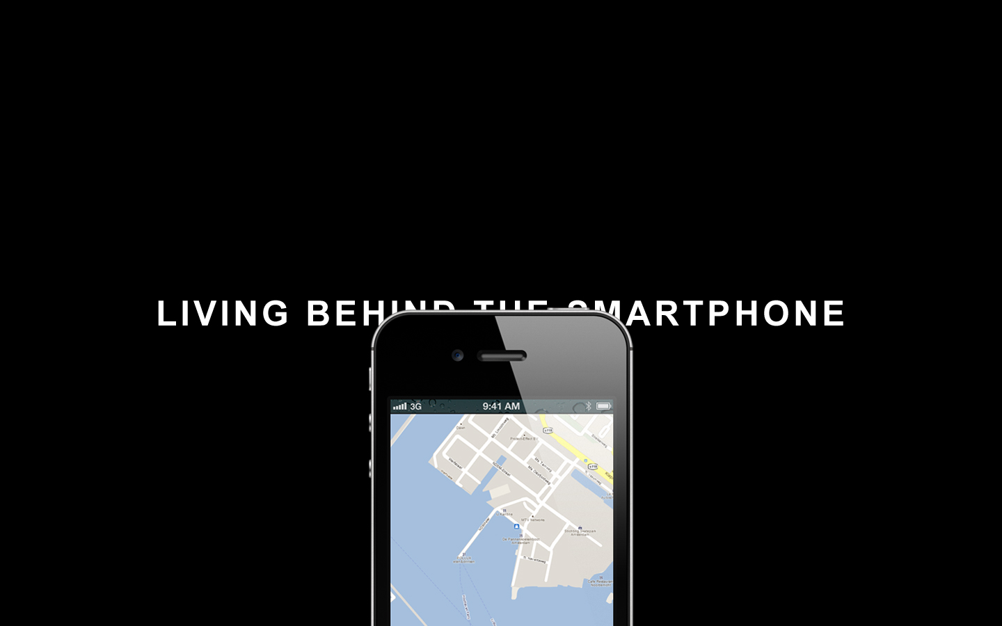
In line with our concern of “living behind the smartphone”, the web-based application remains simple and intuitive. There are only three menu options (which are always displayed in the bottom); one of them leads towards a basic static information page. The second one displays an interactive map (including a suggestive route and markings of visited and non-visited content) and the radio, and the final page allows visitors to enter a code after which a new window showing the content pops up.


