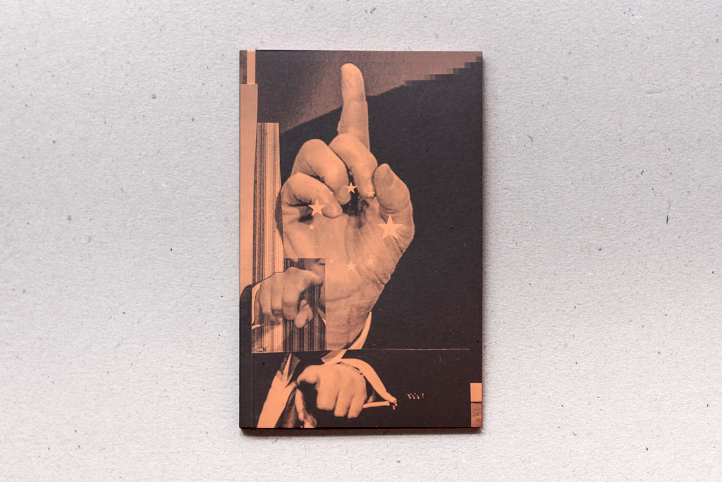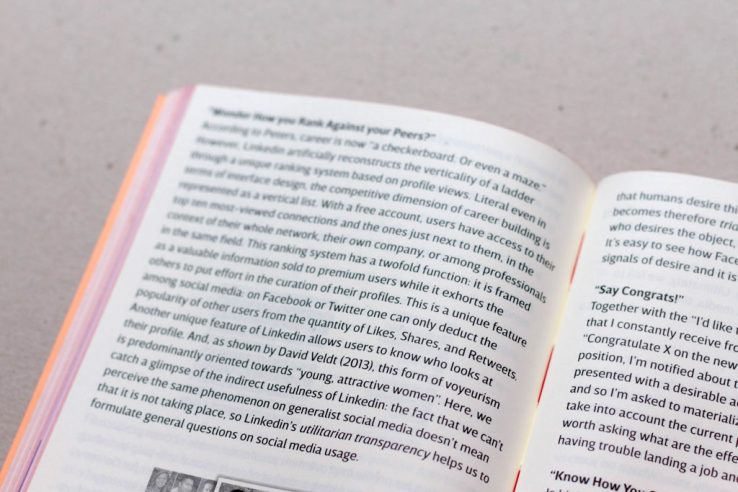
Modes of Criticism 3, a beautiful publication edited by Francisco Laranjo on design and criticism, is out. This issue, dedicated to the relationships between design and democracy and published by Onomatopee, includes an essay of mine on the competitive aesthetics of Linkedin’s previous user experience, which became history when the site was redesigned to align with the convivial regime of dominant platform like Facebook and Google. Here’s an introduction to the piece.

The writing of this essay was concluded just before a drastic redesign of Linkedin’s interface. In its conclusions I somehow predicted the elimination of the anomalous functionalities that made Linkedin peculiar in comparison to the standards of other generalist social media platforms, like Facebook. As I argued, these now obsolete functionalities illustrate a utilitarian transparency more genuinely adherent to the ideology and the aims driving the design of the platform than the full “rhetorical turn toward conviviality” (Davies, 2016) that characterize other dominant social media and guided the current redesign of Linkedin. Instead of updating the essay according to the new design, I decided to preserve my original analysis in order to provide a chronicle of the recent history of social media and a proof of the difficulty to formulate a timely critique in a medial ecosystem that is in “permanent beta”, just like contemporary workers must be, according to Linkedin cofounder Reid Hoffman (2013).


I’d like to thank Sebastian Schmieg, Cristina Cochior, Geert Lovink, Francisco Laranjo and Jona Piehl for taking the time to read the text and provide useful feedback.
Also published on Medium.
