A few days ago, I took part in an “expert session” with a consortium consisting of the Institute of Network Cultures/Amsterdam University of Applied Sciences, NERO Editions, Aksioma and Echo Chamber. The purpose of the session was to share my perspective on Expanded Publishing, which is the focus of their research project. As I saw some worth in the notes I prepared for the event, I turned them into the following article.
You asked me to reflect on the ‘why’, the ‘how’ and the ‘who’ of publishing, understood respectively as its mission and politics, its tools and infrastructure, and its networks and communities. At the risk of stating the obvious, these aspects are for me necessarily intertwined. More: they’re co-determining. Let me explain.
My interest in publishing was originally sparked by my studies in art, design and media theory. As such, it had mostly to do with weird and experimental media, processes, tools and workflows that would shed light on the politics of “making public” and “the making of a public”. Here’s a couple of examples. On the one hand, I looked into digital rights management (DRM) as a form of enclosure; on the other hand, I was fascinated by the EPUB format as an opportunity of unanticipated circulation, remix and reuse. In practical terms, I was doing things like book trailers automatically generated from EPUB files and interviews with artists like Jesse England. England made a backup copy of 1984 after Amazon removed copies of George Orwell’s novels from Kindle devices without asking any permission to the customers involved.
At that time, I was also restructuring my aesthetic, technical and political values regarding publishing around the concept of poor media, which was inspired not only by Hito Steyerl but also Florian Cramer:
[…] poor media are able to “transform quality into accessibility,” like [Steyerl’s] poor image does. Poor media substantiate the book’s potential for duplication and dissemination. Conversely, rich media are the product of a commercial doctrine based on an ornamental understanding of digital technology, a Hollywoodian rhetoric of engagement, and a reactionary conception of the publishing process.
One of the projects I led at the PublishingLab exemplifies the frugal attitude of poor media. Developed by Thijmen van Brunshot and Stef Kors, it resulted in the conclusion that the newsletter could be a viable means to engage Millennial book readers. Here’s more or less what we wrote:
Millennials have a soft spot for gonzo-style self-satirical writing, especially when it addresses topical issues. They prefer this type of content to books because a “listicle” or a short personal essay can easily fit between emails, that is to say, in the middle of the gray literature of work that keeps us all busy swallowing most of our mental energies. However, the medium of email doesn’t need to be dreadful and tedious: it can be repurposed to channel meaningful, pleasurable literary content and interact more personally with its author.
Our client, the innovation office of a big Dutch trade publisher, looked very perplexed: email? That sounds like old news. This was January 2018. Substack had been just launched. Later that year, Craig Mod wrote on Wired that “[o]ur Future Book is composed of email, tweets, YouTube videos, mailing lists, crowdfunding campaigns, PDF to .mobi converters, Amazon warehouses, and a surge of hyper-affordable offset printers in places like Hong Kong.”
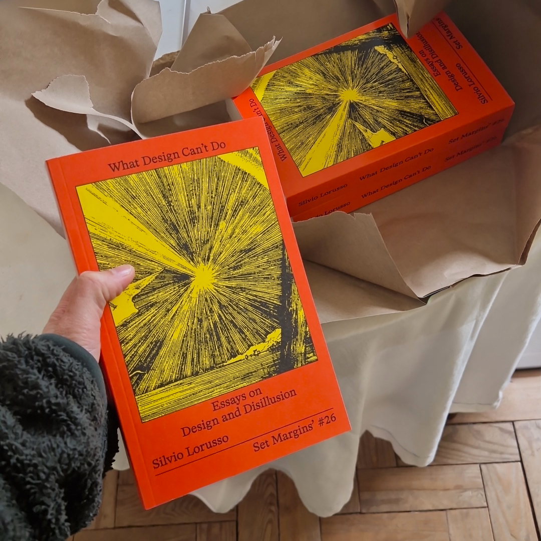
Later, the core of my interest in publishing shifted. This shift coincided, more or less, with the publication of my first ‘non-artist’ book, Entreprecariat. This book brought together, albeit reworked, a lot of different types of ‘content’ (for lack of a better word) which appeared in many different forms: zine, blogpost, longform, article, essay, paper, exhibition, artwork. The scattered nature of this experimental production made its ideas less likely to be taken seriously. At that point, I realized that for an ‘author’ (again, for lack of a better word) to be taken seriously, they have to go through the process of consolidating their intellectual production into the traditional form of a book. Here, ‘traditional’ means published by an established publishing house, provided with an ISBN, distributed in bookshops, archived in libraries, etc. Such an artifact still holds an aura of authoritativeness. Part of being taken seriously is a matter of time. Experimental formats like the ones I mentioned are highly volatile: a domain is not renewed and a viral article suddenly disappears from the web. The traditional book is another story. If it goes well, it can have a ‘shelf life’ of decades.
Why did I care about being taken seriously? The reason was not only ambition. Being taken seriously would allow me to keep doing what I was doing, that is, reading and writing. Now, the problem is that to bring to the world the authoritative artifact that is the book is not so easy – surely less easy than home-printing fifty copies of a cool zine.
If in order to be taken seriously I need to structure my work around the traditional book, and get that book published, my first and foremost concern becomes how to do so. For a writer whose interests span art, design, media and theory, the situation is pretty dire: publishers into that kind of stuff can be counted on the fingers of one hand, fees are ridiculous, royalties often a mirage. The Netherlands is an exception, given the availability of funding for the creative industries. But the funding structure is in peril due to the prominence of political figures that see art as a leftist hobby. The option of academia seems even worse , given the lengthy publishing process, explicit and implicit gatekeeping, the learned incompetence which we call “scientific rigor”, the meager improvements (when they can be called that) provided by peer review. “I’ve seen academic life destroy the best writers of my generation”, said Susan Sontag – imagine what it can do to average writers, then!
Where there is no funding and no tenure track, there is only good will, personal finances and like-minded individuals that share your aesthetic, theoretical or political view. In light of this situation, André Breton’s remark, “One publishes to find comrades!”, could now be reversed to: “One finds comrades to publish”. One of my ‘comrades’ is a person that has published half of the most interesting art and design books of the last decade, and continues to do so, mostly on his own. He reminds me of the infamous XKCD comic on the current state of web infrastructure, which I bootlegged for the occasion:

Keeping reading and writing, “keeping doing what I do”, might sound like a selfish goal but that’s not the case or, at least, it’s not just a selfish goal. In order to write I need to read, and in order to read I need good books, so I need – and I want – other people to keep doing what they do. I like to think that they feel the same about my work. In this sense, most actors involved in this mission aren’t passive. Each one does their part, however little, to let the good stuff happen. Here, the customary division of labor of publishing kinda breaks: an author does promotion for another one, the publisher is an author as well, the editor designs the book, etc. They do all this while walking in and out of the Institution’s corridors (I won’t define this term for conciseness, you know what I mean), because for most of us, there is no survival outside of it – the lucky few who make a living out of Patreon are indeed few and probably not that lucky.
Generally, these actors will have to work against the Institution. They will contribute to and draw from their own “undercommons”. They will covertly allocate resources (time, money, materials) to the ““projects”” they really care about (I put the word ‘project’ in double scare quotes because the very concept of a project is antagonistic to the mission I’m trying to describe). The mode of this practice is conspiration. So, what you call Expanded Publishing is for me first and foremost an issue of conspiring: how do you expand and solidify the network of conspirators? How do you make each one of them aware of the others? How do you stealthy allocate resources to a project? How do you even work on a mission without openly defining it? Those who get it, get it. No need for many words. Conspiration is necessarily tactical because long-term planning is simply not possible: people change jobs, budgets are cut, children are born. And yet, the ultimate mission remains the same, unaltered by the messiness of life.
Conspiration is about maintaining a mission-based secret society of sorts, developing your own steganographic language, acting as a covert agent or, in more contemporary terms, cosplaying the role you are given within the Institution in order to amass resources for the real goal. Am I romanticizing this attitude? Probably, perhaps because sometimes you need a bit of a poetic boost to keep going.
If you find this unethical, just zoom out. As Cornelius Castoriadis pointed out over and over, the Institution is a contradictory structure: it wants to organize people but it cannot allow that they organize too much. That explains the widespread feeling of one’s work being hindered by those who asked for this work in the first place. From this perspective, it is the Institution that is ‘unethical’. Actually, it is beyond ethics: it is deranged, because it presents individuals with an unsolvable double bind – you should do one thing and its opposite. To maintain sanity, better stick to one of the two.