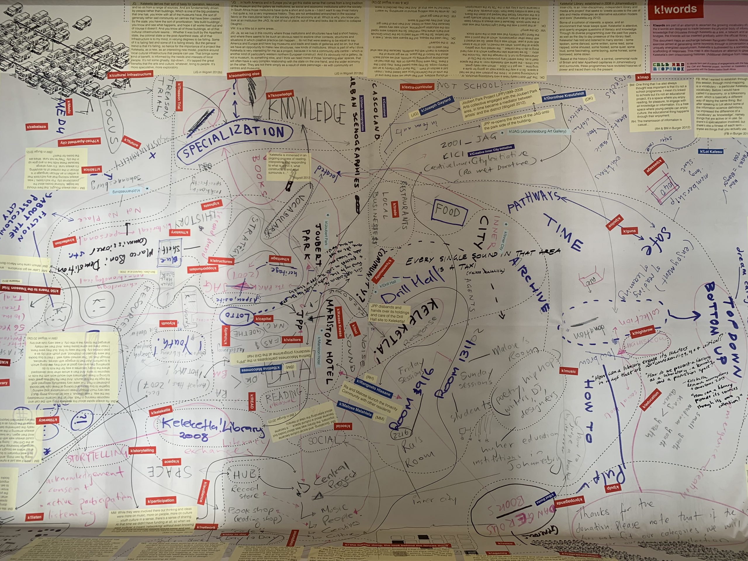
Over the past two months, the Going Hybrid Publishing group has convened for two days of design sprints. The discussions we had during these sprints were informed by our previous state-of-the-art analysis and survey of relevant tools and practices. This blog post is a recap of two design sprint days, sharing both process and outcomes.
Workflow-first Design Sprints
Design Sprints is a methodology developed by Google for iterative design research: ‘The Design Sprint is a proven methodology for solving problems through designing, prototyping, and testing ideas with users. Design Sprints quickly align teams under a shared vision with clearly defined goals and deliverables. Ultimately, it is a tool for developing a hypothesis, prototyping an idea, and testing it rapidly with as little investment as possible in as real an environment as possible.’ Typically, this process of design, prototype, test, and redesign takes place within one intense sprint of five days. However, the Hybrid Pubs group sprint is spread out over 9 days in 9 months, giving more time for in-depth discussion, playfulness, and (productive) failure.
Our approach to prototype development for hybrid publications is work-flow first design, as described by Adam Hyde in Understanding Workflow-first Design: ‘To get to good technology, it is very important to start the process by not thinking about technology at all. If you frame your thinking through the lens of technology, you will more than likely end up with an expensive failure. What [workflow-first designers] are really interested in are good workflows and, later, designing technology to encapsulate and enable good workflow.’ For this reason, the exercises and outcomes described below do not primarily focus on pub tech. Instead, the goal of the first sprint day was to create a clear problem definition, and the goal of the second day was to get a clear understanding of a regular event report publishing workflow.
Exercise 1: Defining Key Terms
The morning session of our first sprint day was an exercise in defining key terms and their interrelations. Each participant noted down up to five key terms they thought were central to making our design sprints successful. These terms were then individually discussed and placed on a large mind to constitute themed clusters. Finally, relations between the different keywords were drawn and qualified.
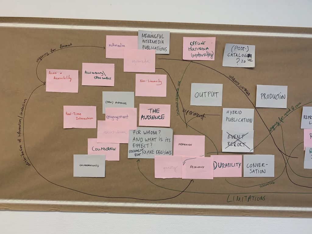
The most important takeaways from defining key terms were:
- When clustered, the key terms showed four relevant aspects of our research that always need simultaneous attention:
- workflow and workload (production): combining quality and speed through reproducibility, automation, role definition
- formal experiments (output): multimedia formats with an eye for non-linearity, real-time interaction, accessibility, off/online
- serving the audience (output): editorial vision on what to publish (and what not), for whom, and with what effect > user-driven, collaborative, engaging (new) audiences
- societal urgencies (motivation): foster quality, relevance, inspiration, accessibility, and durability, and stimulate public debate
- Navigating the four relevant aspects simultaneously by acknowledging their interrelation (defined by limitations, urgencies, workload, and resources) will inform how to balance production and output.
- ‘Hybrid publication’ is understood as a new combination of existing formats.
- Both ‘event report’ and ‘catalog’ need further redefinition or a new term altogether to fit our aspirations. Some propositions included ‘conversation starter’ and ‘conversation piece’.
Exercise 2: Idea Sketching
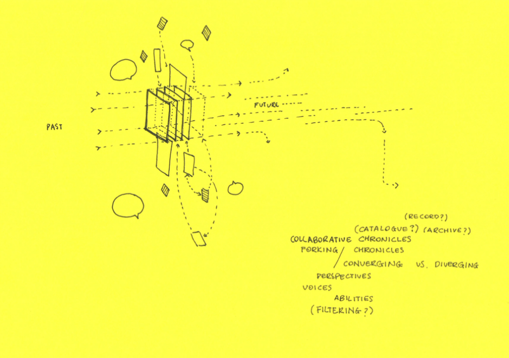
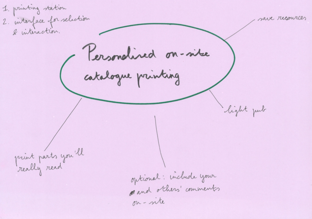
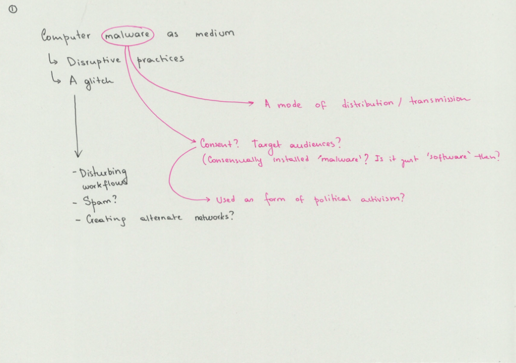
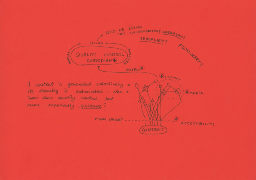
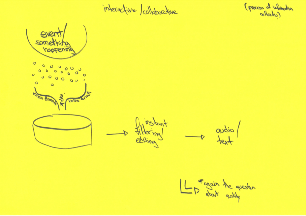
After the general discussion of key terms, the next exercise was extremely concrete: sit down with some sheets of paper, and draw concrete ideas of things you can imagine we could develop together in this project. The aim was not to find the idea that would directly lead to a prototype. Rather, it was to push our collective imagination and define the boundaries of our research area together. Some of the cuter sketches are included below, all of them can be downloaded here.
Crossroads Moment: Problem Definition
The goal of the first sprint day was to define the testing ground for future prototype developments (i.e. problem definition). We were confronted with our first major decision moment when two distinct, but separate problem definitions arose from the exercises in defining key terms and idea sketching:
1) Balancing workload, quality, and speed for event reports is very hard. Meaningful, fast event-reports can significantly add to the experience of an event, which can later feed back into an exhibition and the archive. However, we lack an editorial guideline to determine what to document, and what not. We lack a concept and design of a flexible but reproducible event report. We lack a standardised workflow to combine speed, quality, and minimise workload.
2) It is difficult to create an urgent ‘post-catalogue’ serving a specific purpose and audience. Possible purposes branch out from hyperlocal on-site publishing to global print-on-demand, with various options for interaction/commenting and digital elements (interfaces, audio, etc.).
It was collectively (and fortunately, unanimously) decided to focus on event reports during the rest of the project. The problem definition was, at this point, sufficiently defined to start bringing together the elements for a prototype, and the urgency to innovate event reports was shared among all group members.
Exercise 3: Workflow Analysis
The innovation we are looking for is a successful improvement of the current workflow of event report publishing. Therefore, the second sprint day was all about mapping the workflow of event reports. What are all the steps usually taken, efforts made, and tasks done in event report publishing?
Fortunately, all the expertise we needed to make this mapping was right there, with us, in the room. Each member of our group has experience in event reporting – as reporters, but also as producers, publishers, editors, designers, and in technical support roles. With simple pieces of paper and markers, we noted down all the process steps usually involved in the workflow of publishing an event report. The graph below is a digitized version of the result
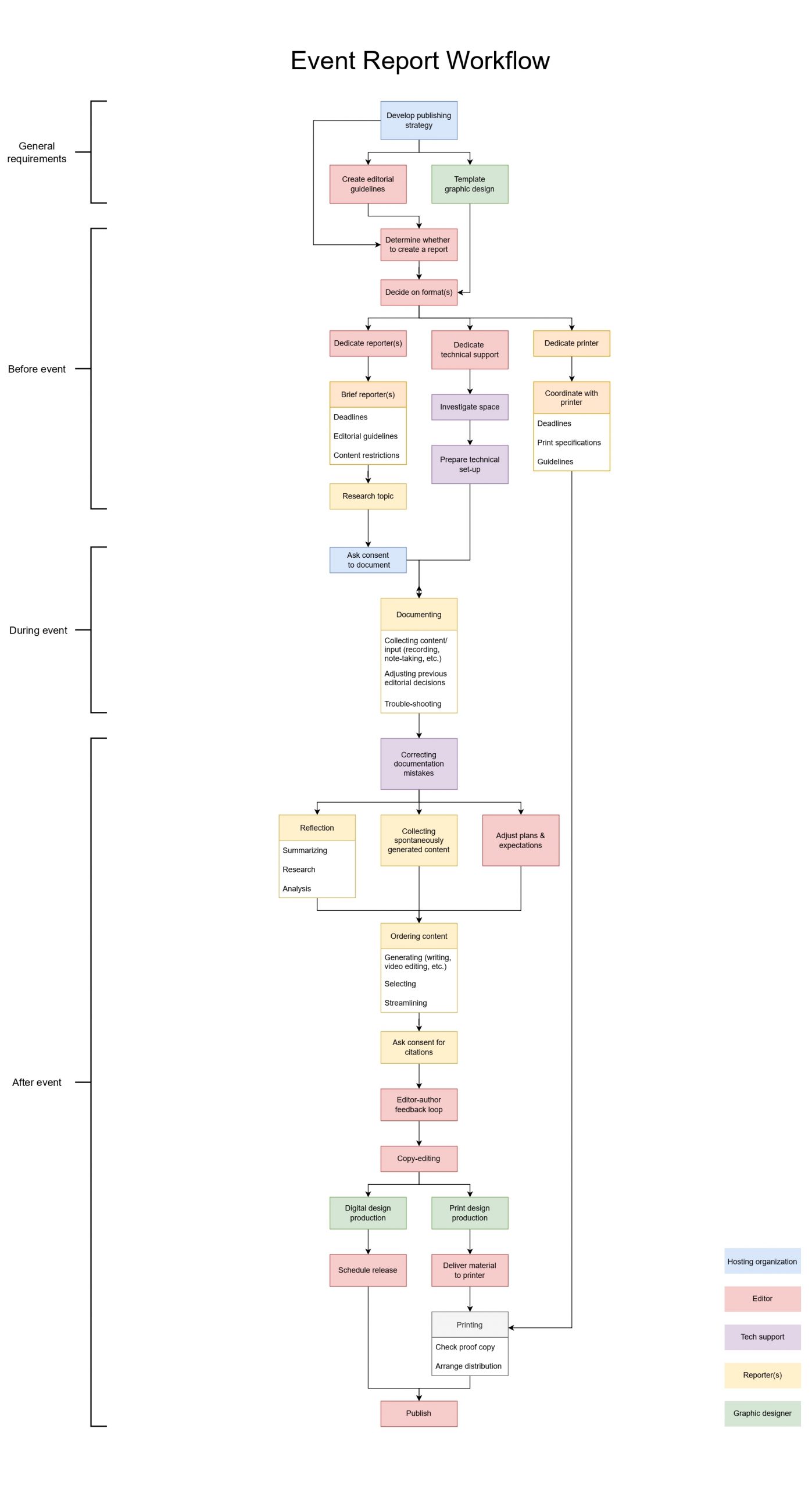
Please note that this is a format-neutral workflow: it should fit written as well as video reports and even social media posts. This is a prerequisite for later experiments with hybridization. Also, we are aware that steps may be mixed, skipped, or added in individual publication processes. However, it is important for the research to create a shared idea of the ’ideal’ workflow.
Exercise 4: Hybridization Potentials in the Workflow
With a common understanding of the event report publishing workflow, it became possible to think about interventions to create hybrids. The main goal is to create an event report that not only includes all the different nuances of the program but also implements and nourishes the critical discussion. What kind of interventions would allow for this? To make this analysis, we split up into different groups based on expertise, one group focusing on editorial work, and the other on technological support.
Early Interventions and Clear Guidelines Create Space for New Meaningful Hybrids
In the entire workflow, the most crucial tasks are documenting, reflecting, and ordering content – this is where meaning is created. However, once in the stage of creating this meaning, it is too late to create new hybrid possibilities. Workflow interventions should happen in the first few steps of the workflow to create new spaces of possibility in later stages. Also, making decisions early about what (not) to do, makes sure that people down the line are not faced with huge workloads.
To create space and time for summarizing, analyzing, and adding value, we need to streamline everything around that. This starts with a good checklist or flowchart, defining the (format) options of reports in a modular way. At the core, this is a question of publishing vision and strategy. The first question to be answered is: what defines a good event report? While this obviously differs depending on the type of event and the envisioned public, we argue that a good report includes at least:
- A summary of the event, including contextual information
- A general analysis or break-down of the program
- At least one specific takeaway. These could take many forms, including:
- Urgent question(s) to take forward from the event
- The structure or methodology used to make the event
- Information conveyed during the event
- Inspiration given by the event
Having a clear concept of a good report allows one to better brief the reporter(s). If no takeaway can be defined beforehand, this might also be a good indication that no report should be produced. Similarly, a vision of what a good report is for one’s organization will allow the use of design to create meaning and determine the best format for reports. Sometimes the best report will be an instantly produced object that can be taken home by the members of the audience. Other times, it could be a video projected on the façade at night. Having thought-through templates and design solutions ready will allow adapting to these different situations.
Start Analyzing During the Event
To speed up and hybridize the event report, a promising intervention would be to transfer the task of reflection from after the event to during the event.
For instance, a spoken summary at the end of an event is interesting in many ways. It helps the audience to digest the program, ideally adding another layer of meaning through analysis. Also, it creates ideal circumstances for hybridizing: the spoken contribution (format 1) can be recorded and published as a video file (format 2) and an audio file (format 3). After making an (automated) transcription, it can also be published as a written text (format 4) online, on social media, or in print publications such as catalogs. However, there are also clear downsides to this extremely fast analysis during the event. Its success completely depends on a single person’s analytical and rhetoric skills.
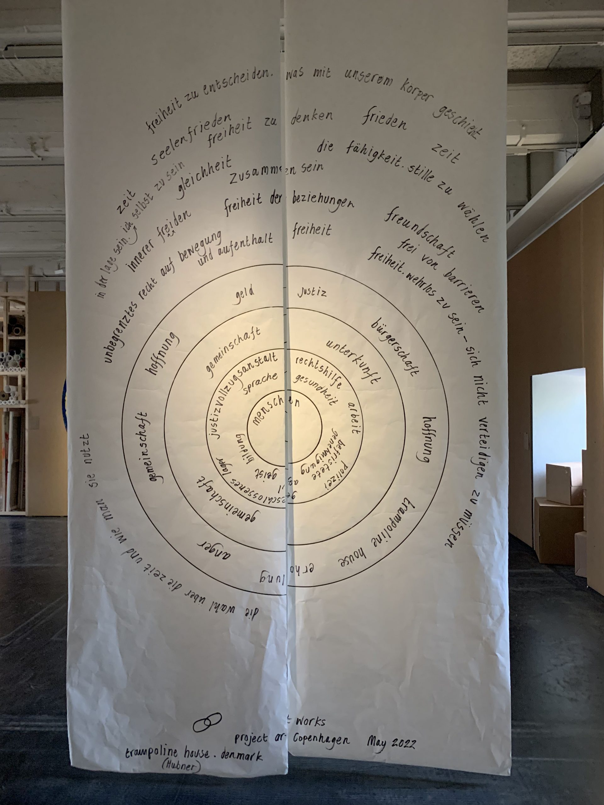
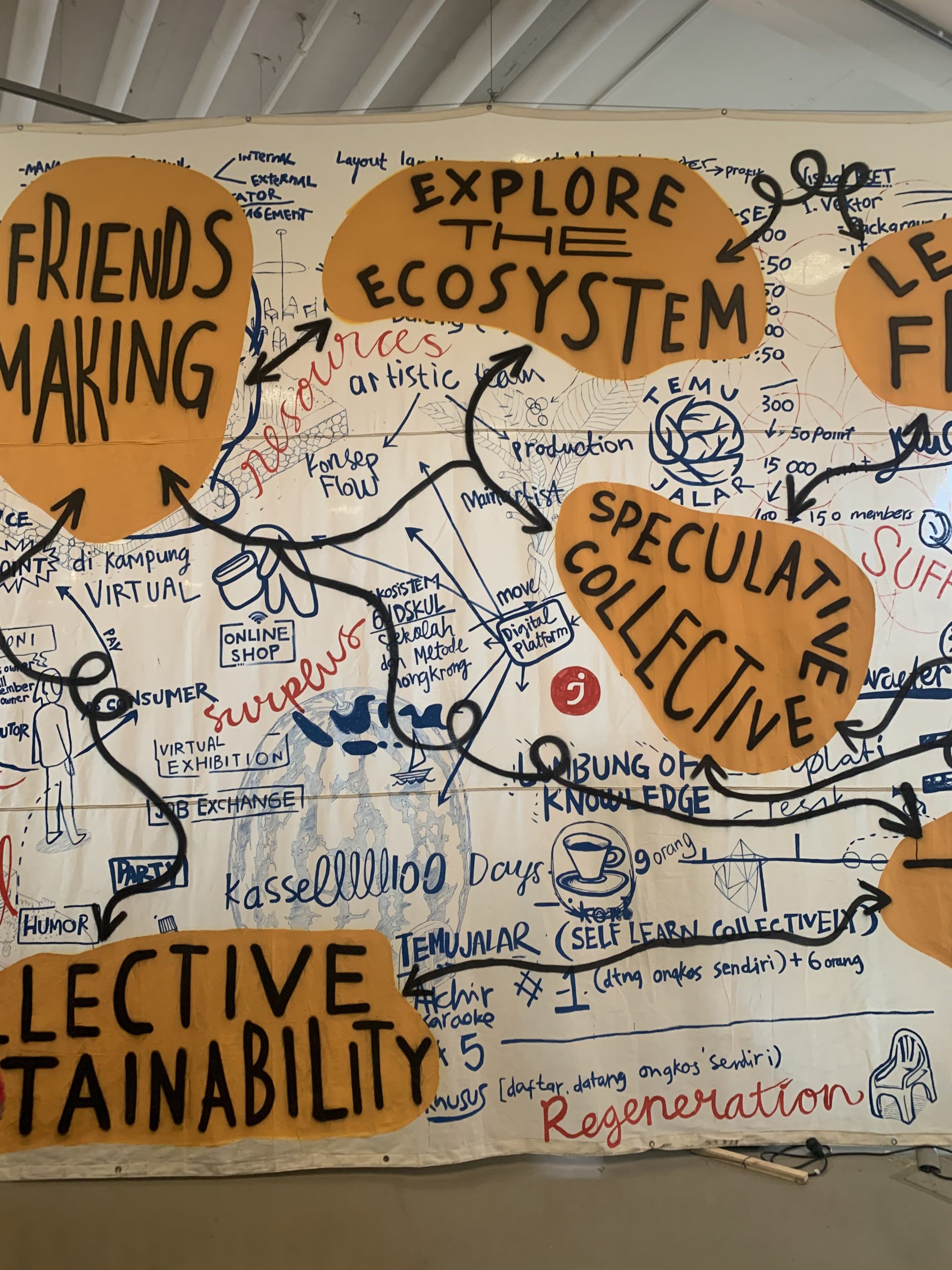
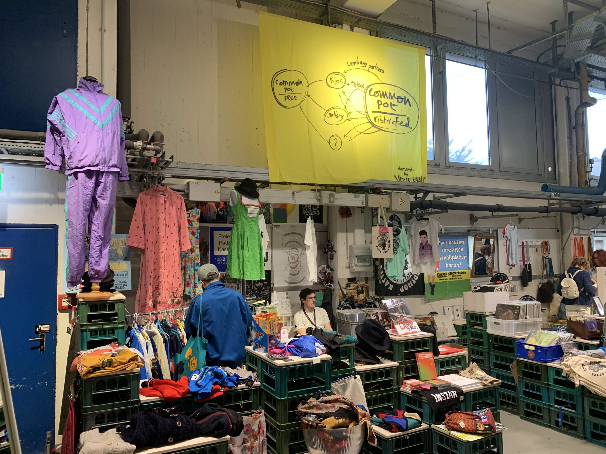
An insightful example in case is the practice of ‘harvesting’ as developed by Ruangrupa and used during documenta fifteen. It is described on the documenta website: ‘Harvesters listen, reflect, and depict this process from their own perspectives, forms, and artistic practices. Harvests can be humorous, poetic, or candid. They can take the shape of a Post-It note, a written story, drawing, film, sound piece, or meme.’ The results of this practice could be witnessed throughout the exhibition: large hybrids between graphs, notes, and artworks, reflecting the process of discussions.
The ideal to share insights and resources and write collectively, as well as the speed of sharing embodied in these harvests, are admirable. But what knowledge do they actually convey? In pictures, they almost make more sense than in the exhibition spaces, where they became a small part of an already overwhelming number of stimuli. How can event reports use the fast pace and creativity of harvest, while also being accessible?
We believe that the answer lies in more structure and technical preparation. This is the point at which pub tech and templating can make meaningful contributions. Specifically, two ideas that came up during the sprint are to use the glitchy text-to-speech AI and to dedicate a note-taking facilitator.
Glitchy Text-to-Speech AI is an open-source tool developed by Hackers & Designers that automatically translates speech to text and also permits to the creation of a quick summary by detecting a tone of voice, volume, and speed and representing these visually. For instance, the louder the voice, the larger the font. This text could be then immediately printed in a pre-designed template and distributed to the audience when the events conclude. This tool is clearly not perfect and often creates weird results, but we imagined these same weird results as a possible conversation started that could create interesting critical discussions between the attendees. Meanwhile, this text could be used by the report editor as an initial draft next to the notes from the participants.
Thus, another suggestion considered facilitating and gathering attendees’ notes. In other words, the idea is to create a design template both digital or physical to distribute to the audience before the event and where they can take notes in a non-linear way (e.g. flow charts, keywords, thoughts, suggestions). These notes can then be sent or handled to the event organizer and used as a starting point for a more insightful report.


