
I belong to the generation that never associated a folder with its physical essence. Hearing the term automatically gave my imagination an appearance of the graphical icons in the operating systems that have followed me since I became an internet user. Without questioning their function, I spent years organizing files, making collections, moving them up and down the tree structure, and during the five times I changed my machine. The better I organized my folders, the more organized I felt.
With the responsibility to move the folders around, one logic of organization became a standard. With the rise of clouds, this standard became a kernel for how software and the web should be developed. And that is with meticulous style, therefore categorization, therefore control, therefore removal of uncategorizable items on the interface. Because form follows function, and code follows thought, it is no wonder why folder templates became popular in the last 10 years of web design.
The Folder template functions as a public version of a local desktop. It should imitate the intimate style of organization, but since it’s not synced to one’s local machine, additional decision-making is needed for the style’s representation. In its inability to track the decisions made in the present moment, they’re either representing the local desktop’s past or its future.
Folder templates are most often used by users who see value in their organization, be it art or a hard skill. They’re also often used by celebrities. Here, one might wonder: what more could celebrities say that they already haven’t on social media platforms like Youtube, Spotify, and Instagram? Let’s find out by inspecting their folder organization on their personal websites.
Please go to: https://oklama.com/.
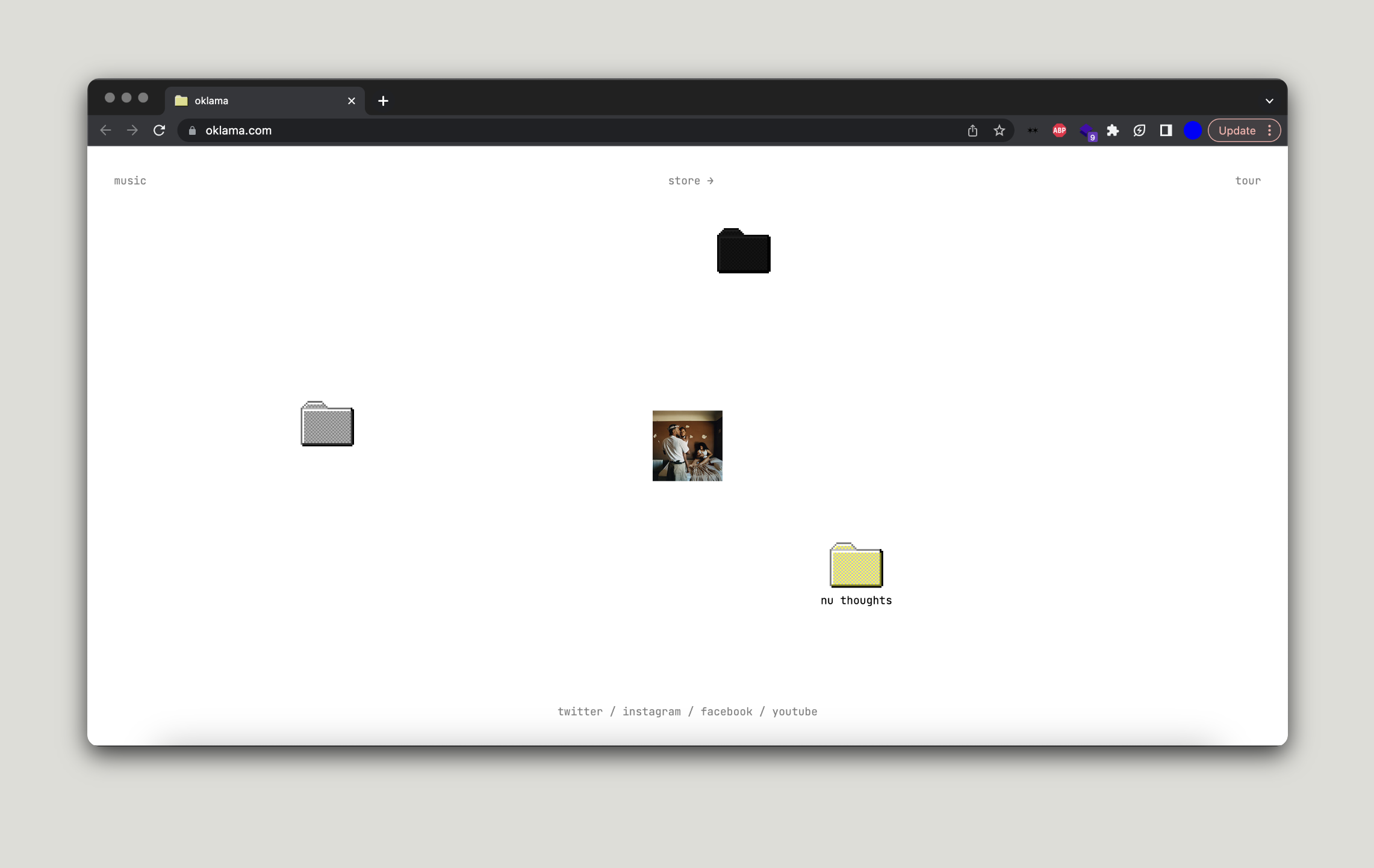
Welcome to Kendrick Lamar’s website. The homepage is an imitation of a desktop, but we don’t know whose. The closest guess is Kendrick’s, but who would think of his desktop so minimally? Let’s say that it’s a desktop Kendrick wants to have, in which case the interface becomes the representation of something inexistent, an extension of a wish.
Though it looks like the website has no header and footer, let’s not get too excited. If you resize the width of the browser from right to the leftest left you can get, and when you see the words come closer together, their presence will become clear. Header containing: music, store->, and tour links + Footer containing the big boys: twitter / instagram / facebook / youtube. No matter what kind of survival mode you put this website in, header + footer will remain the most static points of orientation. That’s what Headers + Footers are for: having a goal on the website; a safe lurking session. For users to always know where they’re going.
The body of his website contains folders. We know folders as containers we fill with personal files in our local machines. When they become public, like on Kendrick’s website, they speak of the owner’s need to convey certain transparency. He’s inviting us to click on his folders, for he is honest in saying that he has nothing to hide and that he’s open to more questions (should they arise once full access has been granted.) Any web critic will relate this gesture to his morality.
There are three folders on his ‘desktop’ and one image (the cover of his most recent album Mr. Morale & the Big Steppers). Selecting it to be the only image on the desktop next to the otherwise organized content gives it a high value. It takes less than a second after one has entered the website to enlarge it. In what seems to be a portrait of a heavy domestic situation contained between white-spotted walls, gun-equipped Kendrick is wearing a thorny crown. Once clicked, the image darkens the homepage’s white background and hides all other content on it. I almost feel asked to take a minute of silence in my user experience, to appreciate, to mourn. And if possible in my mourning, to dig for the answers. Being the most accessible file on the desktop, it speaks of a recent, yet most important, activity (or product?) in the life of Kendrick Lamar.
With a wish to put an end to the holy effect it sprinkles over the interface, I click just outside of the image frame. Only one of the folders has a name: nu thoughts. It is located to the right of the cover image and just above the website’s footer. What I assume the folder contains is some sort of a representation of what he’s currently busy thinking about. When I click on the folder once, a diary is what I find. It’s a typed letter that briefs Kendrick’s daily practices of listening, writing, reflecting, and habits such as not using the phone. Below the letter is a black & white image of him singing. The text-image composition leads to conclude that he’s extremely focused in the process of his creation.
It is a good time to quote Alexander Galloway on the interface from The Interface Effect. According to him, an interface is “not something that appears before you but rather is a gateway that opens up and allows passage to some place beyond” and “this state of ‘being on the boundary.’ It is that moment where one significant material is understood as distinct from another significant material. In other words, an interface is not a thing, an interface is always an effect. It is always a process or a translation.” Now that I’ve cracked the kind of effect Kendrick is after, what am I to discover in the other two unnamed folders on Kendrick’s website?
Clicking on the top folder leads to the folder’s name specified in the hyperlink: master. It contains a date and an image of his hand holding a bible-like book named after his most recent album and two CDS (one of the original and the other of its master copy?). The image changed since the last time I checked this page, which tells us that he’s been synced with his website. He grew a comfortable habit of updating it.
The other unnamed folder called step leads to a page with an image of what looks like an announcement by oklama. The scan of a document announces the release and date of his latest album. At the bottom of it, it says Appreciate Your Patience. It looks very formal.
Let’s go back to the homepage and keep ignoring the strong presence of the header and the footer. After inspecting the website’s code, I’ve learned that the folders + the image are draggable elements. Not only is his private now public, but he also gives the public the agency to position his private parts as they wish. It is always nice to give users elements to interact with and make them think that that’s what online freedom means.
Kendrick’s website is built with minimal update effort. That’s why it literally imitates organizational logic of a local machine. If a website could speak, this one would say: “This is how Kendrick would do it offline anyway”.
Most users, celebrities or not, need a website that requires a minimum to zero effort to update. What minimum effort means in this case is dragging and dropping well-documented material from one grid to another. Users consider content to be more valuable than the digital grids that hold it together, and that’s one of the reasons why web templates don’t change much over time. Grids can pretend to look less like grids, but their capturing logic remains inherited. Minimal update effort is the work of a poetic regime and therefore “receptive to diverse political adaptations”. 0 effort to update, on the other hand, means that somebody else is investing minimum effort to do it for you.
Let’s look at a slightly more complicated example of a Folder Website: https://web.archive.org/web/20220324153310/https://okay-kaya.com/.
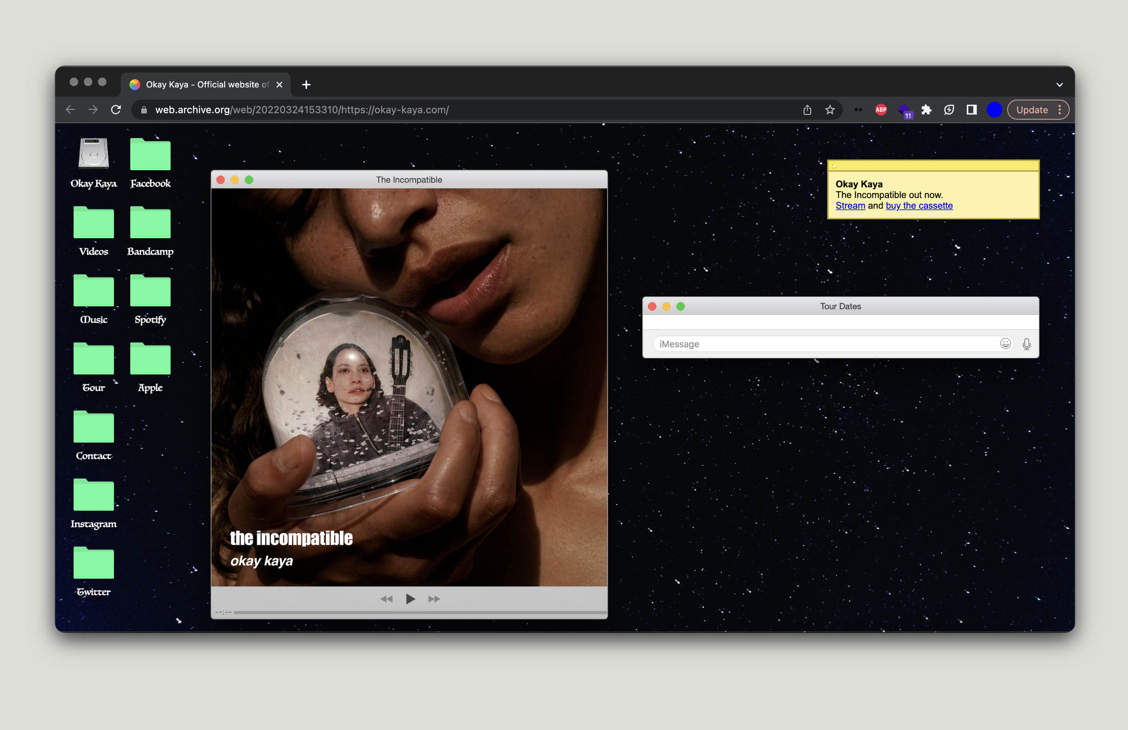 Note that we are using a Wayback machine to go back to a specific version of Okay Kaya’s website. For a better experience of the design, I recommend x-ing the Wayback machine’s header and entering a full view of the interface.
There’s a lot to look at. A lot of folders before a starry night. We have entered a very specific user situation. It is safe to assume that it was she who left the windows (The Incompatible, Tour Dates, and Sticky Notes) open on a shared desktop. Although they all look like intimate files, such as iMessages conveying tour dates, it’s a different kind of privacy we’re looking at.
Compared to Kendrick’s mystery in folder names, Okay Kaya is more determined about presenting different versions of her public self. It’s the kind of interiority that is meant to be shared by an emerging musician from the beginning, and that is the platform-extracted self. Her extracted parts are to be found on every big boy: twitter / instagram / facebook / youtube / spotify, as if each new tab opened by the click on each named folder will compile her whole self.
But that was then, March 2022. Not so long ago; still during the pandemic. If you look at the current website, you can tell that the design has simplified and become an imitation of a pocket business card (analog —> digital corporate mentality). The need to extract herself across platforms is no longer of the highest importance, that is, a folder on its own. There are zero folders to be found. She no longer needs you to tune in. Her extracted selves are now social icons captured in a container and modestly placed at the bottom left corner of the homepage. It’s more user-friendly like that.
But have you ever seen a folder website that resembles an average user’s desktop, that is, loaded with folders and media files on top of each other?
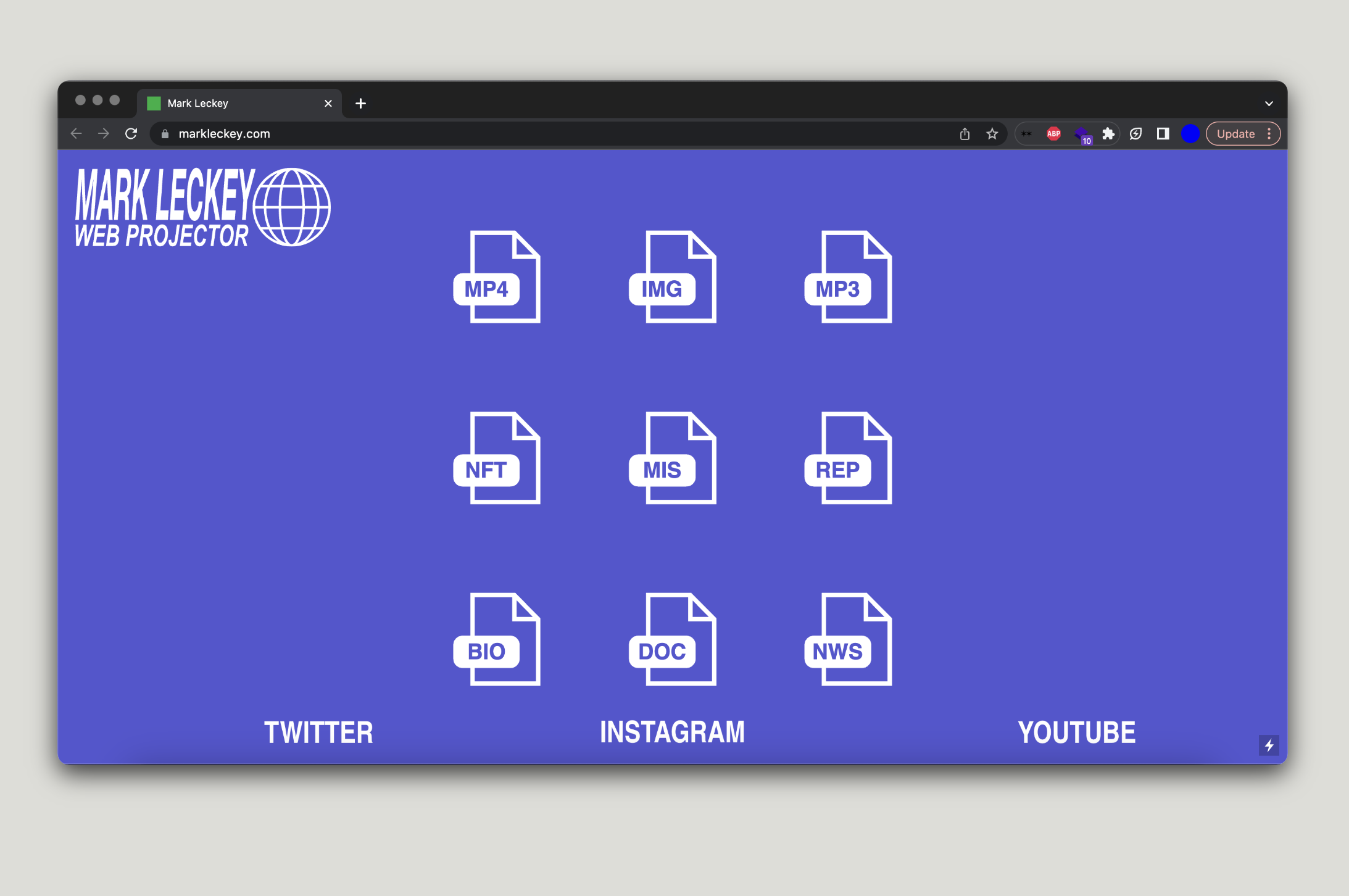
Mark Leckey’s website is a perfect example of an organized mess. On the top left corner of the homepage, a bold logo image says: MARK LECKEY WEB PROJECTOR and a globe icon next to the two rows of the text. This tells me that Mark sees his website as a different kind of project than the ones he usually develops. He’s not treating the website as a public repository where he can quickly throw in whatever he’s documented for the public gaze, even though the amount of content may contradict this point.
MARK LECKEY WEB PROJECTOR and a globe icon next to it refers to Mark’s occupation of one of the internet’s galaxies where Mark organizes different projects in different folders/media icons such as MP4, IMG, MP3, NFT, MIS, REP, BIO, DOC, NWS. If the website could speak, this one would say: “Welcome to my internet. Click to figure out.”
One might think of him as multi-talented, hyperactive, perhaps manic. A fearless artist whose sharing of the work is only meant to open a discussion that will further shape its next version. More than fearlessness, his website reveals that he’s just pretty organized and desires to be in control of his content. He enjoys what the software enables him to do best: decide what belongs where. In this galaxy of the internet, he is the sovereign.
Mark’s website is built on Cargo CMS.
Cargo content management software, like any other, allows everyone to organize their online content in abundance. It offers a broad icon library and the user ability to turn their favorite ones into anchors. Mark Leckey used this method of organization which explains why every next click leads to a new page. For example, if you click on one of the main categories like MP4, you’ll be directed to a page where you need to make a decision of which MP4 year made by Mark Leckey you’d like to look at. Thanks to the design being so simple and flattening the importance of any, I can even close my eyes when selecting.
2013. Cinema in the Round 2077 (2013). Back. 2016. FEELIN THE CAT (2016). I click on the logo to go back home. I felt trapped for a second there, lost my attention span. I click on the Instagram icon and scroll down his feed. It’s not Mark’s fault.
Though Kendrick’s + Kaya’s websites are custom-built and seem to be independent of traditional CMS software (i.e. Cargo), they reflect the same logic of organization. Alexander wrote that ideology “ideology gets modelled in software. .. The computer is the ultimate ethical machine. It has no actual relation with ideology in any proper sense of the term, only a virtual relation.” And that’s why every Folder Website looks the same.
But that’s not the reason why we barely spend any time clicking through other people’s public folders. All this poetic arrangement on interfaces is the work done for the sake of experiencing the selected snippets of their practices in a mode with reduced noise of social media platforms. Despite their attempt to be the digital islands where users can have a relaxing bath in their content, they exist to legitimize their profiles on social media platforms. They’re like, a signature slightly different from the blue checkmark earned by the platforms’ verification process. Slightly different…How long before a user clicks on their IG icon to check how many of their peers have a similar taste?