With the intention to test and eventually adopt open standards for the ToD project, we made some experiments on EPUB. In order to understand clearly how this format works, we developed a publications’ catalogue using Sigil. This software includes both a code editor and a WYSIWYG one, which has useful formatting tools (such as bold, italic, indents, text-alignment, lists), but it doesn’t have a button to create links.
EPUB’s creation process is very similar to web design, that’s why basic knowledge of XHTML and CSS is necessary in order to format the text and define styles for the content. The main distinction is that while different web browsers share, more or less, the same page’s visualization, each reading platform render EPUB files in a different way.
In the case of EPUB, re-flowable content, which is a webpages’ feature as well, not only means the layout changes according to the window size, but also that each reading platform can render the document through a default “platform-style”. In this way the reader defines formatting options, like text-alignment or font size, then applied to every book. In addiction, some platforms – such as iBooks – simulate page turning, or – like Stanza – show the content as divided in slides, while some other only allow to scroll the content. Therefore, even if the style is defined in the CSS, it’ll be probably overwritten by the platform.
Re-flowable content can be seen from two different perspectives:
1. single book-oriented: design and layout are allowed, but only considering the limits of the platform.
2. platform-oriented: design and layout are not allowed, because the reading platforms already contains design preferences the user should choose among.
The second one, which seems to be prevailing, can be considered harmful to the ebook’s spread: the visual differences between books are annulled without a good reason. A middle way is desirable: the reader should have the possibility to modify the layout set by the designer according to his necessity, for instance making the font bigger.
In order to respect EPUB requirements, the designer (is that still the right word to define him/her?) should avoid any kind of fixed feature and set every element in relative relationship with the page and the other elements. An example could be the cover: its height shouldn’t be set a dimensions in pixel, but as 100% of the window’s height.
Testing the EPUB beta version we realize several reading platforms – like Bookworm – don’t support font embedding. We also found out font size is different among platforms, so it seems convenient to set relative font size, using em units for instance.
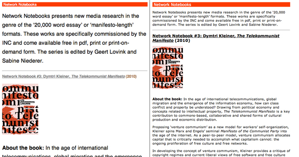
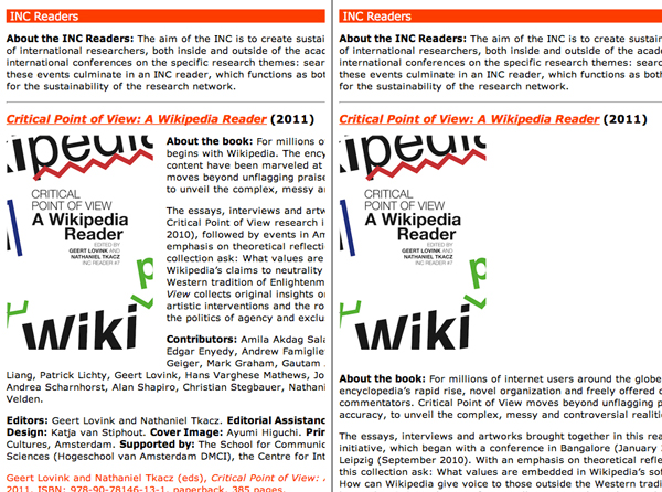
Setting the text on the right of images (fig. 1) made totally disappear many of them on some platforms. That’s why we had to apply a more standard solution, with the text going under the images (fig. 2).
In the case of EPUB, design process is to be considered in a very different perspective from traditional one. The designer’s choices are based on what different platforms allow. As a result of those very strict limits, design seems like a “least common denominator” practice.


