
[Parts of this essay are now included in the book What Design Can’t Do (Set Margins’, 2023).]
“The thing that pisses me off the most is the degradation of the intellectual role of the designer.” This is what my friend tells me, as we listen to each other’s anguished outpourings replete with VAT numbers, freelancing and short-term contracts. And that made me wonder what constitutes that role, whether it actually existed, how it vanished and what replaced it. Trying to answer these questions, I’d like to focus on graphic design as it is the field where I come from, and I believe it represents a paradigmatic case within the so-called creative industries.
These days we hear a lot about the gig economy, the economy of little jobs, of chores. Platforms like Uber, AirBnB or Foodora are quickly becoming the direct intermediaries of any kind of service, a seemingly unavoidable development since they are prone to monopolization. Graphic design is no exception: online marketplaces like Fiverr and TaskRabbit offer access to graphic designers able to create a logo, a website, a poster.

On Fiverr, whose motto is “do not just dream, do”, a logo apparently costs between five and nine dollars, the same goes for an infographic or an illustration. On TaskRabbit (“we do chores, you live life”) the hourly rates seem to fluctuate between 20 and 60 dollars per hour. The description of a tasker strikes me: Barbara J., $25 per hour, claims to be a self-taught graphic designer, since all her previous jobs included tasks where she created graphics. This generalization of graphic design is the keystone of my argument on its potential intellectual role.
Automation, Defaultism and Template Culture
Reading the recent headlines, it might appear that we have been teleported back to the ’30s, a time when John Maynard Keynes, a highly respected economist, could say without the slightest hesitation that soon weekly working hours would fall down to fifteen. This forecast is a vivid expression of the zeitgeist, imbued with a firm confidence in the advent of the “leisure society.” The reduction of working hours would have been made possible by machines, able to automate an increasing number of processes.

The future is now (photo: Justglenn)
Nowadays, the hype around automation is back to its record high thanks to the advances in artificial intelligence and to an ultra-cited 2013 study according to which 47% of the jobs currently performed in the US are put at risk by computerization. The study includes a ranking of about 700 professions ordered by probability of automation in ascending order. Graphic design occupies the 161st place. Not bad.

Bot or not?
However, I think that graphic design (in which I include web design as well), has already undergone the drastic effects of automation, at least in a broad sense. The Web is full of generators capable of producing endless permutations of logos. Some of these generators make use of neural networks and therefore have the ability improve their designs by “learning” from their mistakes. But there is no need to be a Singularity zealot to acknowledge the revolutionary impact of digital technology on graphic design. In the early ’90s several desktop publishing applications found a widespread use among professionals and ordinary people alike. A few years later “photoshop” became a verb, and, together with other elements of the Adobe suite, it populated the collective imagination. The statements of the designers who were first inspired by computers are full of enthusiasm: “We are the primitives of a new technological era”, the Emigre duo proclaimed, omitting that so was everyone else. At the same time, the work of these pioneers, full of proudly executed mishaps, seems to conceal a passive-aggressive form of Luddism.

April Greiman (1986)
In his dystopian novel Player Piano (1952), Kurt Vonnegut depicts an almost completely automated society where it is sufficient to simply record the movements of a worker on a disk to ensure that the machine will endlessly repeat them with full accuracy. When I open Word or InDesign, I run into a similar situation, since the page, only apparently blank, already contains a series of design choices registered in advance, such as the margins’ width.
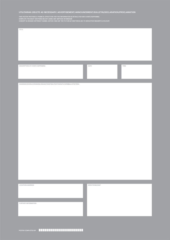
Daniel Eatock (1998)
That’s how template culture comes to life, where every new project actually derives from a long sequence of previous projects. In the mid-2000s, default settings became fashionable. Why waste time on design decisions when one can celebrate the aprioristic purity of the template? Aren’t we like dwarfs sitting on the shoulders of giants? Perhaps, this is the most authentic expression of the idealistic impulse that permeates the modernist ideology. British designer Daniel Eatock quipped on this trend by producing a generic poster that could be used for any type of event. In this way, as it is the case in Player Piano, Eatock had done nothing but make himself obsolete.
Appropriation, Vernacular and Visual Relativism
No More Rules. This is the title of the study on the influence of postmodernist mentality on graphic design conducted by Rick Poynor. During the analyzed period, ranging from the early ’80s to the early 2000s, designers subverted, one by one, all the commandments that until a short time before had seemed carved in stone. With a sans serif font, of course.
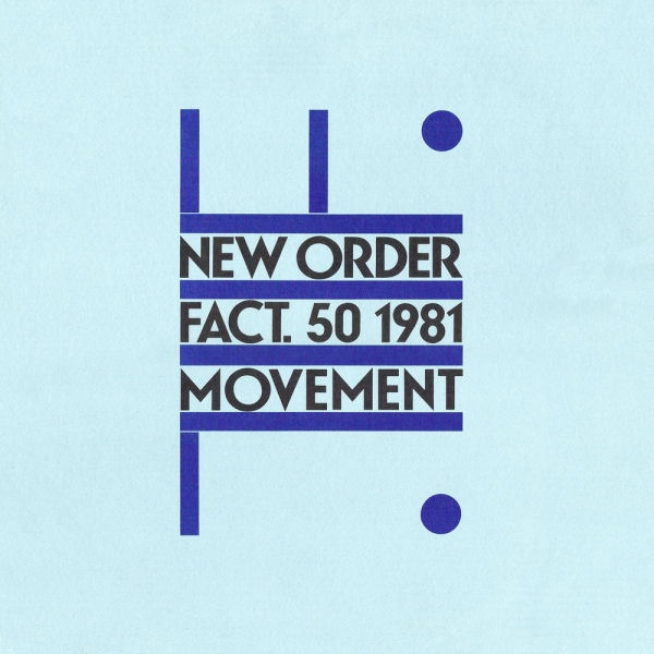
Peter Saville (1981)
Among the various trends that characterize this era, there is one that interests me particularly, and has to do with appropriation. To understand what I mean just look at the sleeve of The Man-Machine by Kraftwerk, inspired (to say the least) by Russian Constructivism, or the work of Peter Saville, who “cloned” a futurist poster by Fortunato Depero to create a cover for the band New Order. Are we in 1981 or 1932? No hope of progress is left, only an eternal return to the origin.
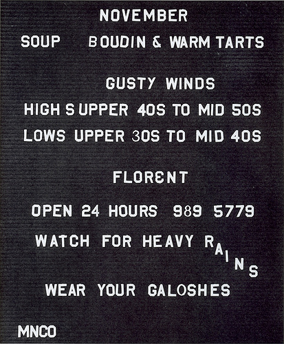
Tibor Kalman (1987)
A few years later, Tibor Kalman turns his gaze to “low”, vernacular visual cultures, with a move analogous to the one made by Robert Venturi, Denise Scott Brown and Steven Izenour in the field of architecture. It’s time to learn from Las Vegas, but also from the supermarket sign or the diner menu. The focus is now on the “design without designers”, as it is phrased in an invitation to an event organized by Kalman himself.
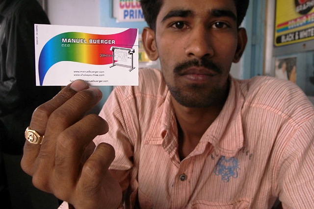
Manuel Buerger (2009)
The fascination with everyday graphics, along with the historical rebounds of a growing number of designers, has deprived graphic design of any anchor. Yet again, a few years later, rules forcefully reappeared. Not surprisingly, many Italian graphic designers that have experienced the postmodern period consider it a sort of Dark Age. However, the seed of doubt has never been fully eradicated and the consequent visual relativism is a constant presence in today’s design practice. Take German designer Manuel Buerger, who went to a copy shop in Mumbai to commission the design of his own business card.
Intellectualization: the Writer-Designer
Perhaps partly because of this visual relativism and the democratization of tools, graphic design, at least the one produced in some avantgarde schools, underwent a process of intellectualization. A term that indicates the tendency to make writing and research the pivot of a designer’s practice. Obviously, texts penned by graphic designers are hardly a novelty: in 1963 Ken Garland wrote the First Things First manifesto while in 1978 Albe Steiner published Il mestiere di grafico.

An essay by the Dutch studio Metahaven (2012)
The change that I observe concerns a certain insufficiency of visuality. While the texts produced by Steiner or Garland acted in one way or another as a support to their practice, new designers develop research-based projects, that often consist in the production of a text and only afterwards in the design of the artifact that will host it (maybe even delegated to another designer). Thus, several designers gradually shy away from doing graphic design as it is commonly understood, and they become primarily writers.
Diluted Design
As a result of the developments I described, graphic design culture has, at least superficially, become part of popular culture. Everyone knows that Comic Sans, the vernacular typeface par excellence, is a cause for mockery. While intellectualized graphic design, where one writes more and designs less, remains the domain of a cluster of enlightened schools and a few art galleries. In this case, the intellectual role of the designer is only recognized by other designers. There are exceptions, but as such they corroborate the general unsustainability of this kind of practice.
In addition to being part of popular culture, graphic design has become a common practice, as in the case of our tasker who, maybe between an Excel spreadsheet and the other, had to jot down a logo or think of the layout of a presentation. According to Ian Bogost, we’re all “hyperemployed”. Instead of merely practicing our official job, we perform many of them, before, during and after working hours. Tasks such as doing marketing and PR for ourselves and for our products, administering our weekly or monthly schedule, setting meetings, resetting passwords, and so on. Many of these include graphic design operations. Therefore, if we consider –and I think it is fair to do so– the replacement of a cover image on Facebook or the adoption of a new template for our blog a design endeavor, graphic design suddenly acquires the same professional and cultural value of sending an e-mail. In an episode of the Età dell’oro, a web series on the hardships of a group of creative workers from Milan, we see the art director instructing the graphic designer with a perpetual “two points on the left, no no, two points on the right”. Graphic design becomes micromanagement, while the designer turns into a Kafkaesque, voice-controlled mouse.
Only a few designers equipped with one or more master’s degrees, would serenely accept such perspective. This is particularly true in Italy, a country where a nostalgia for the heyday of “public utility” graphic design is still strong. An era in which graphic designers could devote themselves to major public works and thus build, establish and ultimately defend their cultural role, both directly and indirectly. Furthermore, that period seems particularly dear to contemporary designers because it was driven by a series of ideals, again linked in a way or another to Modernism, somehow easy to embrace. Values that were universal, pure, not polluted by fastidious ambiguities or contradictions.
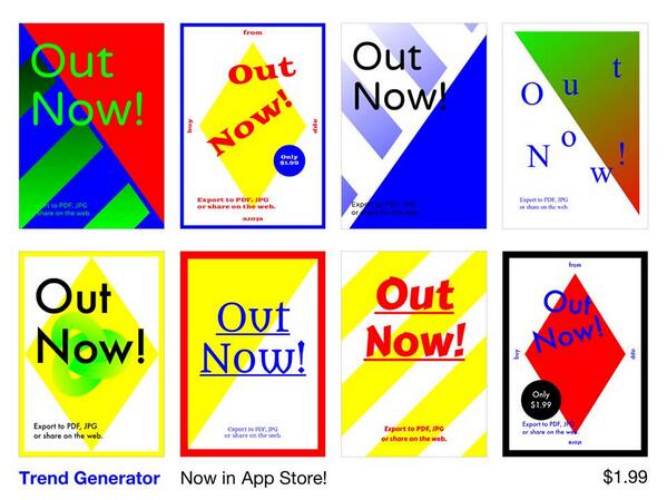
Autotrend
Before the advent of TaskRabbit, Italian graphic designers were already active in the defense of their professional and cultural position. The battlefield was that of unpaid competitions, such as those managed by Zooppa.com. One of the main tactics, back then as now, was to ridicule the lack of a “design common sense” of the amateur, who was guilty, for instance, of having aligned the text to the right. Poor fool. However, common sense can be seen as a time bomb within the field graphic design: as the commandment that forbids the use of Comic Sans for something that is not comical became commonplace, so have the few precepts that are sufficient to create a decent poster. And if these, together with fashionable tricks, are then incorporated into commonly used software and templates –as it happens for example with the Trendlist generator– the bomb might explode soon.
When attacking non-professionals, graphic designers generally appeal to the notion of quality. Thus, they argue that the client should be educated in order to recognize it. Perhaps, it is still possible to tie the concept of quality to some specialized forms like type design or the design of wayfinding systems. Or maybe one could argue about quality with some degree of objectivity in the case of large-scale projects, such as the identity of big museums or companies. However, going back to diluted graphic design, I want to focus briefly on one case that proves the fragility of a qualitative approach and includes the developments I described.

Lindsay Ballant proposed a comparative analysis of the campaigns of Hillary Clinton and Bernie Sanders. According to Ballant, the communication system of Sanders, less rigid and more messy (from her point of view more “authentic”) than the impeccable corporate image developed by Michael Bierut/Pentagram for Clinton proves paradoxically stronger. This is because it is able to accommodate diverse or even contradictory instances.

Given the results, it seems that the real communicative hurricane of the last elections -exponentially more chaotic and “authentic” (if by this we mean grassroots) than Sanders’ one- was largely ignored by the design community. Trump’s “meme machine” seems to have played a crucial role in his rise: the memes forged on 4chan and 8chan, then “gone to die” on reddit, were finally employed by the official accounts of the candidate. As a result, they were shared and discussed globally by the most prominent media outlets under the label of the Alt-Right, and even by the official Clinton’s blog. The radical amateurish assembly of Trump supporters mixes cinematographic references, appropriations of comics, Third Reich symbols. Sometime it employs free software like Gimp or easy to use online generators. In addition, the esoteric cult that animates the production of these memes has an undoubtedly literary value, and it is not that far from complex satirical religions provided with sacred texts like Discordianism.
I happened to show some Pepe memes to a group of students that were recently introduced to the world of graphic design. All of them, covertly smiling, thought mine was a joke. How could I blame them? After all, they have been exposed for months to an unspoken Manichaeism in which the simple abstractions of design are Good, while the material world, including the public and clients, is Evil. At the same time, it is also hard to blame a society that is not able to recognize the value of graphic design anymore. Clearly, I don’t speak of the carefully created design of Google, offered for free to millions of users. I refer to the long tail, populated by designers who are forced, in order to survive, to convince their client that the layout specifically developed for a website, with little resources, is better than the interface of, say, Medium.com, a superb free platform.
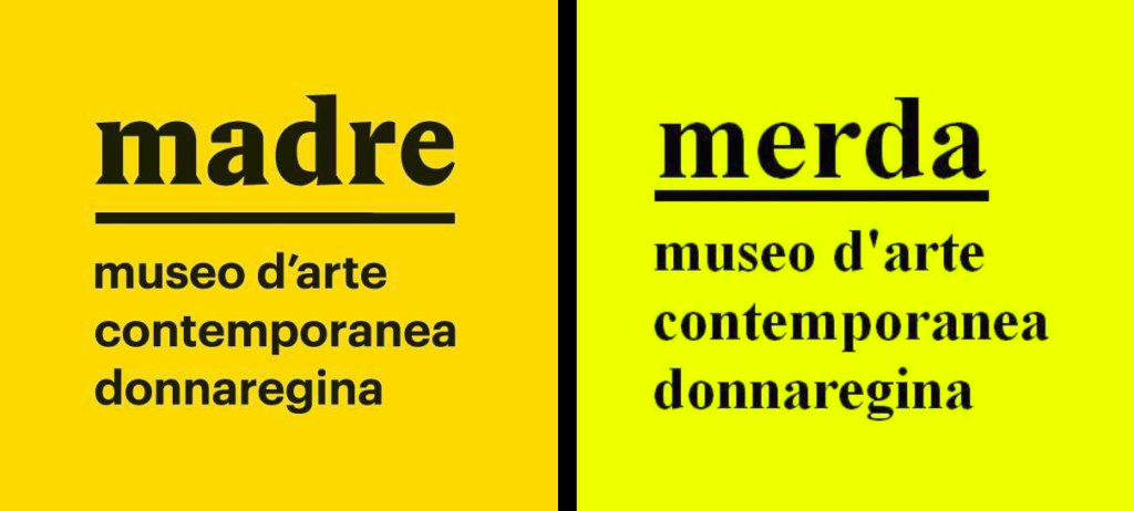
In order to weigh the perceived economic value attributed by the public to the work of graphic designers, I’d like to resurrect the story behind the logo of Madre, a contemporary art museum in Naples. Apparent cost of the restyling: 20,000 euros. Result: popular uprising on social media accompanied by a plethora of parodies. The not-so-veiled message: “I could do that myself.” Last year, following the Epic Fail of a public awareness campaign entitled “Fertility Day”, the Italian minister of health asked creative workers to help out with the design of the next one. At no charge, of course.
Make the World a Better Place
Where to ground graphic design education, when all that concerns it appears relative? I studied Industrial Design at the Politecnico di Bari, which is certainly not known for its excellence in design. I remember one of the first days of college, when a contemptuous professor proclaimed without the slightest compassion that only a few of us would actually become designers. That made me think of Highlander, with its unforgettable “there can be only one.”
Although the field of design is often characterized by teamwork, competition is part of its educational imprint. An attitude that not only involves the relationship with others, but also with oneself, as students are immersed in an ocean of late nights, insomnia and self-sacrifice. An attitude that capitalizes on passion and on the idea that design is not a job but a lifestyle. At one point, among my colleagues, a novel custom spread out: in addition to friends and family, students would include in the acknowledgments of their thesis also coffee, because, as Coffee Company reminds us, “sleep is overrated.”
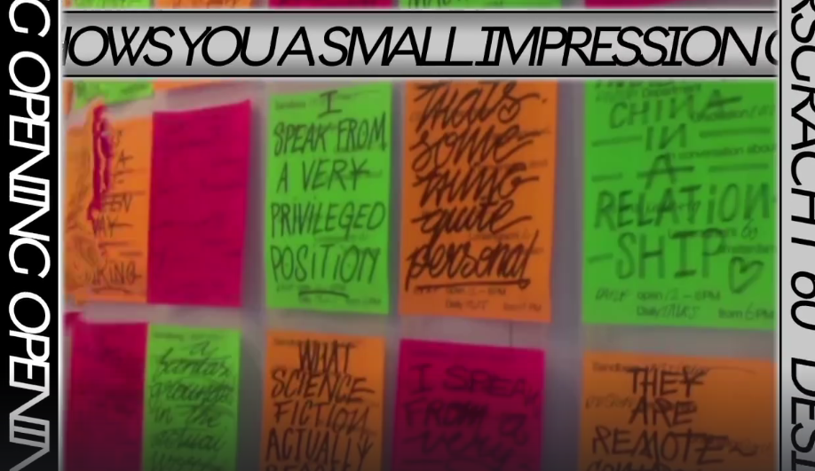
Sandberg Instituut graduation show (2016)
Once one is ahead of the competition, where should they devote their talent? Recently, I read a compelling interview with Ruben Pater, who teaches at the Royal Academy of Art The Hague, one of the best design schools in the Netherlands, which is in turn one of the homelands of contemporary graphic design. Answering a question about his teaching method, Pater declares that he tries “to motivate designers to focus on making great work, and while doing that, also imagining the needs and interests of the other 99%.”
![]()
What has been dubbed critical design is partly driven by this benign and necessary motivation. However, this attitude may lead to a curious situation: aspiring designers develop an urgency to solve an ambitious problem affecting some distant countries, while in the evening or in the weekends they might do a bullshit job, technical term coined by anthropologist David Graeber, perhaps in a call center. Basically, as they concentrate on the “other” 99%, they forget to be part of it themselves. It’s hard not to notice an analogy with the world of Californian startups, eager to “make the world a better place.” And the aspiring designer, whether critical or not, doesn’t seem so different from the startupper working uninterruptedly in his basement in order to create a revolutionary product.
Furthermore, both the design field and tech startups are affected by what Evgeny Morozov calls “solutionism”, the idea that to solve a “wicked”, social problem, a technical solution is sufficient. However, such confidence in technology and science seems dubious when expressed within graphic design, a fundamentally humanistic field whose scientific basis appears vague. Perhaps, it would be better to speak of graphic design as a language, highlighting in this way its ideological component.
The fact that design is always imbued with ideology is indeed what Ruben Pater, an avid critic of design solutionism himself, highlights in his The Politics of Design. He begins the book by pointing out a series of often obliterated expressions of privilege, such as the the mere possibility of reading a text online, a benefit granted to only 40% of the world population. Clearly, we shouldn’t dismiss the denunciation of privilege as a sanctimonious do-good design attitude. And we must take into account the dramatic material imbalances within the 99%. But if it’s true that, as Tony Fry argues, design “either serves or subverts the status quo”, it is legitimate to ask whether within certain instances of design education, the impetus to subvert the status quo is precisely what ultimately serves it.
Both the designer in the call center and the startupper in the garage are victims of the cognitive dissonance of what I call entreprecariat, the mutual influence between an entrepreneurial pressure, that happens especially at a social level, and an increasing form of perceived precarity, which is at the same time material, professional, and existential. Both the designer and the startupper seem to be living at the same time two parallel lives, both are divided subjects.
One possible way out for the aspiring designer is exactly education. Since market dynamics rarely allow designers to develop a practice that is intellectually fulfilling, some designers aim to become teachers, tutors, guest lecturers. The protected space of the school provides the ideal backdrop for endless discussions on social issues. Referring to the master programs in creative writing, Timothy Small speaks of a big Ponzi scheme, “a process in which one writer without money begins to teach in order to supplement their income, creating 15 writers without money who in turn will begin to teach thanks to the recommendation of the first writer-teacher, and that in turn will produce another 15 writers with no money, etc, etc.” I wonder whether graphic design follows the same logic. In the article, Small interviewed a young writer-teacher based in Brooklyn, who claims to have chosen to do a master’s degree to “buy two years of time to write, […] two years of the kind of life that rich people have every year, in which money would not be a problem.”
Temporary Autonomous Élites
At the Poltecnico of Bari, where we could barely print a black and white A4 sheet, the prophecy made by the haughty professor seemed unconvincing, as we were almost certain that none of us would have made it. Since the competitive mechanism was partially jammed, we had to content ourselves with a jovial group spirit that involved some teachers and pushed us to address local issues (my thesis, produced in collaboration with two other colleagues, concerned an abandoned barrack in the heart of Bari). No need to say that, if I could go back, I wouldn’t choose any other “educational model”. Years later, many of us became indeed designers, but I’m not sure I can say that we “made it”.
Doing design in Bari was like listening to a glitchy radio communication that we were only occasionally able to fully capture. I believe that the geographical marginality of my alma mater adequately symbolizes the current cultural and professional marginalization of the graphic designer. Therefore, I propose that marginality should be precisely the starting point of any educational project about graphic design. With such premise in mind, it would be easier to recognize the transformation of graphic design from creative work to cognitive work. This mutation, which involves many other sectors of the service economy, has a tragic implication: the war against free labor and the devaluation of graphic design is lost. Maybe a few specific battles will be won, but in a context characterized by an unceasing cascade of free content and tools, it is increasingly difficult to agree to pay even a modest sum for an intangible asset.
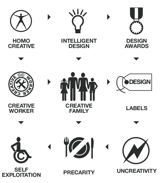
MyCreativity (2006)
What is to be done? First of all, we need to acknowledge the fact that having economic problems as a cognitive worker is a structural consequence, not an individual one. In the 2000s, Richard Florida theorized the advent of the “creative class”, whose transformative potential he praised. A few years later, the MyCreativity group reformulated this concept pragmatically, speaking of self-exploitation, insecurity and creative underclass. We must admit that design schools contribute to populating this creative underclass. So I think it makes sense to talk about design schools as precarity factories. At the same time, however, these schools could be described, to tweak Hakim Bey’s concept, as temporary autonomous élites, since they constitute a space where one can literally buy a degree of control over their time.
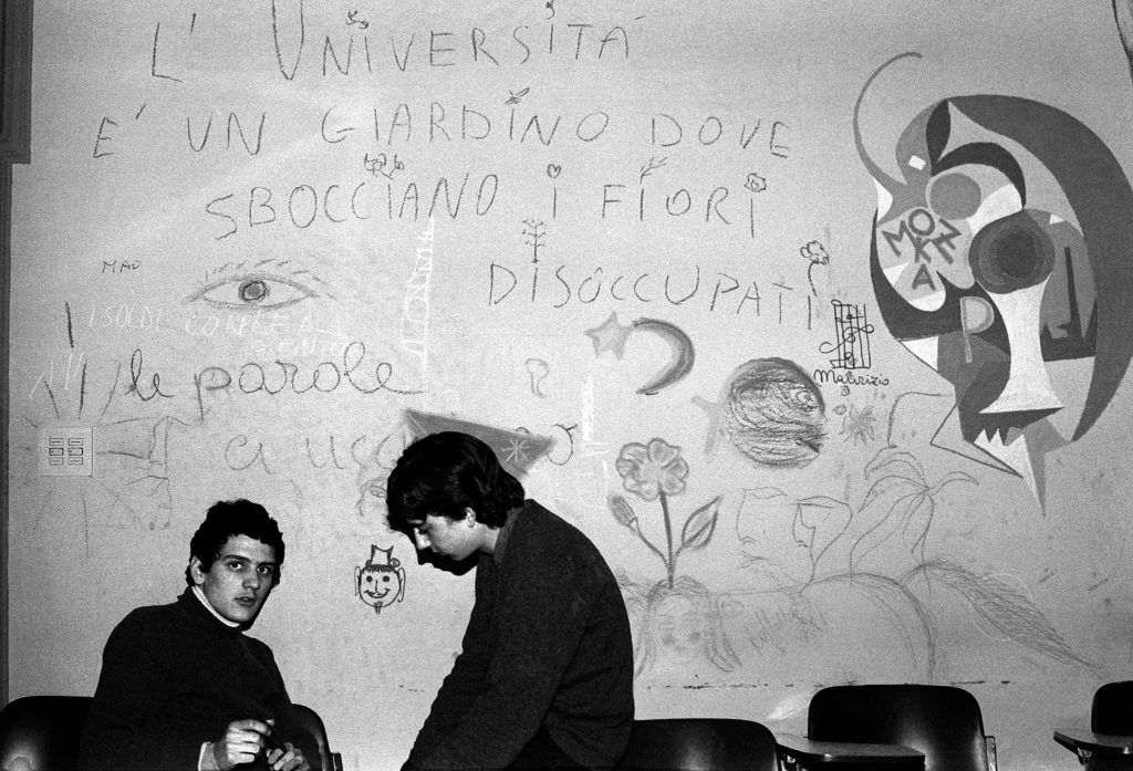
“University is a garden where unemployed flowers blossom”, Bologna (1977). Photo: Enrico Scuro
To what end? To organize. If gratuity is unstoppable, maybe it’s time to extend the target of criticism. Obviously, the client or the studio who does not pay is an exploiter, but the issue must be addressed at a broader level. This is why I think that radical proposals such as universal basic income, perhaps not achievable in practice or even counterproductive, are able to reframe the very meaning of work anyway. Why is the work of a mother or a housewife not considered as such? The reason is simple: because it does not produce income, it’s free. Should the struggle for income support the one against gratuity? I envision a design school functioning like a think tank. Its area of action would be the redefinition of work and the development of strategies to produce a new cultural hegemony.
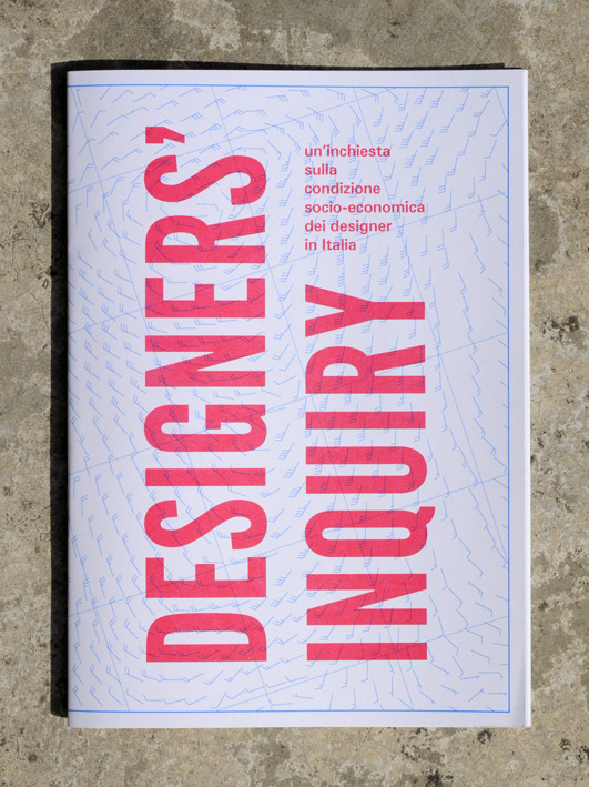
Designers’ Inquiry (2012-13)
If I think about it, some efforts in this direction have already been made, right back in Italy. Brave New Alps, a graphic design duo militating from the heart of the Alps, has catalyzed the debate on the designers’ working conditions for years. In 2013, they formed the Construction Site for Non-Affirmative Practices. The collective produced a one of a kind investigation into the economic and social profile of those who identify as designers. The Designers’ Inquiry was launched not by chance during the Salone del Mobile, the epitome of the rich, opulent and glittering entrepreneurial design. Brave New Alps didn’t stop there and, together with Caterina Giuliani, set up the Precarity Pilot, a physical and virtual platform that includes a set of “best practices” to organize one’s career, redefine notions of success, enable cooperation dynamics, and so on. Maybe this path, the political path, is precisely the one to follow in order to reaffirm the intellectual role of the designer and, while we’re at it, of the cognitariat in general.
Presented during the Citizen-Designer symposium held at AKV|St.Joost in Breda (NL).
Updated: 05/07/2017
Also published on Medium.

Wow! Hits me like a train how precise and well modelled these thoughts are. The conclusion to move on and build think tanks will have to face the reluctance of more art oriented designers but it’s definitely an option to consider.
Thanks for taking the time to read this text. Based on my experience, I would say that there is definitely the will to form a collective subject, especially in the more “artsy” contexts, traditionally rooted in the notion of individual genius. The problem I see has more to do with the means of doing that. Is there enough time? Would the students still be professionally “competitive” if they devote energies to build collective formations?